Custom Style Classes for Inspirations Theme Designs
Some Inspirations theme designs require special custom classes to be added to elements to provide the niche designs we're working on. This is due to either limitations in the core functionality of Crio or the underlying BoldGrid Theme Framework, or due to limitations in the Post and Page Builder's ability to facilitate these customizations. Sometimes, the capability is there, but would cause undue complication for the users to implement these styles via the theme or builder functionality.
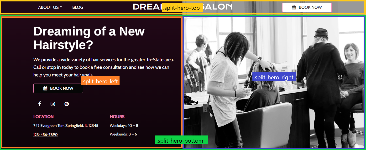
A Split hero design creates a header split down the center of the screen, with a solid color ( palette position 4 ) on the left side, and a background image on the right side. A translucent grey overlay is added to the top right side of the upper row to facilitate readability of the content on the top row.
- theme-split-hero: Added to the
.boldgrid-sectionelement. This class serves as the parent class for all styles for this design. - split-hero-top: Added to the top row of the header where the menu, site-title, and CTA button are located. If using two rows for this content, add the class to both rows.
- split-hero-bottom: Added to the bottom row of the header where the lower content goes. If using multiple rows, add the class to both rows ( not to nested rows though ).
- split-hero-left: Added to all columns inside the
.split-hero-bottomthat fall to the left of the centerline. - split-hero-right: Added to all columns inside the
.split-hero-bottomthat fall to the right of the centerline.
@media screen and ( max-width: 767px ) {
	.boldgrid-section.theme-split-hero {
		background: var(--color-4) !important;

		.row.split-hero-bottom {
			background: var( --color-4 );
		}
	}
}

@media screen and ( min-width: 768px ) {
	.boldgrid-section.theme-split-hero {
		position: relative;

		&::before {
			content: "";
			background: linear-gradient(to right, var( --color-4) 50%, rgba(0,0,0,0) 50%, rgba(0,0,0,0) 50%, rgba(0,0,0,0) 100% );
			position: absolute;
			top: 0;
			bottom: 0;
			left: 0;
			right: 0
		}

		.row.split-hero-top {
			background: linear-gradient(to right, rgba(0,0,0,0) 0%, rgba(0,0,0,0) 50%, rgba(0,0,0,0.4) 50%);
		}
	}
}