

Ce projet à pour objectif de présenter le module Plotly qui est l'un des modules les plus utilisés pour faire de la visualisation de données avec Python. Plotly étant le plus compliqué mais également le plus interactif. Dans ce README toutes les fonctions seront accompagnées du résultat. Le code complet pour ce repository est dans les fichiers sous le nom code.py . Plotly utilise comme structure de données de base les dataframe.
Pour comprendre plus en détails comment plotly fonctionne, je vous invite à consulter mon article sur plotly. ( bientôt disponible )
- Analyse de données
-
Fonctions principales plotly.express
- Scatter plot
- Courbe de tendance et densité
- Error bars
- Bar charts
- Graphiques de corrélations
- Scatter plot avec échelle des tailles des points
- Plot avec animation
- Line Charts
- Area charts
- Pie charts
- Pie charts avec partie en dehors
- Donut charts
- Sunburst charts
- Treemaps
- Histograms
- Boxplots
- Violon plots
- Density contours
- Heatmap
- Point sur une carte
- Surface sur une carte
- Polar plots
- Polar bar charts
- Radar charts
- Coordonnées en 3D
- Ternary charts
-
- Machine Learning
Installation :
pip install plotlyDocumentation Plotly .
from plotly.offline import plot  # pour travailler en offline!
import plotly.express as px
import plotly.graph_objects as go
from plotly.subplots import make_subplots
import pandas as pd
import numpy as npwide_df = px.data.medals_wide()
fig = px.bar(wide_df, x="nation", y=["gold", "silver", "bronze"],
title="Proportion des productions de Minerais", # le titre
labels={"value": "Production annuelle en Tonnes", "variable": "type"}, # le nom des axes
color_discrete_map={"gold": "gold", "silver": "silver", "bronze": "#c96"}, # la couleur par classe
template="simple_white") # couleur du fond
fig.update_layout(font_family="Rockwell", # police du texte
showlegend=False)
fig.add_annotation(text="Production supérieur à la demande", x="South Korea", # ajouter un texte avec une flèche
y=49, arrowhead=1, showarrow=True)
fig.add_shape(type="line", line_color="salmon", line_width=3, opacity=1, line_dash="dot", #najouter une ligne horizontale
x0=0, x1=1, xref="paper", y0=40, y1=40, yref="y")
plot(fig)
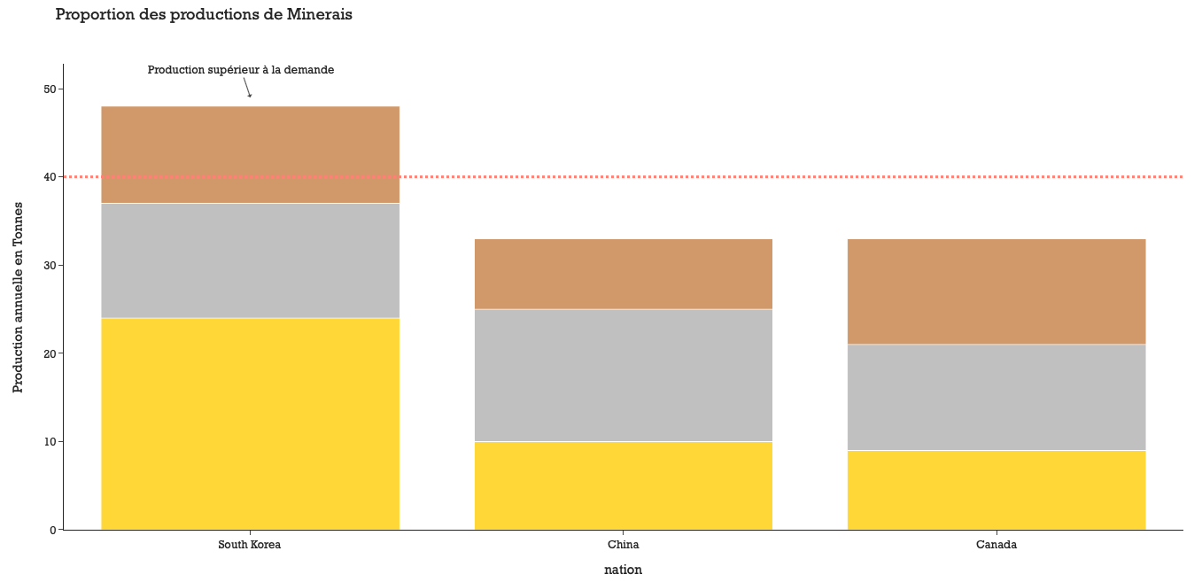
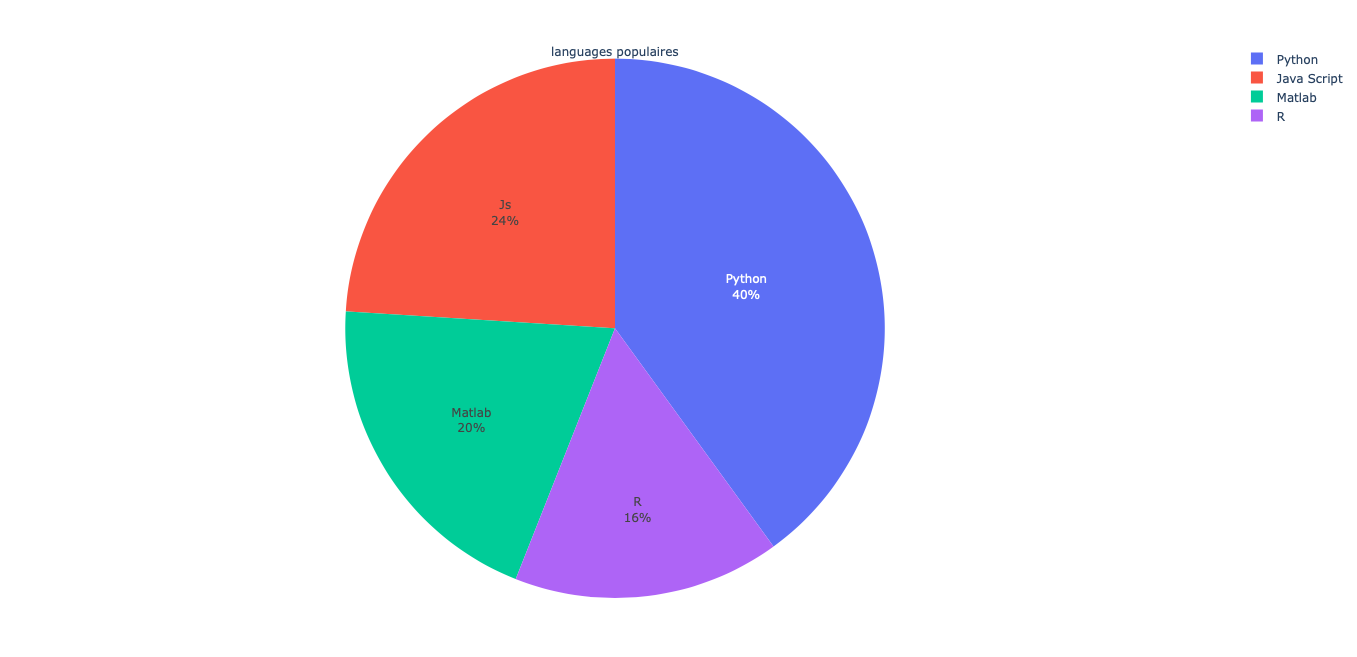
fig = go.Figure(go.Pie(
    title = "languages populaires",
    values = [2, 5, 3, 2.5],
    labels = ["R", "Python", "Java Script", "Matlab"],
    text = ["R", "Python", "Js", "Matlab"],
    hovertemplate = "%{label}: <br>Popularity: %{percent} </br> %{text}" # ce qu'on voit avec la souris dessus))
plot(fig)
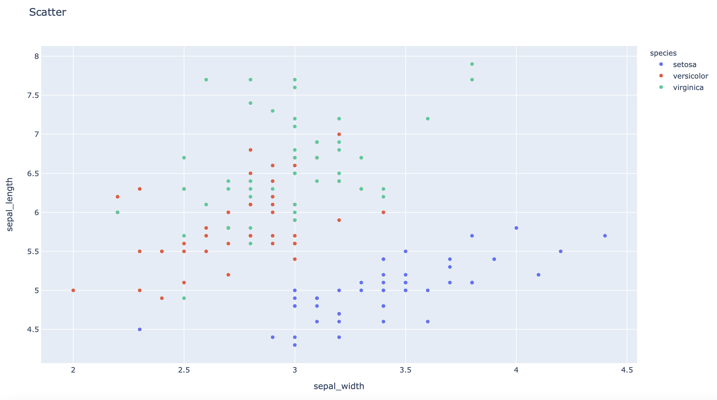
df = px.data.iris() # pandas dataframe
fig = px.scatter(df, x="sepal_width", y="sepal_length", color="species", title='Scatter')
plot(fig)
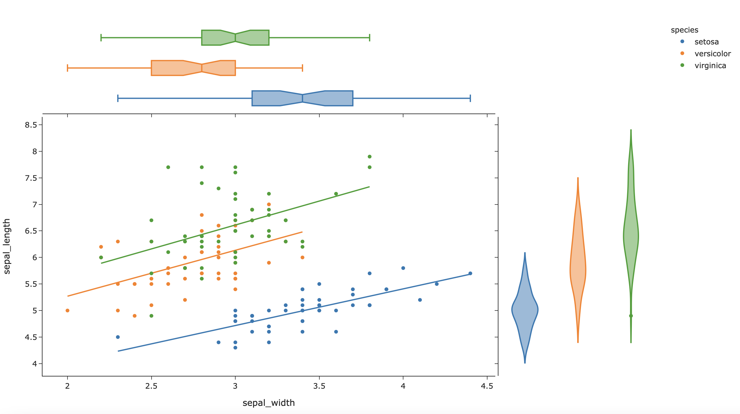
df = px.data.iris()
fig = px.scatter(df, x="sepal_width", y="sepal_length", color="species",marginal_y="violin",
                 marginal_x="box", trendline="ols", template="simple_white")
# trendline = ols pour lineaire et lowess pour non linéaire
plot(fig)
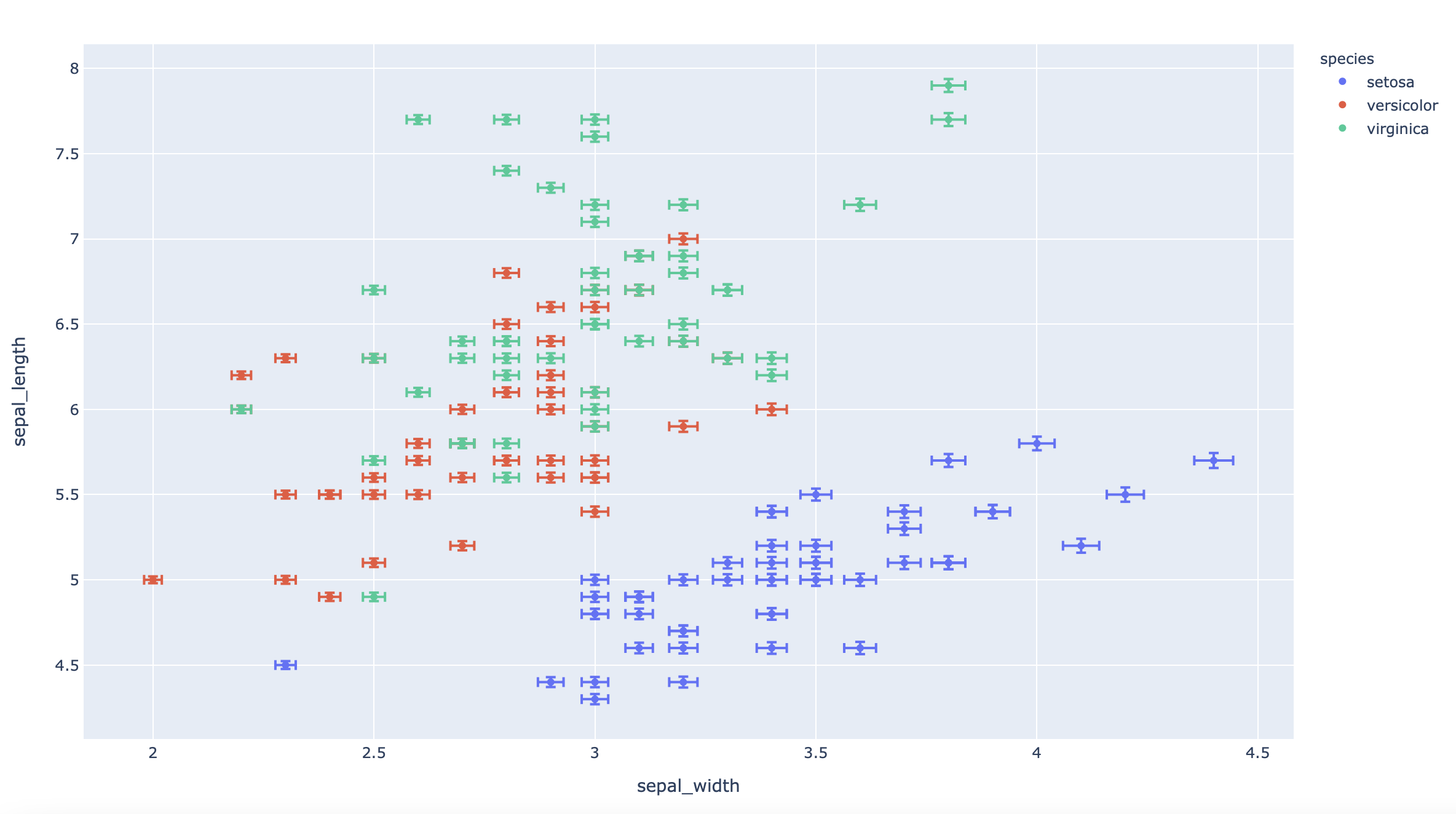
df = px.data.iris()
df["e"] = df["sepal_width"]/100
fig = px.scatter(df, x="sepal_width", y="sepal_length", color="species", error_x="e", error_y="e")
plot(fig)
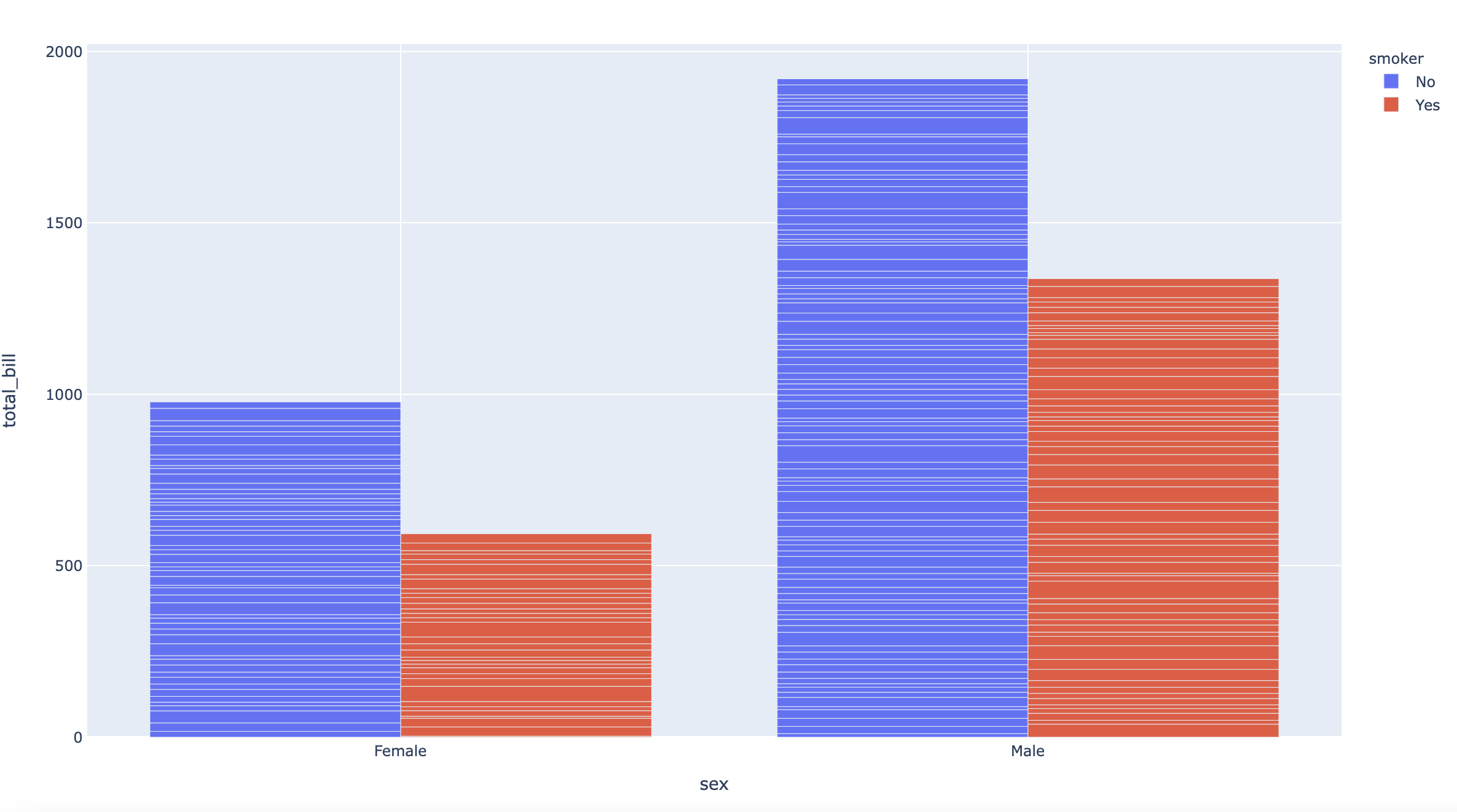
df = px.data.tips()
fig = px.bar(df, x="sex", y="total_bill", color="smoker", barmode="group")
# barmode="group" pour séparer les bars par color
plot(fig)
df = px.data.iris()
fig = px.scatter_matrix(df, dimensions=["sepal_width", "sepal_length", "petal_width", "petal_length"], color="species")
plot(fig)

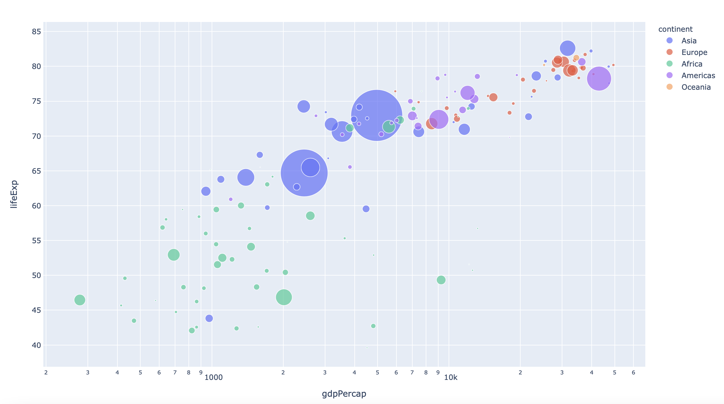
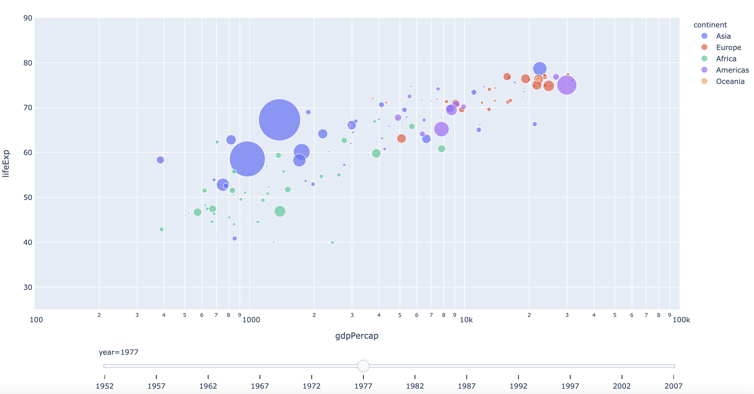
df = px.data.gapminder()
fig = px.scatter(df.query("year==2007"), x="gdpPercap", y="lifeExp", size="pop", color="continent",
           hover_name="country", log_x=True, size_max=60)
plot(fig)
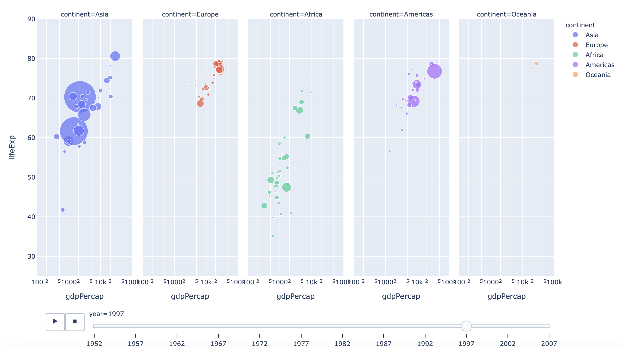
df = px.data.gapminder()
fig = px.scatter(df, x="gdpPercap", y="lifeExp", animation_frame="year", animation_group="country",
           size="pop", color="continent", hover_name="country", facet_col="continent",
           log_x=True, size_max=45, range_x=[100,100000], range_y=[25,90])
# facet_col pour couper les données en plusieurs colonnes
plot(fig)
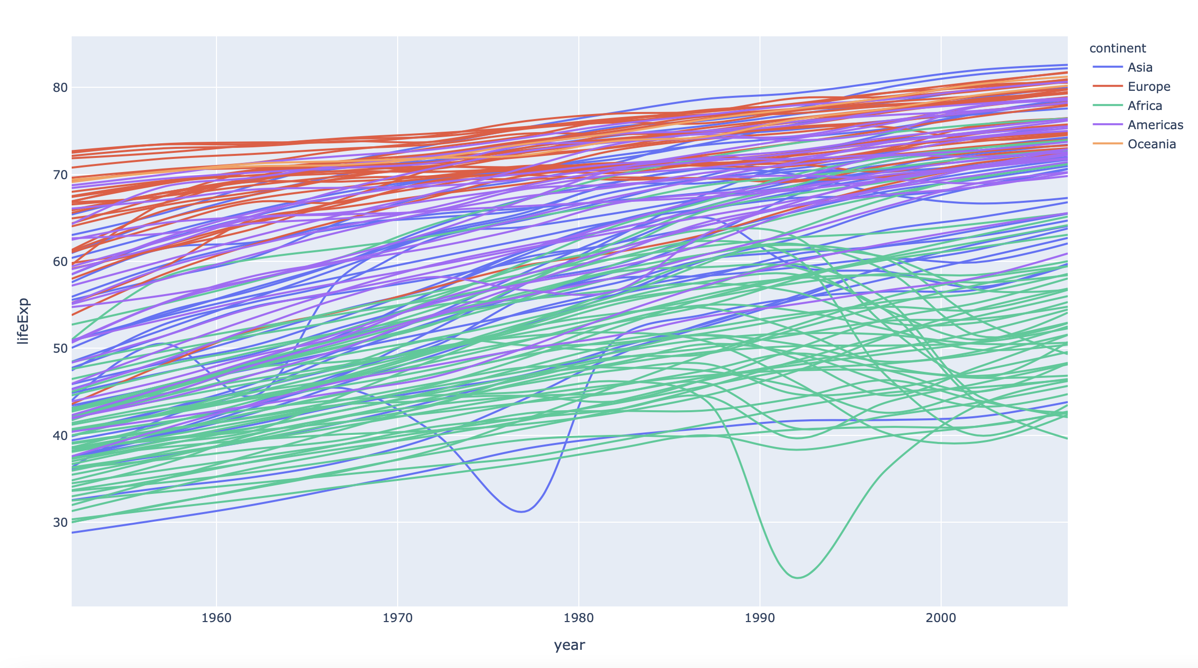
df = px.data.gapminder()
fig = px.line(df, x="year", y="lifeExp", color="continent", line_group="country", hover_name="country",
        line_shape="spline", render_mode="svg")
plot(fig)
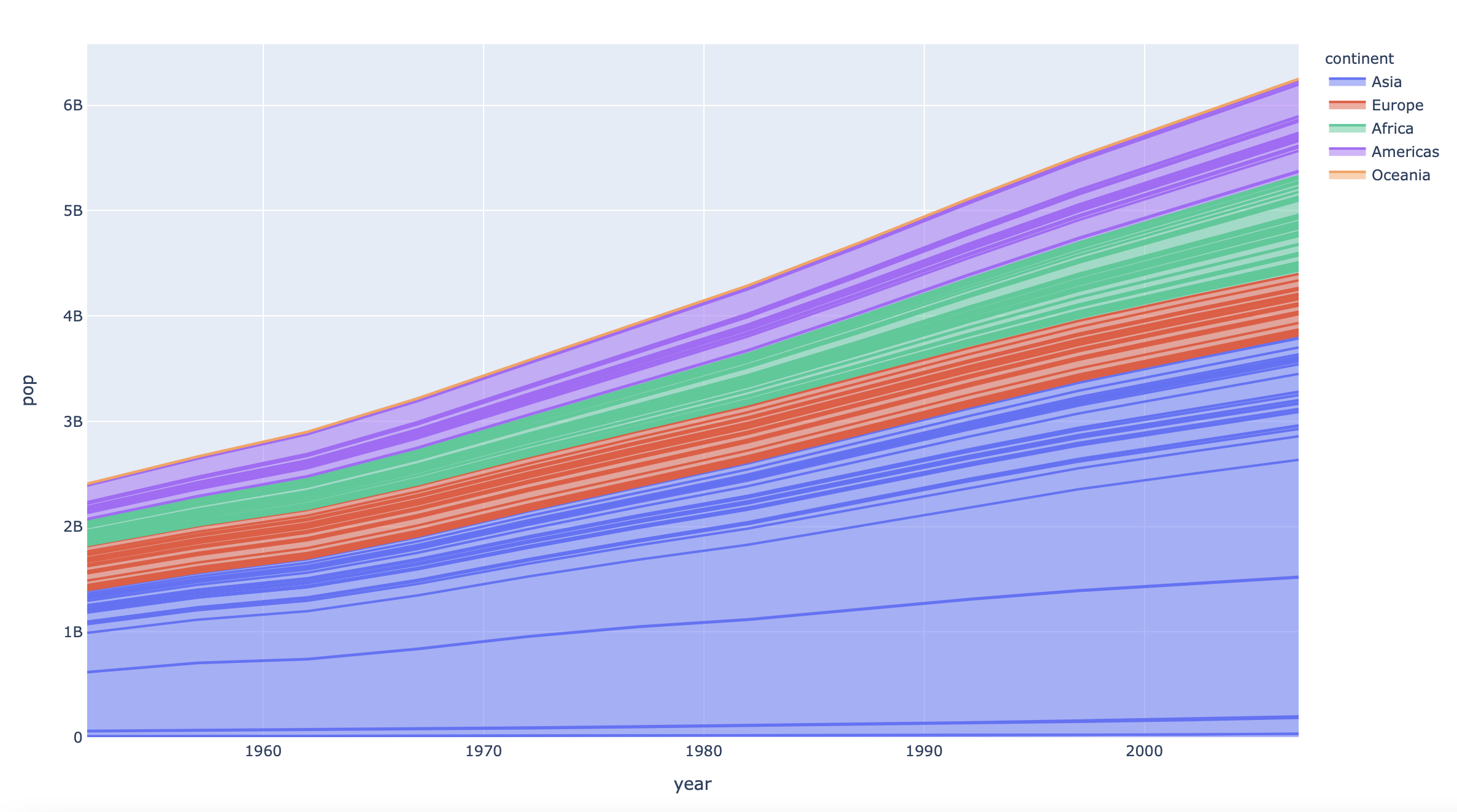
df = px.data.gapminder()
fig = px.area(df, x="year", y="pop", color="continent", line_group="country")
plot(fig)
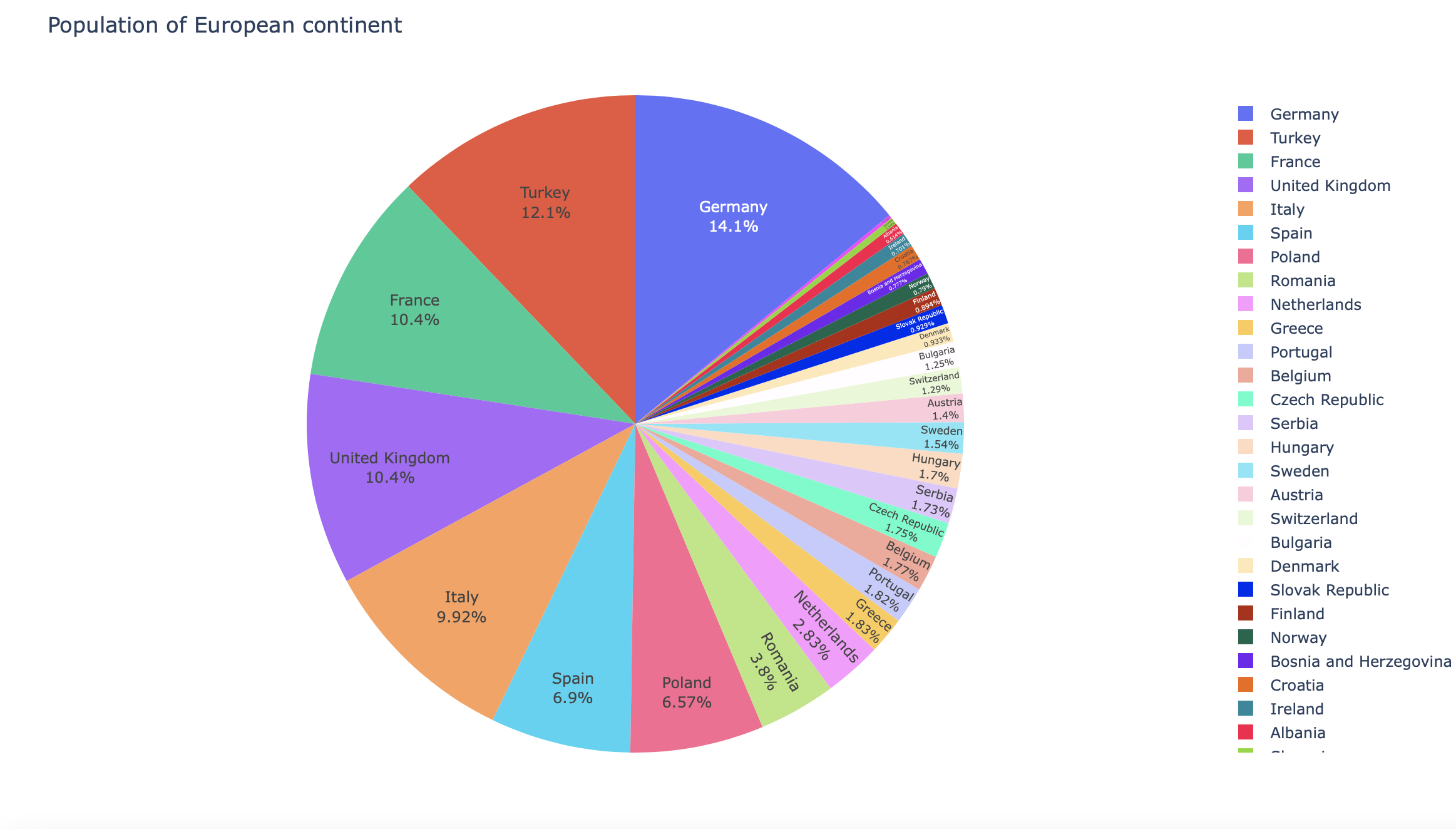
df = px.data.gapminder().query("year == 2007").query("continent == 'Europe'")
df.loc[df['pop'] < 2.e6, 'country'] = 'Other countries' # Represent only large countries
fig = px.pie(df, values='pop', names='country', title='Population of European continent')
fig.update_traces(textposition='inside', textinfo='percent+label')
plot(fig)
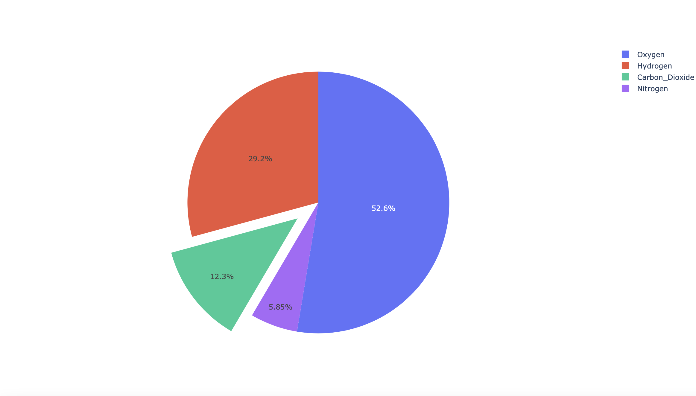
labels = ['Oxygen','Hydrogen','Carbon_Dioxide','Nitrogen']
values = [4500, 2500, 1053, 500]

# pull is given as a fraction of the pie radius
fig = go.Figure(data=[go.Pie(labels=labels, values=values, pull=[0, 0, 0.2, 0])])
plot(fig)
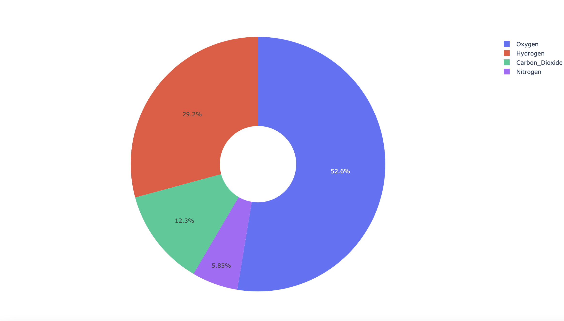
labels = ['Oxygen','Hydrogen','Carbon_Dioxide','Nitrogen']
values = [4500, 2500, 1053, 500]
# Use `hole` to create a donut-like pie chart
fig = go.Figure(data=[go.Pie(labels=labels, values=values, hole=.3)])
plot(fig)
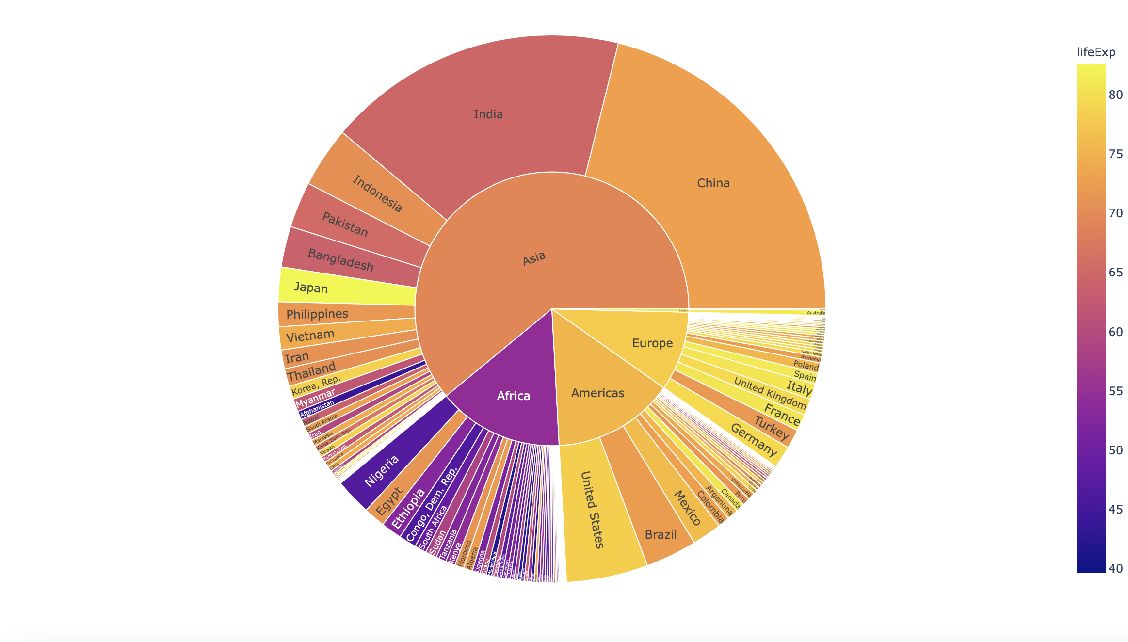
df = px.data.gapminder().query("year == 2007")
fig = px.sunburst(df, path=['continent', 'country'], values='pop',
                  color='lifeExp', hover_data=['iso_alpha'])
plot(fig)
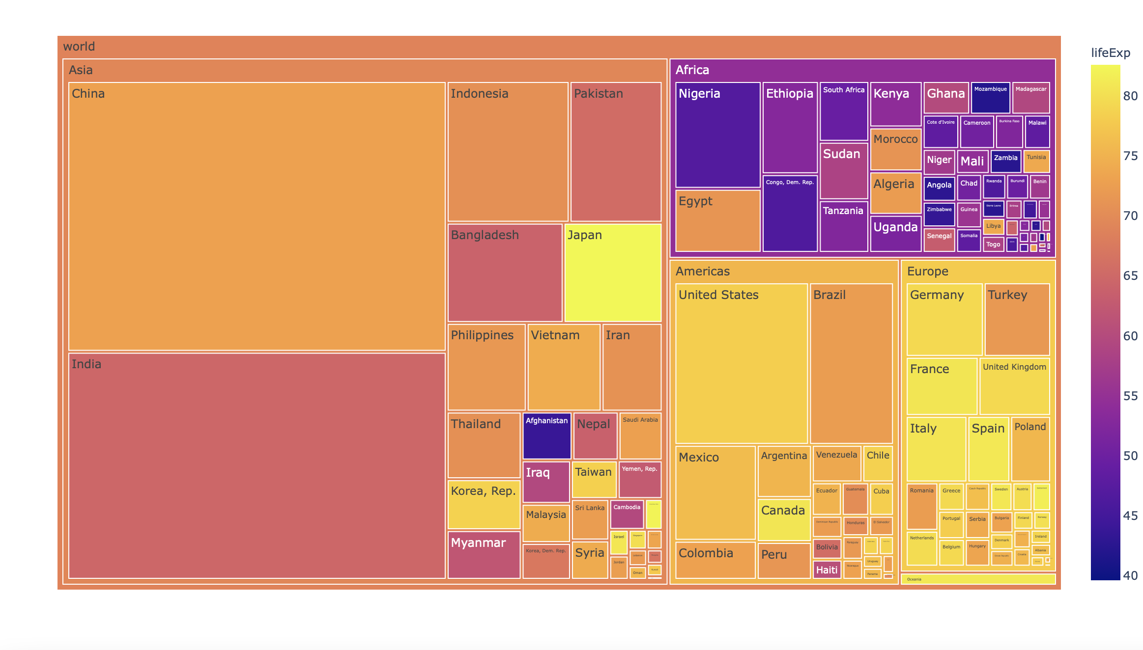
df = px.data.gapminder().query("year == 2007")
fig = px.treemap(df, path=[px.Constant('world'), 'continent', 'country'], values='pop',
                  color='lifeExp', hover_data=['iso_alpha'])
plot(fig)
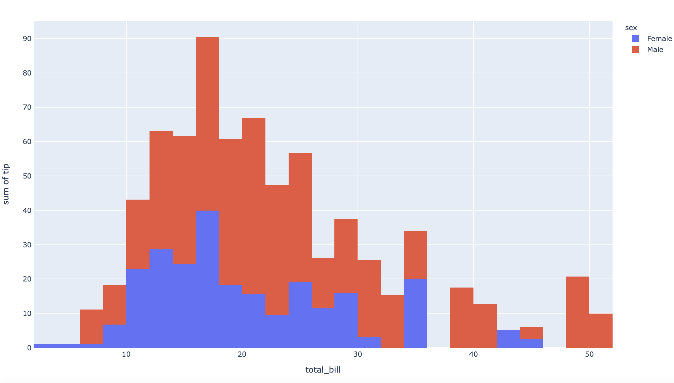
df = px.data.tips()
fig = px.histogram(df, x="total_bill", y="tip", color="sex", hover_data=df.columns)
plot(fig)
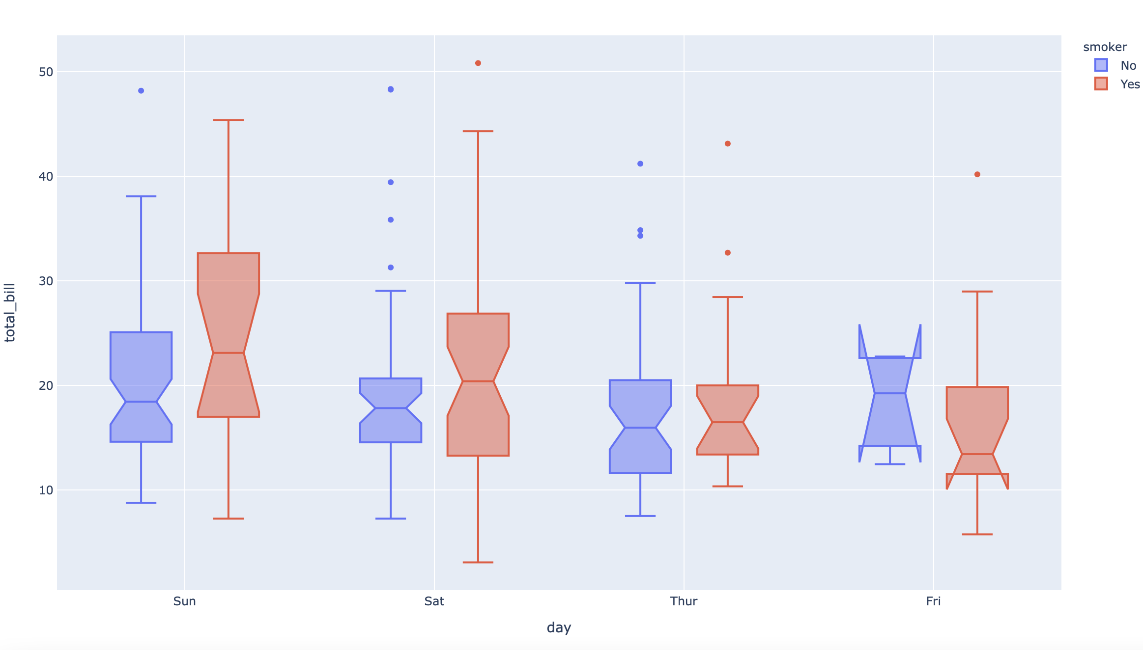
df = px.data.tips()
fig = px.box(df, x="day", y="total_bill", color="smoker", notched=True)
plot(fig)
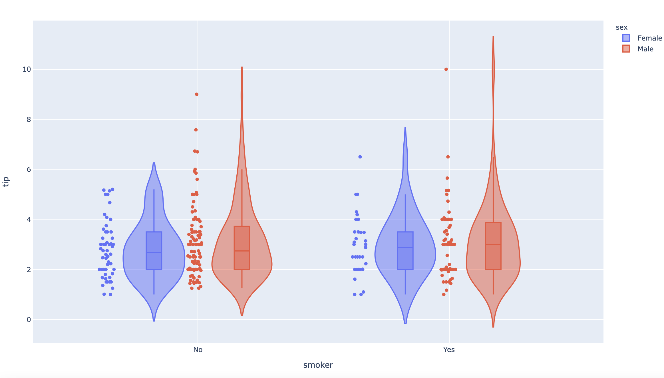
df = px.data.tips()
fig = px.violin(df, y="tip", x="smoker", color="sex", box=True, points="all", hover_data=df.columns)
plot(fig)
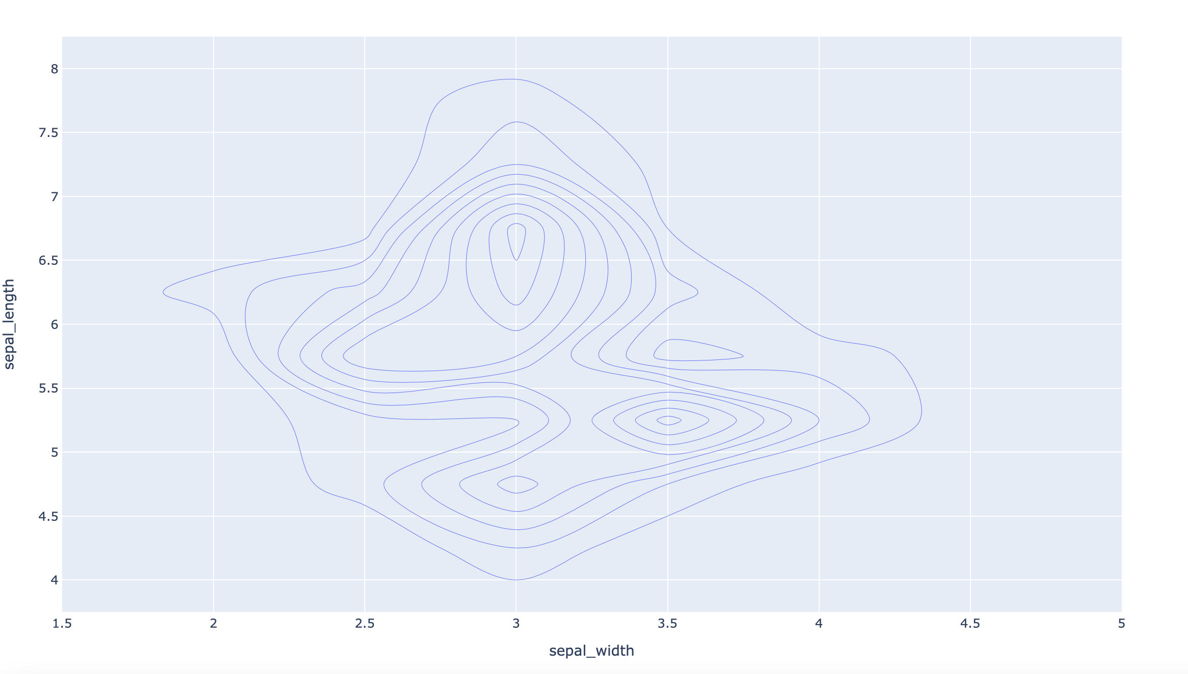
df = px.data.iris()
fig = px.density_contour(df, x="sepal_width", y="sepal_length")
plot(fig)
df = px.data.iris()
fig = px.density_heatmap(df, x="sepal_width", y="sepal_length", marginal_y="histogram")
plot(fig)
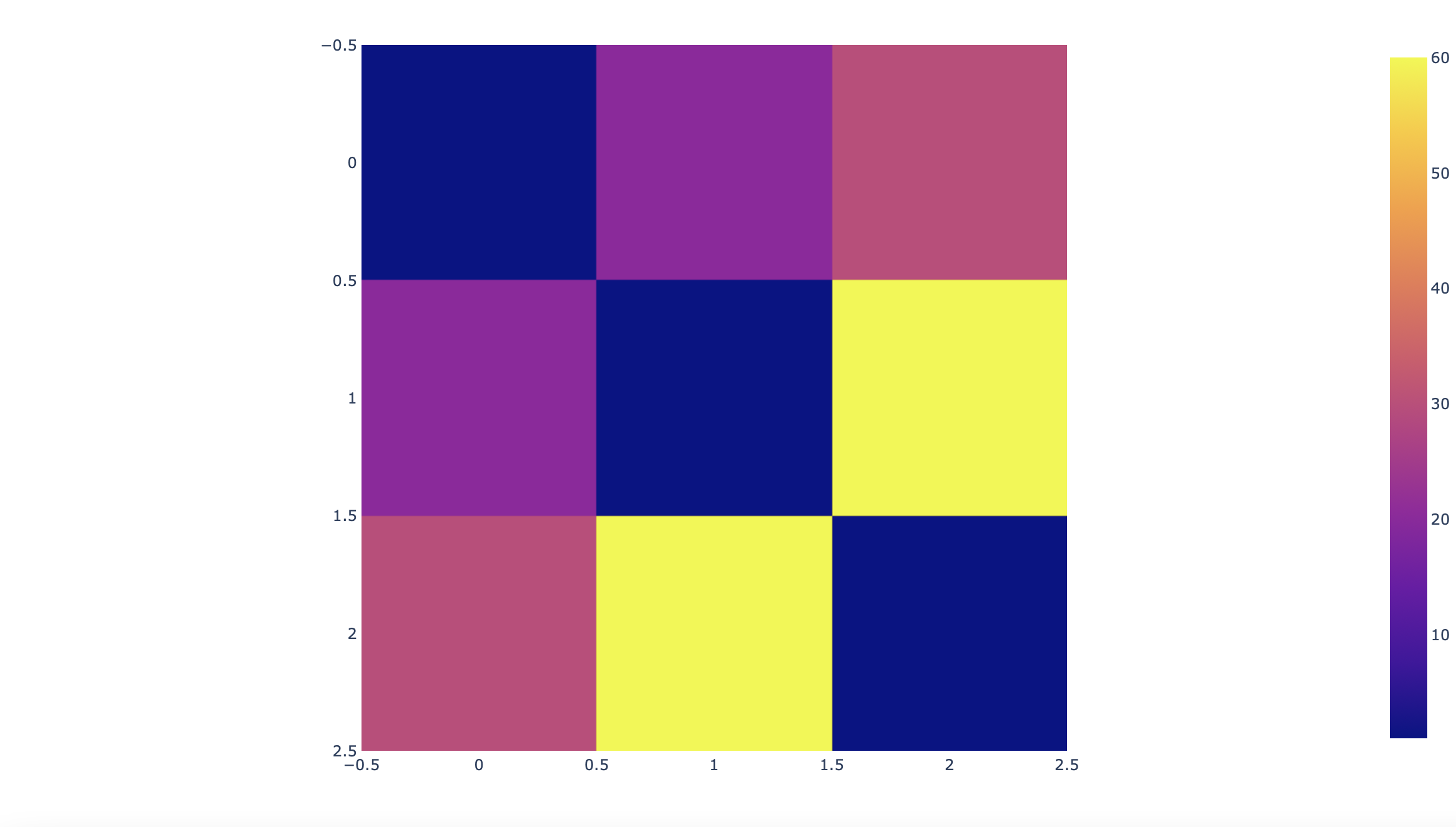
fig = px.imshow([[1, 20, 30],
[20, 1, 60],
[30, 60, 1]])
plot(fig)
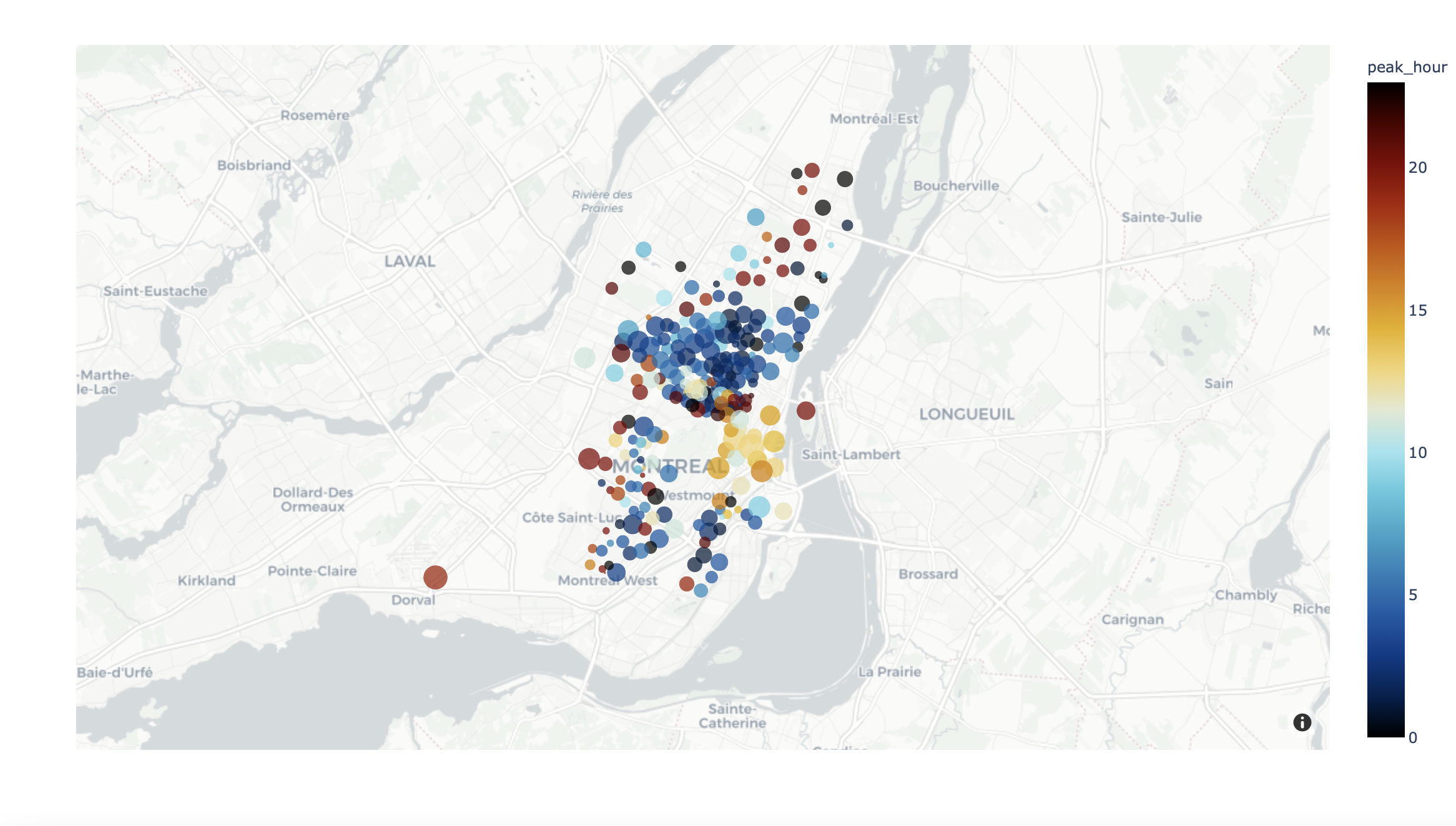
df = px.data.carshare()
fig = px.scatter_mapbox(df, lat="centroid_lat", lon="centroid_lon", color="peak_hour", size="car_hours",
                  color_continuous_scale=px.colors.cyclical.IceFire, size_max=15, zoom=10,
                  mapbox_style="carto-positron")
plot(fig)
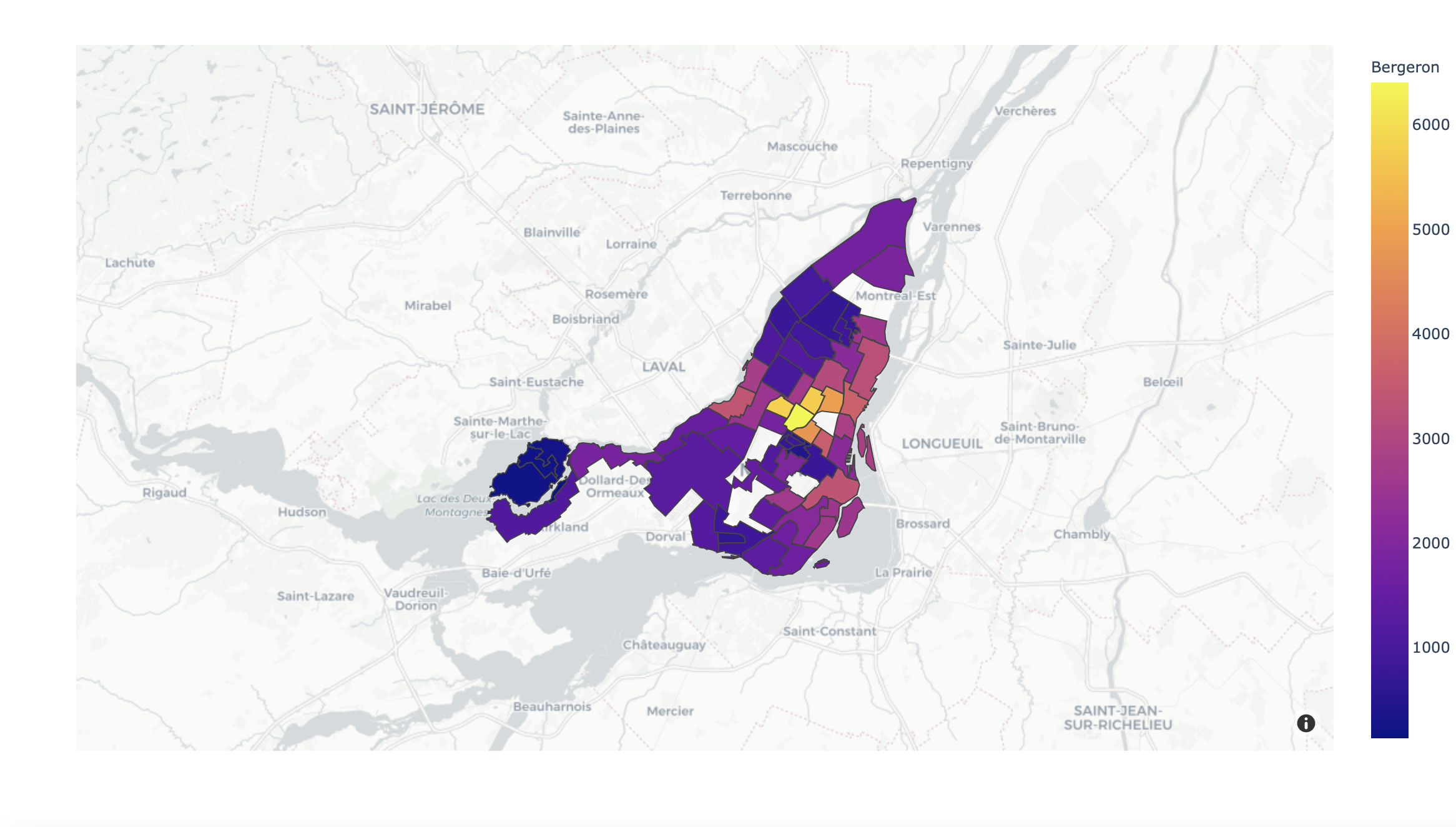
df = px.data.election()
geojson = px.data.election_geojson()

fig = px.choropleth_mapbox(df, geojson=geojson, color="Bergeron",
                           locations="district", featureidkey="properties.district",
                           center={"lat": 45.5517, "lon": -73.7073},
                           mapbox_style="carto-positron", zoom=9)
plot(fig)
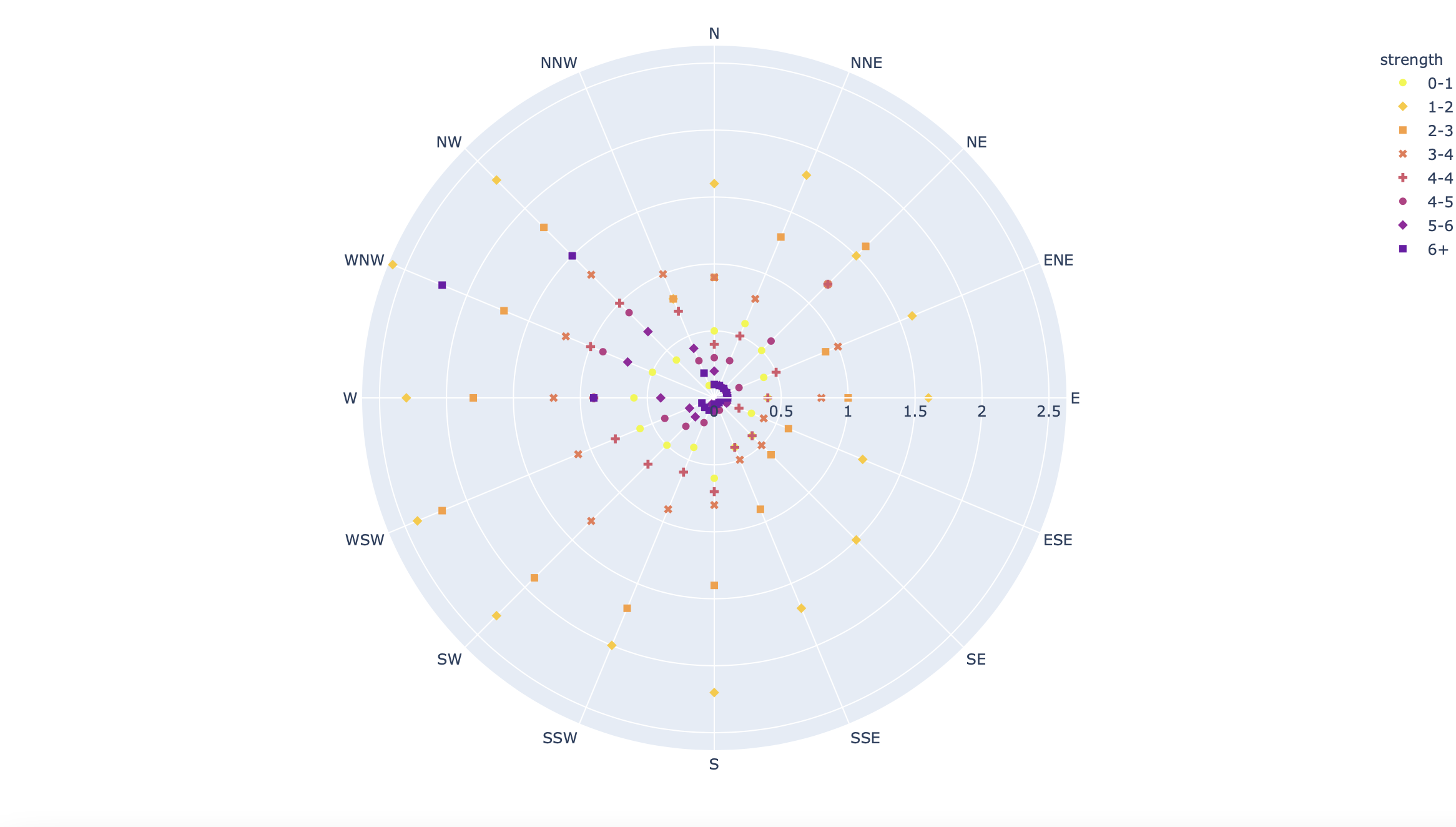
df = px.data.wind()
fig = px.scatter_polar(df, r="frequency", theta="direction", color="strength", symbol="strength",
            color_discrete_sequence=px.colors.sequential.Plasma_r)
plot(fig)
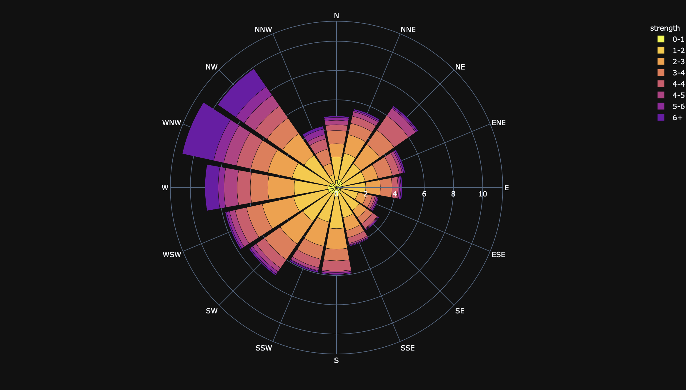
df = px.data.wind()
fig = px.bar_polar(df, r="frequency", theta="direction", color="strength", template="plotly_dark",
            color_discrete_sequence= px.colors.sequential.Plasma_r)
plot(fig)
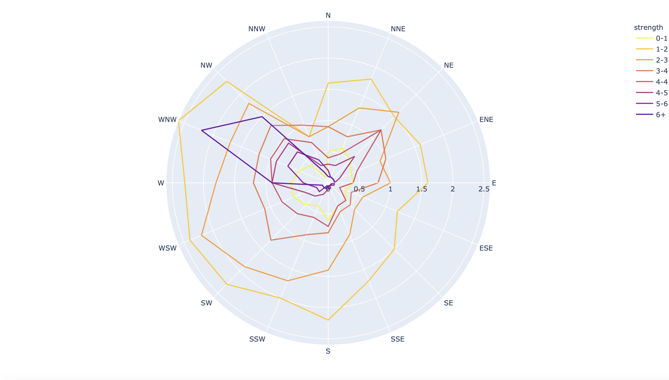
df = px.data.wind()
fig = px.line_polar(df, r="frequency", theta="direction", color="strength", line_close=True,
            color_discrete_sequence=px.colors.sequential.Plasma_r)
plot(fig)
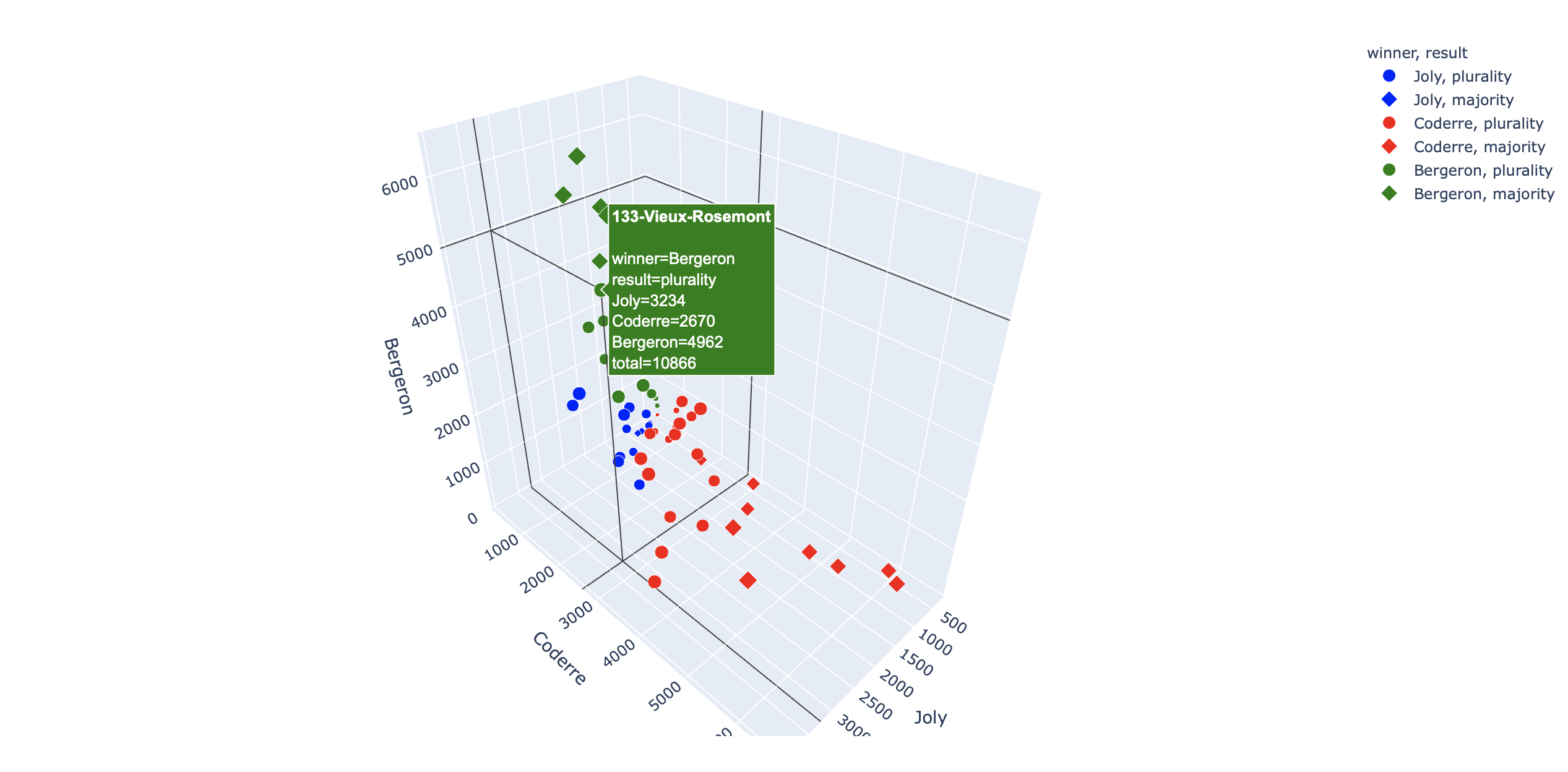
df = px.data.election()
fig = px.scatter_3d(df, x="Joly", y="Coderre", z="Bergeron", color="winner", size="total", hover_name="district",
                  symbol="result", color_discrete_map = {"Joly": "blue", "Bergeron": "green", "Coderre":"red"})
plot(fig)
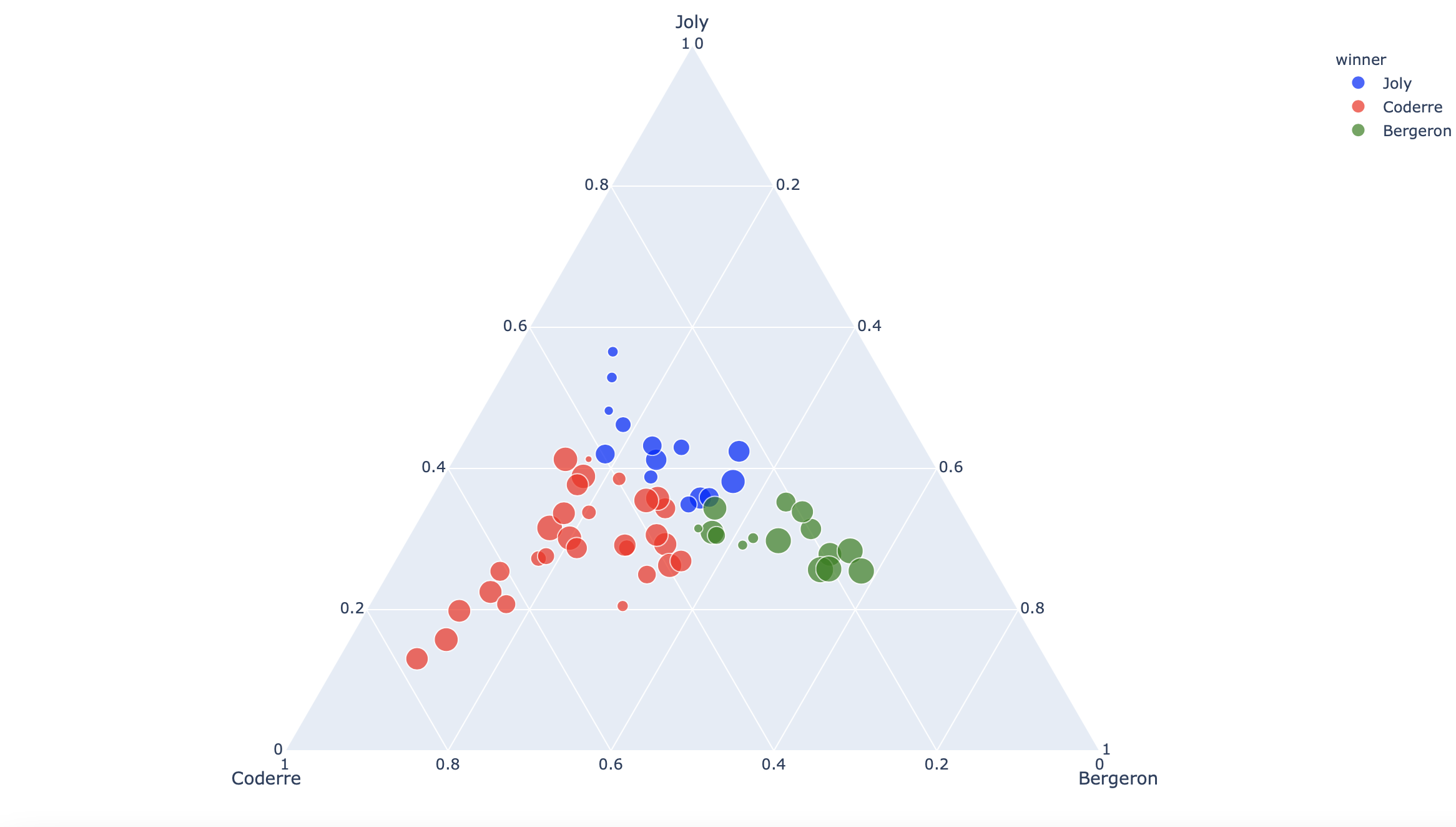
df = px.data.election()
fig = px.scatter_ternary(df, a="Joly", b="Coderre", c="Bergeron", color="winner", size="total", hover_name="district",
                   size_max=15, color_discrete_map = {"Joly": "blue", "Bergeron": "green", "Coderre":"red"} )
plot(fig)
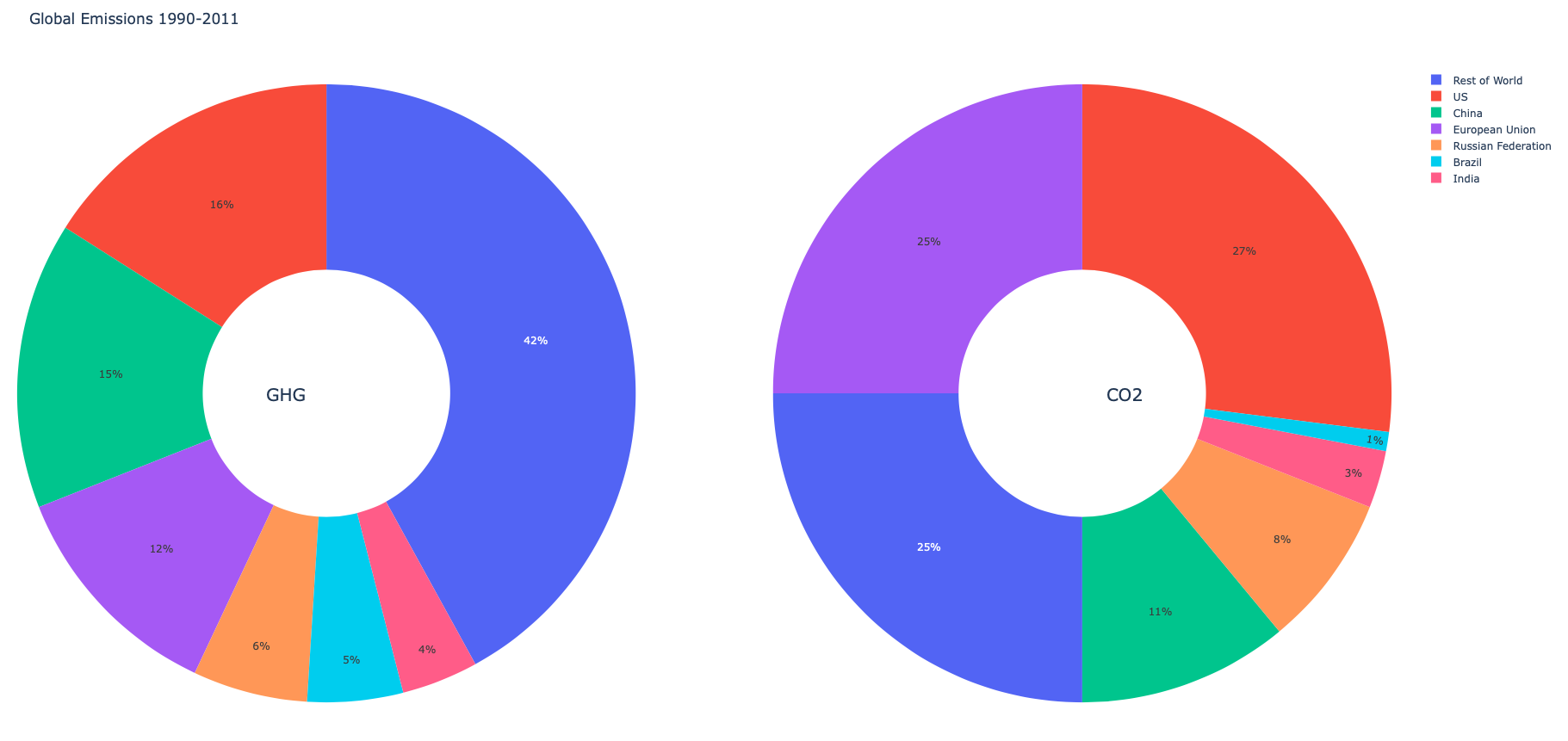
labels = ["US", "China", "European Union", "Russian Federation", "Brazil", "India","Rest of World"]
fig = make_subplots(rows=1, cols=2, specs=[[{'type':'domain'}, {'type':'domain'}]]) # 'domain' for pie subplots
fig.add_trace(go.Pie(labels=labels, values=[16, 15, 12, 6, 5, 4, 42], name="GHG Emissions"),1, 1)
fig.add_trace(go.Pie(labels=labels, values=[27, 11, 25, 8, 1, 3, 25], name="CO2 Emissions"),1, 2)
fig.update_traces(hole=.4, hoverinfo="label+percent+name")
fig.update_layout(
    title_text="Global Emissions 1990-2011",
    # Add annotations in the center of the donut pies.
    annotations=[dict(text='GHG', x=0.18, y=0.5, font_size=20, showarrow=False),
                 dict(text='CO2', x=0.82, y=0.5, font_size=20, showarrow=False)])
plot(fig)
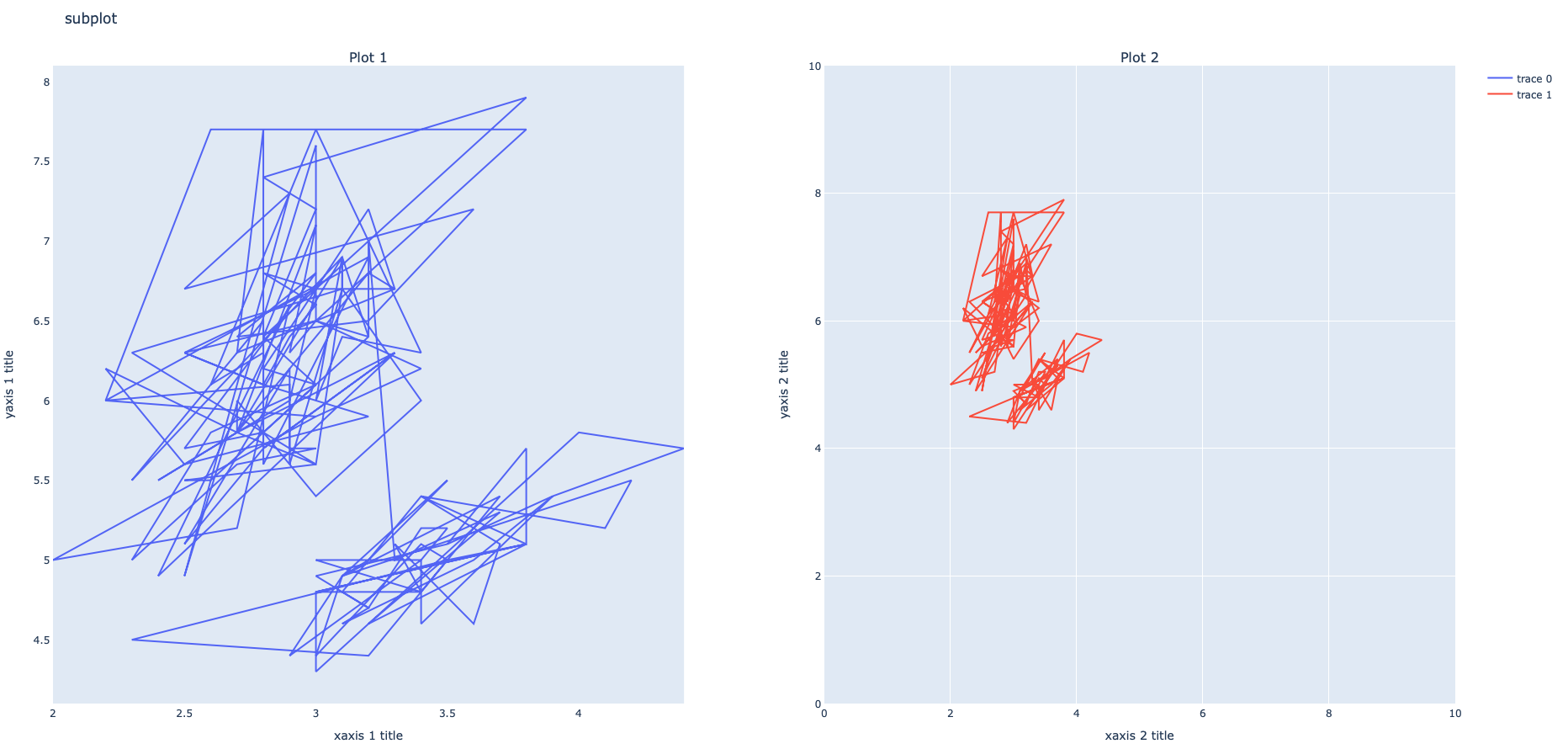
df = px.data.iris() # pandas dataframe
fig = make_subplots(rows=1, cols=2,subplot_titles=("Plot 1", "Plot 2")) #titre de chaque subplot
fig.add_trace(go.Scatter(x=df["sepal_width"], y=df["sepal_length"]),1,1)
fig.add_trace(go.Scatter(x=df["sepal_width"], y=df["sepal_length"]),1,2)
fig.update_layout(title_text="subplot")
# pour changer les axes de chaque subplot :
fig.update_xaxes(title_text="xaxis 1 title", showgrid=False, row=1, col=1) # sans grid x
fig.update_xaxes(title_text="xaxis 2 title", range=[0, 10], row=1, col=2)
fig.update_yaxes(title_text="yaxis 1 title", showgrid=False,row=1, col=1) # sans grid y
fig.update_yaxes(title_text="yaxis 2 title", range=[0, 10], row=1, col=2)
plot(fig)
# pour avoir l'axe X en commun :
fig = make_subplots(rows=3, cols=1, shared_xaxes=True, vertical_spacing=0.02)
# pour avoir l'axe Y en commun
fig = make_subplots(rows=2, cols=2, shared_yaxes=True)
xy: 2D Cartesian subplot type for scatter, bar, etc. This is the default if no type is specified.

scene: 3D Cartesian subplot for scatter3d, cone, etc.

polar: Polar subplot for scatterpolar, barpolar, etc.

ternary: Ternary subplot for scatterternary.

mapbox: Mapbox subplot for scattermapbox.

domain: Subplot type for traces that are individually positioned. pie, parcoords, parcats, etc.

trace type: A trace type name (e.g. bar, scattergeo, carpet, mesh, etc.)
which will be used to determine the appropriate subplot type for that trace.
z_data = df = pd.read_csv("https://raw.githubusercontent.com/plotly/datasets/master/volcano.csv")
fig = go.Figure(data=[go.Surface(z=z_data, colorscale='IceFire')]) # Z1 liste de liste
fig.update_layout(title='Mountain')
plot(fig)

df = px.data.iris()
fig = px.scatter_3d(df, x='sepal_length', y='sepal_width', z='petal_width',
              color='species', size='petal_length', size_max=18,symbol='species', opacity=0.7)
plot(fig)

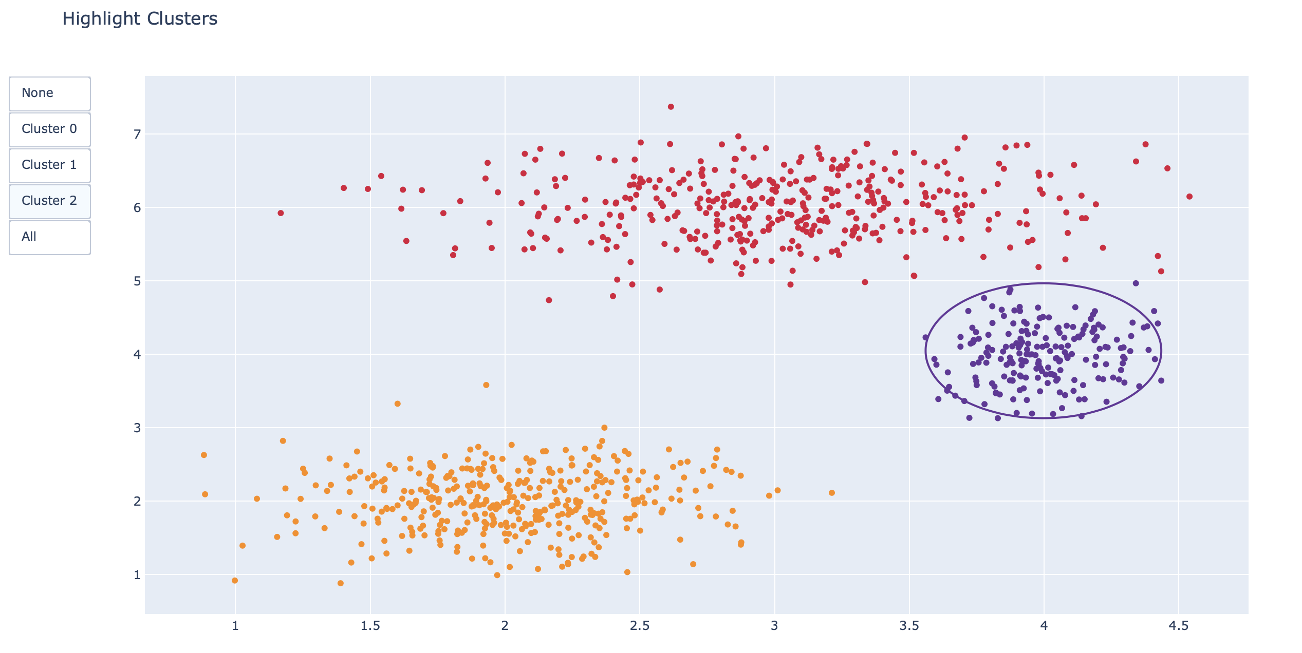
np.random.seed(1)

x0 = np.random.normal(2, 0.4, 400)
y0 = np.random.normal(2, 0.4, 400)
x1 = np.random.normal(3, 0.6, 600)
y1 = np.random.normal(6, 0.4, 400)
x2 = np.random.normal(4, 0.2, 200)
y2 = np.random.normal(4, 0.4, 200)

# Create figure
fig = go.Figure()

# Add traces
fig.add_trace(go.Scatter(x=x0,y=y0,mode="markers",marker=dict(color="DarkOrange")))
fig.add_trace(go.Scatter(x=x1,y=y1,mode="markers",marker=dict(color="Crimson")))
fig.add_trace(go.Scatter(x=x2,y=y2,mode="markers",marker=dict(color="RebeccaPurple")))

# Add buttons that add shapes
cluster0 = [dict(type="circle",xref="x", yref="y",x0=min(x0), y0=min(y0),x1=max(x0), y1=max(y0),line=dict(color="DarkOrange"))]
cluster1 = [dict(type="circle",xref="x", yref="y",x0=min(x1), y0=min(y1),x1=max(x1), y1=max(y1),line=dict(color="Crimson"))]
cluster2 = [dict(type="circle",xref="x", yref="y",x0=min(x2), y0=min(y2),x1=max(x2), y1=max(y2),line=dict(color="RebeccaPurple"))]

fig.update_layout(updatemenus=[dict(type="buttons",buttons=[
                dict(label="None",
                     method="relayout",
                     args=["shapes", []]),
                dict(label="Cluster 0",
                     method="relayout",
                     args=["shapes", cluster0]),
                dict(label="Cluster 1",
                     method="relayout",
                     args=["shapes", cluster1]),
                dict(label="Cluster 2",
                     method="relayout",
                     args=["shapes", cluster2]),
                dict(label="All",
                     method="relayout",
                     args=["shapes", cluster0 + cluster1 + cluster2])]
		     ,)])
fig.update_layout(title_text="Highlight Clusters",showlegend=False,)
plot(fig)
df = px.data.gapminder()
fig = px.scatter(df, x="gdpPercap", y="lifeExp", animation_frame="year", animation_group="country",
           size="pop", color="continent", hover_name="country",
           log_x=True, size_max=55, range_x=[100,100000], range_y=[25,90])

fig["layout"].pop("updatemenus") # optional, drop animation buttons
plot(fig)
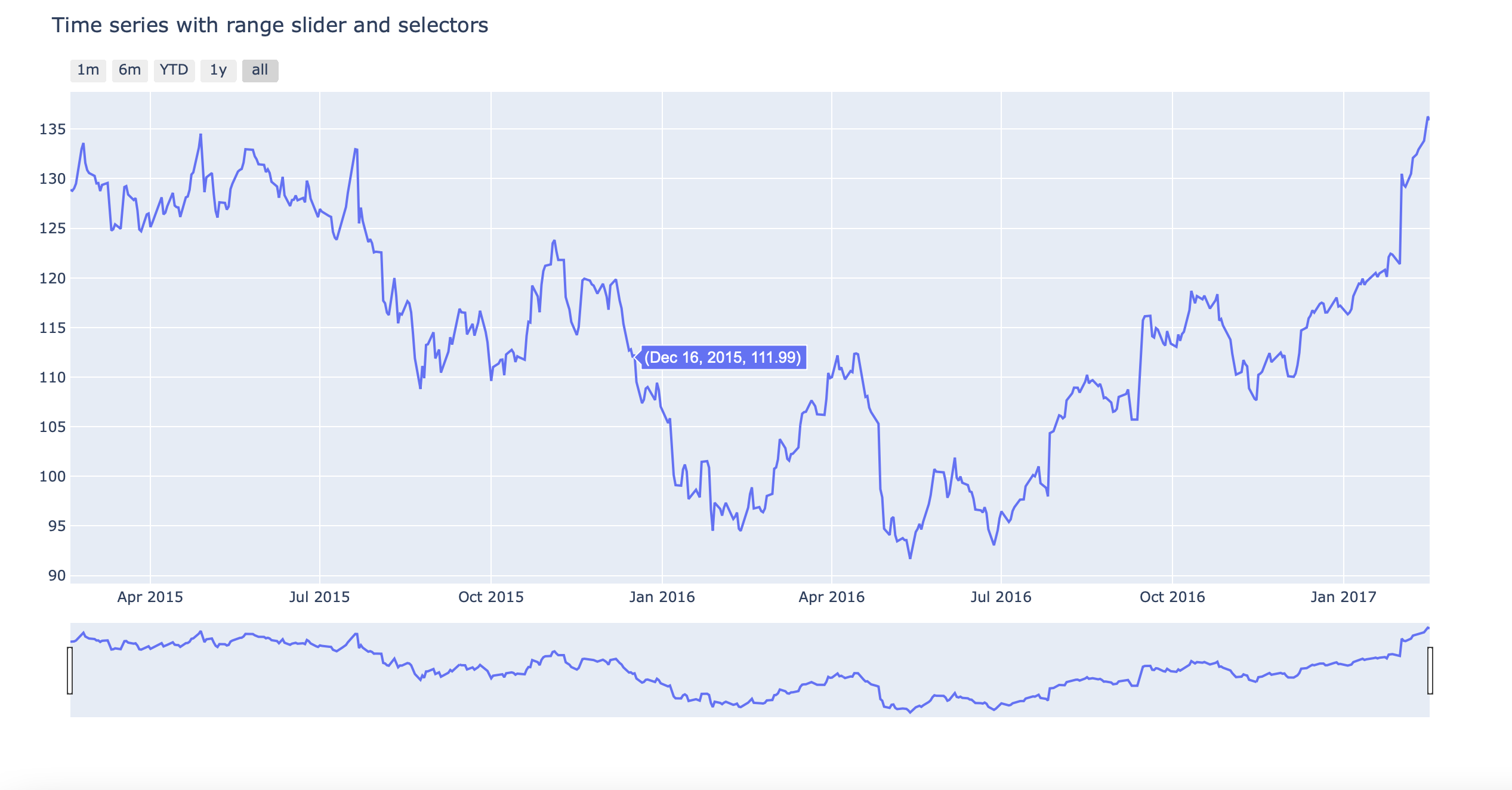
# Load data
df = pd.read_csv("https://raw.githubusercontent.com/plotly/datasets/master/finance-charts-apple.csv")
df.columns = [col.replace("AAPL.", "") for col in df.columns]

# Create figure
fig = go.Figure()
fig.add_trace(go.Scatter(x=list(df.Date), y=list(df.High)))

# Set title
fig.update_layout(title_text="Time series with range slider and selectors")

# Add range slider
fig.update_layout(xaxis=dict(rangeselector=dict(
            buttons=list([
                dict(count=1,
                     label="1m",
                     step="month",
                     stepmode="backward"),
                dict(count=6,
                     label="6m",
                     step="month",
                     stepmode="backward"),
                dict(count=1,
                     label="YTD",
                     step="year",
                     stepmode="todate"),
                dict(count=1,
                     label="1y",
                     step="year",
                     stepmode="backward"),
                dict(step="all")])
            ),rangeslider=dict(visible=True),type="date"))
plot(fig)
from sklearn.linear_model import LinearRegression

df = px.data.tips()
X = df.total_bill.values.reshape(-1, 1)

model = LinearRegression()
model.fit(X, df.tip)

x_range = np.linspace(X.min(), X.max(), 100)
y_range = model.predict(x_range.reshape(-1, 1))

fig = px.scatter(df, x='total_bill', y='tip', opacity=0.65)
fig.add_traces(go.Scatter(x=x_range, y=y_range, name='Regression Fit'))
fig.show()

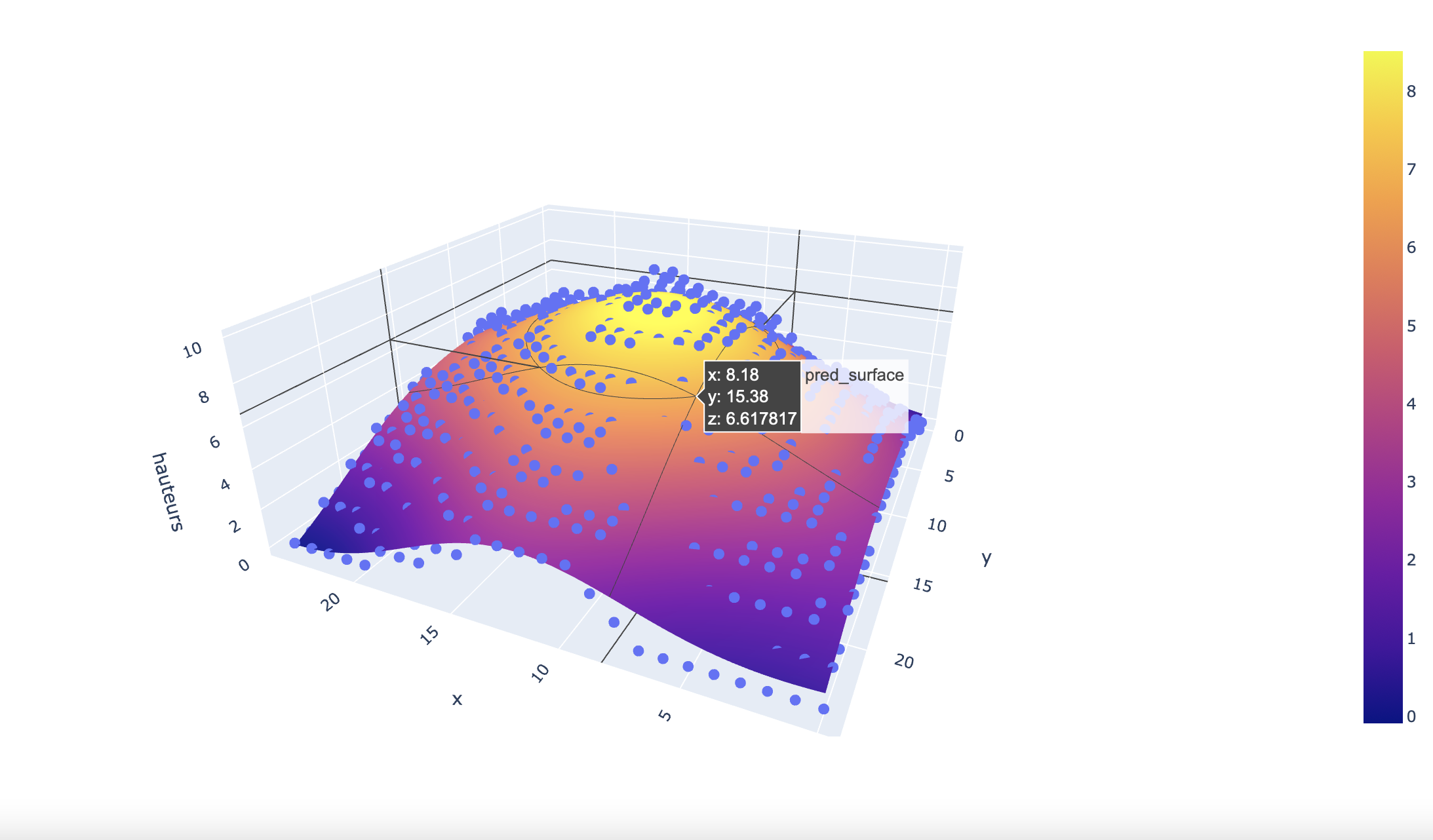
Le contenu de df_final est disponible dans les fichiers du github.
from sklearn.svm import SVR

mesh_size = .02
margin = 0

df = df_final

X = df[['x', 'y']]
y = df['hauteurs']

# Condition the model on sepal width and length, predict the petal width
model = SVR(C=1.)
model.fit(X, y)

# Create a mesh grid on which we will run our model
x_min, x_max = X.x.min() - margin, X.x.max() + margin
y_min, y_max = X.y.min() - margin, X.y.max() + margin
xrange = np.arange(x_min, x_max, mesh_size)
yrange = np.arange(y_min, y_max, mesh_size)
xx, yy = np.meshgrid(xrange, yrange)

# Run model
pred = model.predict(np.c_[xx.ravel(), yy.ravel()])
pred = pred.reshape(xx.shape)

# Generate the plot
fig = px.scatter_3d(df, x='x', y='y', z='hauteurs')
fig.update_traces(marker=dict(size=5))
fig.add_traces(go.Surface(x=xrange, y=yrange, z=pred, name='pred_surface'))
plot(fig)
![]()
![]()
![]()