

A Flutter package providing a customizable and interactive tree view with selection capabilities.
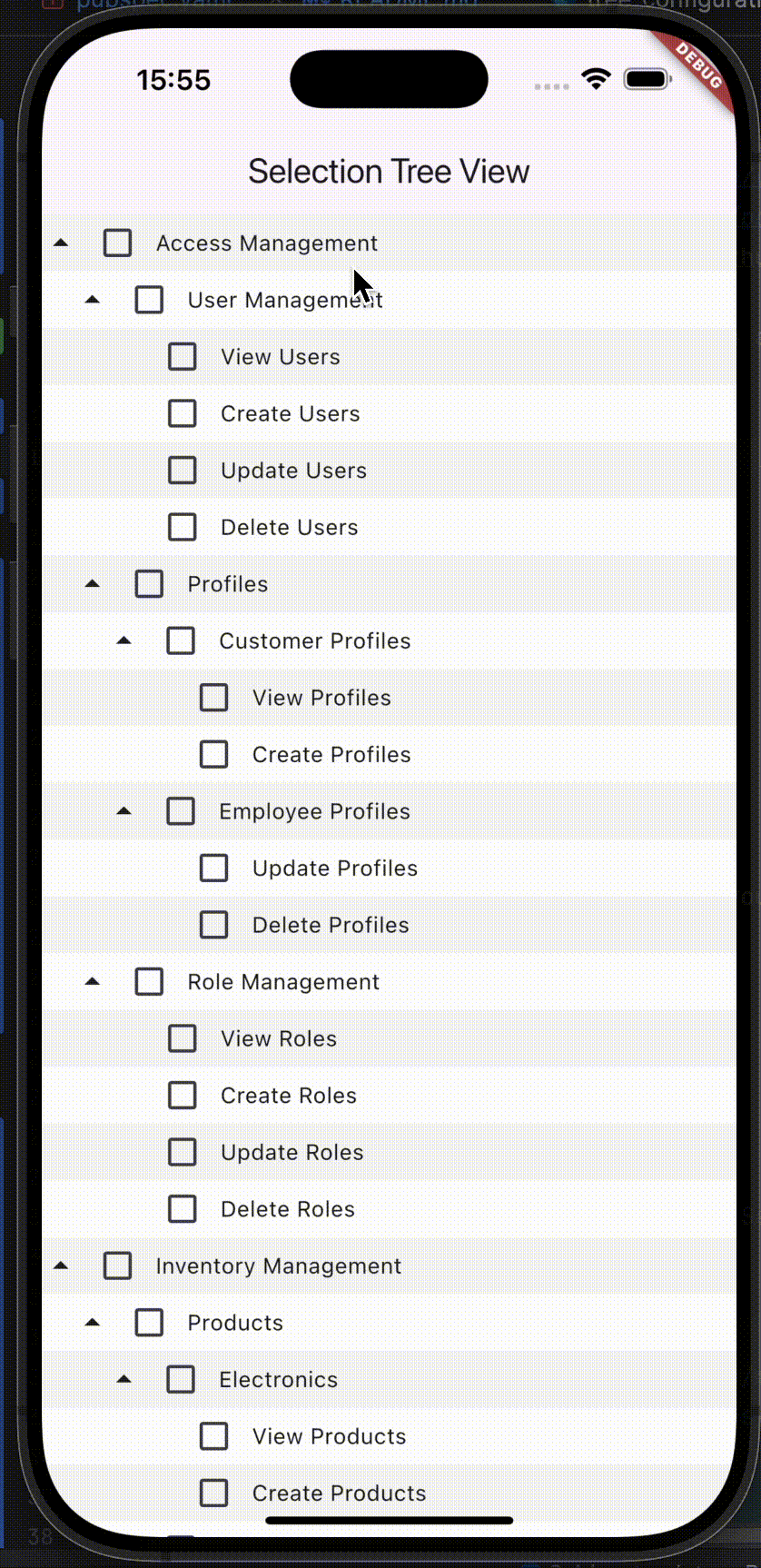

- Hierarchical data display.
- Expandable/collapsible buttons.
- Customizable button appearance.
- Support data format functions.
To use the SelectionTreeView widget in your Flutter project, follow these steps:
flutter pub add selection_tree_view
Here's a basic example of how to use the SelectionTreeView widget:
import 'package:flutter/material.dart';
import 'package:selection_tree_view/models/mock_data_model.dart';
import 'package:selection_tree_view/screens/selection_tree_view.dart';

void main() {
  runApp(const MyApp());
}

class MyApp extends StatelessWidget {
  const MyApp({super.key});

  @override
  Widget build(BuildContext context) {
    return MaterialApp(
      title: 'Selection Tree View',
      home: Scaffold(
        appBar: AppBar(title: Text('Selection Tree View')),
        body: SelectionTreeView(
          rootNodes: MockDataModel.mockTreeData(),
          onSelectNode: (rootNodes, nodeSelected) {},
          treeRowDecoration: (node, index) {
            return BoxDecoration(
              color: index % 2 == 0 ? Colors.grey.shade100 : Colors.white,
            );
          },
          // prefixIconBuilder: (node) {
          //   return node.children.isEmpty
          //       ? SizedBox()
          //       : Icon(Icons.arrow_drop_up);
          // },
          // treeConfiguration: TreeConfiguration(
          //   showCheckbox: true,
          //   animatePrefixIcon: false,
          // ),
          // titleBuilder: (title) {
          //   return Text(
          //     title,
          //     style: TextStyle(
          //       color: Colors.black,
          //       fontWeight: FontWeight.bold,
          //       fontSize: 12,
          //     ),
          //     maxLines: 1,
          //     overflow: TextOverflow.ellipsis,
          //   );
          // },
        ),
      ),
    );
  }
}The relationship tree data format consists of a list of maps where each map represents a node with the following keys:
- parentId: The ID of the parent node.
- value: The display name for the node.
- id: A unique identifier for the node.
static List<Map<String, dynamic>> initialRelationshipTreeData() => [
    {"parentId": 0, "value": "Earth", "id": 1},
    {"parentId": 1, "value": "Continents", "id": 2},
    {"parentId": 2, "value": "Asia", "id": 3},
    {"parentId": 3, "value": "China", "id": 4},
    {"parentId": 4, "value": "Beijing", "id": 5},
    {"parentId": 4, "value": "Shanghai", "id": 6},
    {"parentId": 3, "value": "Japan", "id": 7},
    // Add more nodes as needed
];
To build a relationship tree from the above data, use the following function:
List<TreeNode> relationshipTree = TreeHelper.buildRelationshipTreeData(initialRelationshipTreeData());The path tree data format consists of maps that define permission codes, names, and hierarchical paths. Each map includes the following keys:
- code: A unique code representing a specific permission.
- name: The display name for the permission.
- path: The hierarchical path indicating the category of the permission.
static List<Map<String, dynamic>> initialPathTreeData() => [
    {
    'code': 'VIEW_USERS',
    'name': 'View Users',
    'path': r'Access Management\\User Management',
    },
    {
    'code': 'CREATE_USERS',
    'name': 'Create Users',
    'path': r'Access Management\\User Management',
    },
    {
    'code': 'UPDATE_USERS',
    'name': 'Update Users',
    'path': r'Access Management\\User Management',
    },
    // Add more permissions as needed
];
To convert the path tree data into a tree structure, utilize the following function:
List<TreeNode> pathTree = TreeHelper.buildPathTreeData(initialPathTreeData());The SelectionTreeView widget offers various customization options:
treeConfiguration(TreeConfiguration):titleStyle(TextStyle): Node title style.nodeHeight(double): Row height.prefixIcon(Widget): Default prefix icon.animatedDuration(Duration): Animation speed.showCheckbox(bool): Show checkboxes.animatePrefixIcon(bool): Animate prefix icon.
titleBuilder(Widget Function(String title)): Custom title widget.prefixIconBuilder(Widget Function(TreeNode node)): Custom prefix icon widget.treeRowDecoration(BoxDecoration Function(TreeNode node, int index)): Row decoration.
For more advanced customization, refer to the API documentation.
Contributions are welcome! Please feel free to submit a Pull Request.
This project is licensed under the MIT License - see the LICENSE file for details.