Use Counter widget in Alarm #1243
Conversation
|
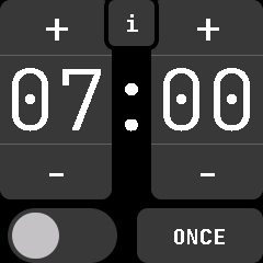
I think that thasparent button is not intuitive. |
|
I don't think it not being perfectly intuitive is an issue, as the feature is not critical. I wouldn't automatically pop it up in the face of the user. |
Saves a few bytes
I afaid it is a doubtful decision from the user experience point of view. How is it supposed user to find out this feature? By a misclick, and than by test clicking to find an exact boundary of the area that causes the info text to pop? You mean that the gray color of the time fields might hint a user that they are clickable? But in the stop-watch app they are gray too, but NOT clickable. It is not intuitive, it is not consistent. There definitely should be some visible difference between clickable and non-clickable elements in the interface, I believe. |
|
I've now brought back the separate info button while we look for another solution if necessary.
|
|
I propose to show the "Time to alarm:" overlay by swiping upwards instead of using a button for it, just as it is in the music app to show the volume controls. Swiping up might be a good default gesture for additional features anyways, as if there is one default people are more likely to "discover" these across different screens, even if there is no visible control element. It also doesn't clutter the screen and helps with the problem of hitting small buttons reliably. |
@mashuptwice Do you mean that it shouldn't be adjustable by default or what do you mean? |
|
@Riksu9000 I am not sure what you mean by adjustable. I mean to use a swipe-up instead of the info button to show the countdown until the alarm. I've edited my comment to clarify that. |
Use the Counter widget in alarm. The Info feature was retained by making it a transparent button that stretches above the time, so you can see the info by tapping the time.