

based on material-dialogs
入坑这个系列不是为了在MIUI系统上使用特定的(MIUI-dialog)弹窗,而是为了保证App弹窗适配App的UI(毕竟非Material Design的App用系统或者material-dialogs的弹窗总是感觉不搭)
- Gradle Dependency
- Basics
- Customizing the Message
- Action Button
- CountDown
- Adding an Icon
- Text Input
- Callbacks
- Dismissing
Add it in your root build.gradle at the end of repositories:
allprojects {
    repositories {
        ...
        maven { url 'https://jitpack.io' }
    }
}
Step 2. Add the dependency

implementation 'com.github.PPeanutButter:miui-dialogs:@jitpack_version'
Here's a very basic example of creating and showing a dialog:

MIUIDialog(this).show {
    title(R.string.your_title)
    message(R.string.your_message)
}
this should be a Context which is attached to a window, like an Activity.
If you wanted to pass in literal strings instead of string resources:
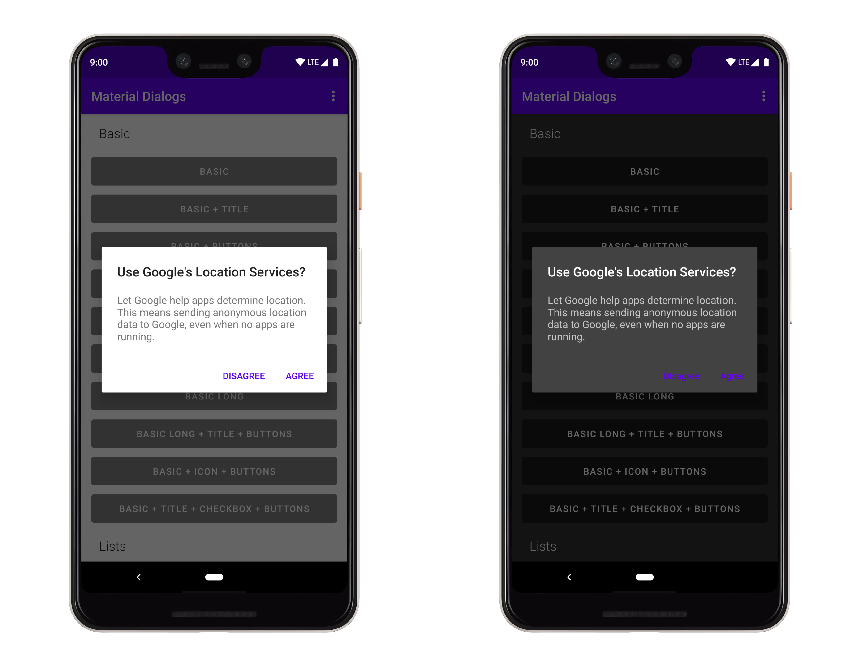
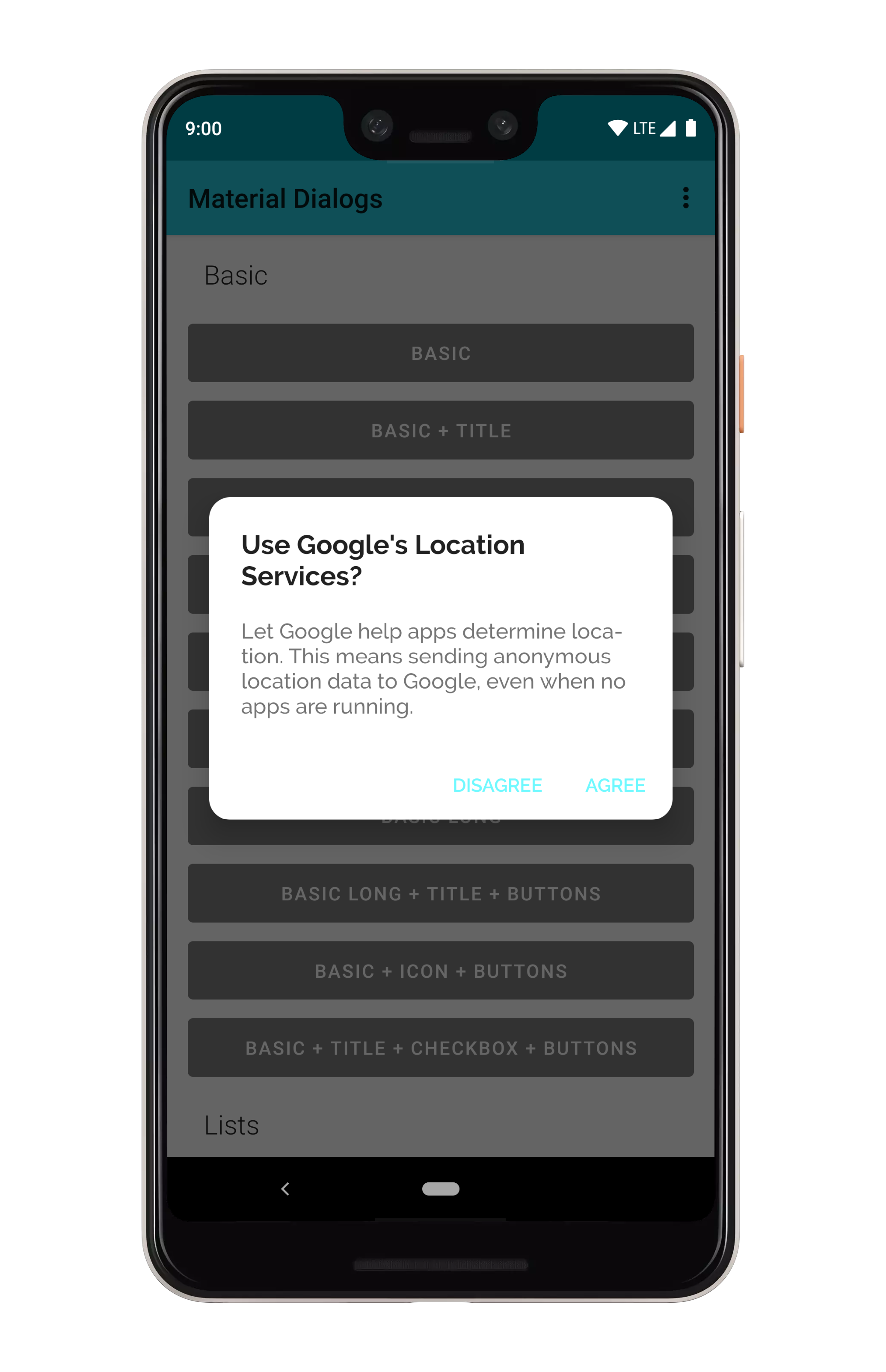
MIUIDialog(this).show {
    title(text = "Use Google\'s Location Services?")
    message(text = "Let Google help apps determine location. This means sending anonymous location data to Google, even when no apps are running.")
}
Note that you can setup a dialog without immediately showing it, as well:
val dialog = MIUIDialog(this)
    .title(R.string.your_title)
    .message(R.string.your_message)
dialog.show()The message function lets you trail it with a lambda, which exposes certain built-in modifiers along with allowing you to act on the TextView directly.

MIUIDialog(this).show {
  message(R.string.your_message) {
      html() // format, color, etc. with tags in string
      html { link ->  // same as above, but...
        // Invokes a callback when a URL is clicked instead of auto opening it in a browser
      }
      lineSpacing(1.4f) // modifies line spacing, default is 1.0f

      // You can directly act on the message TextView as well
      val textView = messageTextView
  }
}There are simple methods for adding action buttons:

MIUIDialog(this).show {
  positiveButton(R.string.agree)
  negativeButton(R.string.disagree)
}
You can use literal strings here as well:
MIUIDialog(this).show {
  positiveButton(text = "Agree")
  negativeButton(text = "Disagree")
}
Listening for clicks on the buttons is as simple as adding a lambda to the end:
MIUIDialog(this).show {
    positiveButton(text = "Agree"){
        //do
    }
    negativeButton(text = "Disagree"){
        //do
    }
}
If action buttons together are too long to fit in the dialog's width, they will be automatically stacked:
not tested yet!
You can disable Positive Button in first few seconds(let user wait):

MIUIDialog(this).show {
    title(text = "Use Google\'s Location Services?")
    message(text = "Let Google help apps determine location. This means sending")
    positiveButton(text = "Agree",countdown = 5){
        "you clicked positive button!".toast(this@MainActivity3)
    }
    negativeButton(text = "Disagree"){
        "you clicked negative button!".toast(this@MainActivity3)
    }
}
You can also set run Negative Callback automatically when wait time-out:

MIUIDialog(this).show {
    title(text = "Use Google\'s Location Services?")
    message(text = "Let Google help apps determine location. This means sending a")
    positiveButton(text = "Agree"){
        "you clicked positive button!".toast(this@MainActivity3)
    }
    negativeButton(text = "Disagree",countdown = 10){
        "you clicked negative button!".toast(this@MainActivity3)
    }
}You can display an icon to the Top of the title:
not support yet!
You can setup an input dialog using the input extension on MIUIDialog:

MIUIDialog(this).show {
  input()
  positiveButton(R.string.submit)
}
With a setup input dialog, you can retrieve the input field:
val dialog: MIUIDialog = MIUIDialog(this).show{}
val inputField: EditText = dialog.inputField
You can append a lambda to receive a callback when the positive action button is pressed with text entered:
MIUIDialog(this).show {
  input { dialog, text ->
      // Text submitted with the action button
  }
  positiveButton(R.string.submit)
}
If you set waitForPositiveButton to false, the callback is invoked every time the text field is
modified:
MIUIDialog(this).show {
  input(waitForPositiveButton = false) { dialog, text ->
      // Text changed
  }
  positiveButton(R.string.done)
}
To allow the positive action button to be pressed even when the input is empty:
MIUIDialog(this).show {
  input(allowEmpty = true) { dialog, text ->
      // Text submitted with the action button, might be an empty string`
  }
  positiveButton(R.string.done)
}You can set a hint to the input field, which is the gray faded text shown when the field is empty:
MIUIDialog(this).show {
  input(hintRes = R.string.hint_text)
}
A literal string can be used as well:
MIUIDialog(this).show {
  input(hint = "Your Hint Text")
}
You can also prefill the input field:
MIUIDialog(this).show {
  input(prefillRes = R.string.prefill_text)
}
A literal string can be used as well:
MIUIDialog(this).show {
  input(prefill = "Prefilled text")
}You can apply input types to the input field, which modifies the keyboard type when the field is
focused on. This is just taken right from the Android framework, the input type gets applied
directly to the underlying EditText:
val type = InputType.TYPE_CLASS_TEXT or
  InputType.TYPE_TEXT_VARIATION_EMAIL_ADDRESS

MIUIDialog(this).show {
  input(inputType = type)
}By default, input lines is 1, you can set multiLines = true to activate multilines input when input content maght be large
MIUIDialog(this).show {
    title(text = "Use Google\'s Location Services?")
    input(hint = "Type something", multiLines = true){ charSequence, _ ->
        charSequence?.toString()?.toast(this@MainActivity3)
    }
    positiveButton(text = "Agree")
    negativeButton(text = "Disagree"){
        "You clicked negative button!".toast(this@MainActivity3)
    }
}You can do custom validation using the input listener. This example enforces that the input starts with the letter 'a':

MIUIDialog(this).show {
  input(waitForPositiveButton = false) { dialog, text ->
    val inputField = dialog.getInputField()
    val isValid = text.startsWith("a", true)
    inputField?.error = if (isValid) null else "Must start with an 'a'!"
    dialog.setActionButtonEnabled(POSITIVE, isValid)
  }
  positiveButton(R.string.submit)
}There are a few lifecycle callbacks you can hook into:
MIUIDialog(this).show {
  onPreShow { dialog -> }
  onShow { dialog -> }
  onDismiss { dialog -> }
  onCancel { dialog -> }
}
Dismissing a dialog closes it:
MIUIDialog(this).show {
    dismiss()
}
You can prevent a dialog from being canceled, meaning it has to be explictly dismissed with an action button or a call to the method above.
MIUIDialog(this).show {
  cancelable = false  // calls setCancelable on the underlying dialog
  cancelOnTouchOutside = false  // calls setCanceledOnTouchOutside on the underlying dialog
}not support yet!
not support yet!
not support yet!
not support yet!
Google's newer mindset with Material Theming (vs the 2014 mindset) is flexible. If you take their "Crane example", you see that they change fonts, corner rounding, etc.
Light and dark theming is automatic based on your app's theme (basically whether android:textColorPrimary
is more light or more dark):
Material Dialogs uses the value of the colorBackgroundFloating attribute in your Activity theme
for the background color of dialogs. You can also use the md_background_color attribute in your
theme, which will take precedence.
Material Dialogs uses the value of the ?android:colorControlHighlight attribute in your Activity
theme for the ripple color of list items, buttons, etc. by default. You can override this with the
md_ripple_color theme attribute as well.
Corner radius is the rounding of dialog corners:
it can be changed with an attribute in your app theme. It defaults to 4dp:
<style name="AppTheme.Custom" parent="Theme.AppCompat">

  <item name="md_corner_radius">16dp</item>

</style>
There is also a programmatic setter for this value:
MaterialDialog(this).show {
  // literal, internally converts to dp so 16dp
  cornerRadius(16f)
  // Using a dimen instead is encouraged as it's easier to have all instances changeable from one place
  cornerRadius(res = R.dimen.my_corner_radius)// (not support yet)
}By default, android:textColorPrimary and android:textColorSecondary attributes from your Activity
theme are used for the title and content colors of dialogs. colorPrimary is used for the default
text color of action buttons. If you wish to override these, there are attributes provided:
<style name="AppTheme.Custom" parent="Theme.AppCompat">

  <item name="md_color_title">@color/your_color</item>
  <item name="md_color_content">@color/your_color</item>
  <item name="md_color_button_text">@color/your/color</item>

</style>This library supports using custom fonts, powered by the Support libraries ResourcesCompat class.
With raw font files or XML font files in your /res/font folder, you can use them in Material Dialogs
using attributes in your app's theme.
<style name="AppTheme.Custom" parent="Theme.AppCompat">

  <item name="md_font_title">@font/your_font</item>
  <item name="md_font_body">@font/your_font</item>
  <item name="md_font_button">@font/your_font</item>

</style>
See the "Custom Theme" example in the sample project (open the overflow menu for the theme switcher).