PasswordBox zh CN
适用于: v1.1.12 或更新的版本
辅助类名: PasswordBoxHelper
命名空间: Panuon.WPF.UI
位于: SharedResources/Panuon.WPF.UI/Helpers/PasswordBoxHelper.cs
全局资源字典: pack://application:,,,/Panuon.WPF.UI;component/Styles/PasswordBox.xaml
独立资源字典: pack://application:,,,/Panuon.WPF.UI;component/Styles/PasswordBoxStyle.xaml
独立资源样式键: pu:StyleKeys.PasswordBoxStyle
静态类
提供一系列属性和方法, 用于自定义 PasswordBox 控件的样式。
此类型仅可以在 PasswordBox 控件上使用。
当 IsEnabled 属性的值设为 False 时, Opacity 的属性值将与 GlobalSettings.Setting.DisabledOpacity 属性的值绑定(它的默认值为 0.4 )。有关全局设置的更多内容, 请查看GlobalSettings 辅助类。
WatermarkForeground 的默认值会设置成比 Foreground 属性更浅的颜色(如果后者为 System.Media.SolidColorBrush 类型)。
Padding 属性的默认值为 5,0,5,0 , IconHelper.Margin 属性的默认值为 10,0,0,0 。
若要更改通过 Icon 属性定义的图标的其他属性, 请查看IconHelper 辅助类。
若要更改通过 ShadowColor 附加属性定义的阴影效果的详细属性, 请查看ShadowHelper 辅助类。
HoverForeground 附加属性仅支持纯色画刷(即 System.Media.SolidColorBrush )。如果设置为渐变画刷,将引发WPF内部错误。
类型: System.Object
默认值: {Null}
获取或设置密码输入框的图标。若要更改图标的间距、字体等属性,请查看IconHelper 辅助类。
类型: System.Object
默认值: {Null}
获取或设置密码输入框的水印内容。
类型: System.Media.Brush
默认值: ``(相较于Foreground属性较浅的颜色)`
获取或设置密码输入框水印文本的前景色彩画刷。
类型: System.Windows.CornerRadius
默认值: 0,0,0,0
获取或设置密码输入框的圆角大小。
类型: System.Media.Color ?
默认值: {Null}
获取或设置密码输入框的阴影颜色。此属性可以通过设置为 Null (在Xaml中为 {x:Null})来取消效果。若要更改阴影的模糊半径、深度等属性,请查看 ShadowHelper 辅助类。
类型: System.Media.Brush
默认值: (相较于Background属性较深的颜色)
获取或设置密码输入框悬浮时的背景色彩画刷。此属性可以通过设置为 Null (在Xaml中为 {x:Null})来取消效果。
类型: System.Media.Brush
默认值: {Null}
获取或设置密码输入框悬浮时的前景色彩画刷。此属性可以通过设置为 Null (在Xaml中为 {x:Null})来取消效果。
此属性仅支持支持纯色画刷(即SolidColorBrush)。如果设置为渐变画刷,将引发WPF内部错误。
类型: System.Media.Brush
默认值: {Null}
获取或设置密码输入框悬浮时的边框色彩画刷。此属性可以通过设置为 Null (在Xaml中为 {x:Null})来取消效果。
类型: System.Media.Color ?
默认值: {Null}
获取或设置密码输入框悬浮时的阴影颜色。此属性可以通过设置为 Null (在Xaml中为 {x:Null})来取消效果。若要更改阴影的模糊半径、深度等属性,请查看 ShadowHelper 辅助类。
类型: System.Media.Brush
默认值: (相较于Background属性更深的颜色)
获取或设置密码输入框获得键盘焦点时的背景色彩画刷。此属性可以通过设置为 Null (在Xaml中为 {x:Null})来取消效果。
类型: System.Media.Brush
默认值: {Null}
获取或设置密码输入框获得键盘焦点时的前景色彩画刷。此属性可以通过设置为 Null (在Xaml中为 {x:Null})来取消效果。
类型: System.Media.Brush
默认值: {Null}
获取或设置密码输入框获得键盘焦点时的边框色彩画刷。此属性可以通过设置为 Null (在Xaml中为 {x:Null})来取消效果。
类型: System.Windows.Thickness ?
默认值: {Null}
获取或设置密码输入框获得键盘焦点时的边框粗细。此属性可以通过设置为 Null (在Xaml中为 {x:Null})来取消效果。
类型: System.Media.Brush
默认值: {Null}
获取或设置密码输入框获得键盘焦点时水印文本的前景色彩画刷。此属性可以通过设置为 Null (在Xaml中为 {x:Null})来取消效果。
类型: System.Media.Color ?
默认值: {Null}
获取或设置密码输入框获得键盘焦点时的阴影颜色。此属性可以通过设置为 Null (在Xaml中为 {x:Null})来取消效果。若要更改阴影的模糊半径、深度等属性,请查ShadowHelper 辅助类。
类型: Panuon.WPF.UI.AuxiliaryButtonVisibility
默认值: [Collapsed] / Visible / VisibleOnNonnull / VisibleOnHover / VisibleOnHoverAndNonnull / VisibleOnFocused / VisibleOnFocusedAndNonnull_
获取或设置是否在密码输入框的尾部显示清空按钮。Collapsed 表示始终不显示,Visible 表示始终显示,VisibleOnNonnull 表示当密码输入框的文本不为空时显示,VisibleOnHover 表示当鼠标悬浮在密码输入框上时显示,VisibleOnHoverAndNonnull 表示当鼠标悬浮在密码输入框上且文本不为空时显示,VisibleOnFocused 表示当密码输入框获得键盘焦点时显示,VisibleOnFocusedAndNonnull 表示当密码输入框获得键盘焦点且文本不为空时显示。
类型: System.Windows.Style
默认值: {Null}
获取或设置用于清空密码输入框文本的 Button 按钮 控件的样式。有关此属性的使用方式,请查看示例2。
有关如何使用资源键的更多内容, 请查看命名与约定-资源键。
一些无法从外部访问的属性已被隐去。
资源键全称: {ComponentResourceKey ResourceId=ClearButtonStyle, TypeInTargetAssembly={x:Type pu:PasswordBoxHelper}}
缩略资源键: {pu:PasswordBoxHelper.ClearButtonStyle}
清空按钮的 Button 按钮 控件样式。
<Style x:Key="{ComponentResourceKey ResourceId=ClearButtonStyleKey, TypeInTargetAssembly={x:Type local:PasswordBoxHelper}}"
TargetType="Button"
BasedOn="{StaticResource {x:Static rs:StyleKeys.ButtonStyleKey}}">
<Setter Property="Margin"
Value="0,0,5,0" />
<Setter Property="Background"
Value="Transparent" />
<Setter Property="local:ButtonHelper.HoverBackground"
Value="{x:Null}" />
<Setter Property="local:ButtonHelper.ClickBackground"
Value="{x:Null}" />
<Setter Property="FontFamily"
Value="/Panuon.WPF.UI;component/Resources/Fonts/#PanuonIcon" />
<Setter Property="FontSize"
Value="{Binding FontSize, RelativeSource={RelativeSource TemplatedParent}, Mode=OneWay}" />
<Setter Property="Content"
Value="" />
<Setter Property="Foreground"
Value="{Binding Foreground, RelativeSource={RelativeSource AncestorType=PasswordBox}, Mode=OneWay}" />
</Style>
xmlns:pu="https://opensource.panuon.com/wpf-ui"
···
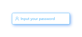
<PasswordBox Height="40"
Width="200"
pu:IconHelper.FontFamily="{StaticResource PanuonIconFont}"
pu:PasswordBoxHelper.Icon=""
pu:PasswordBoxHelper.Watermark="Input your password"
pu:PasswordBoxHelper.CornerRadius="4"
pu:PasswordBoxHelper.FocusedForeground="#36AAF7"
pu:PasswordBoxHelper.FocusedBorderBrush="#36AAF7"
pu:PasswordBoxHelper.FocusedShadowColor="#36AAF7"
pu:ShadowHelper.Opacity="0.5"
pu:ShadowHelper.BlurRadius="15"
pu:ShadowHelper.ShadowDepth="5">
</PasswordBox>
xmlns:pu="https://opensource.panuon.com/wpf-ui"
xmlns:purs="clr-namespace:Panuon.WPF.UI.Resources;assembly=Panuon.WPF.UI"
···
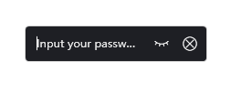
<PasswordBox Height="40"
Width="200"
Padding="10,0"
Background="#1E1F24"
Foreground="#FFFFFF"
BorderBrush="LightGray"
pu:IconHelper.FontFamily="{StaticResource PanuonIconFont}"
pu:PasswordBoxHelper.Watermark="Input your password"
pu:PasswordBoxHelper.CornerRadius="4"
pu:PasswordBoxHelper.ClearButtonVisibility="VisibleOnFocused"
pu:PasswordBoxHelper.PlainButtonVisibility="VisibleOnFocused">
<pu:PasswordBoxHelper.ClearButtonStyle>
<Style TargetType="Button"
BasedOn="{StaticResource {x:Static pu:PasswordBoxHelper.ClearButtonStyleKey}}">
<Setter Property="Content"
Value="" />
<Setter Property="FontSize"
Value="16" />
</Style>
</pu:PasswordBoxHelper.ClearButtonStyle>
<pu:PasswordBoxHelper.PlainButtonStyle>
<Style TargetType="Button"
BasedOn="{StaticResource {x:Static pu:PasswordBoxHelper.PlainButtonStyleKey}}">
<Setter Property="FontSize"
Value="16" />
</Style>
</pu:PasswordBoxHelper.PlainButtonStyle>
</PasswordBox>