2 Clock view : Analogical
To set the analogical mode for the Clock object you can use either XML or Java implementation.
<com.arbelkilani.clock.Clock
   android:id="@+id/clock"
   android:layout_width="match_parent"
   android:layout_height="match_parent"
   app:clock_type="analogical" />
Clock clock = findViewById(R.id.clock);
clock.setClockType(ClockType.analogical);By choosing to set the analogical type, the Clock class offer, developers over 15 attributes in order to help them to customize their own style or features for the Clock object created.
All the attributes could be set either using XML attributes in the Clock tag or using Java code as shown in the next example :
<com.arbelkilani.clock.Clock
   android:id="@+id/clock"
   android:layout_width="match_parent"
   android:layout_height="match_parent"
   app:show_center="true"
   app:center_inner_color="@color/orange"/>
Clock clock = findViewById(R.id.clock);
clock.setClockBackground(R.drawable.background_1);
clock.setShowCenter(true);
clock.setShowHoursValues(true);
// or using AnalogicalThemeBuilder class
AnalogicalTheme analogicalTheme = new AnalogicalTheme.AnalogicalThemeBuilder()
.setShowBorder(true)
.setBorderColor(R.color.blue)
.setShowProgress(true)
.build();
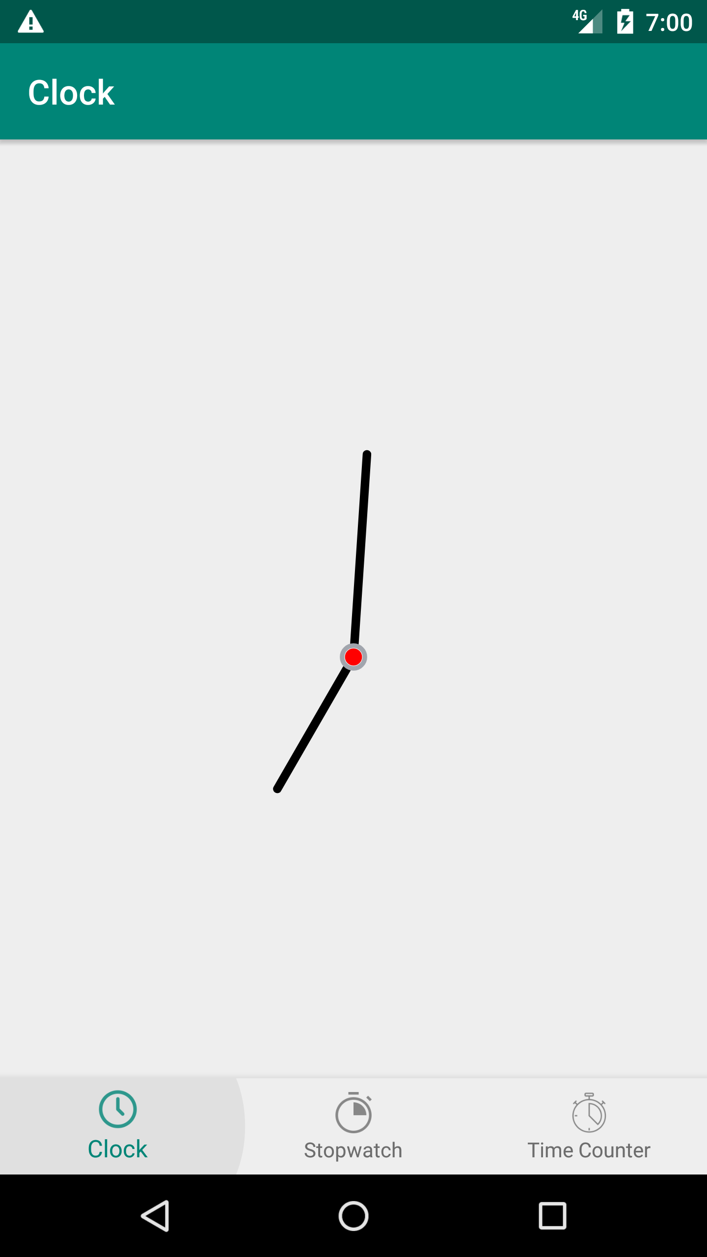
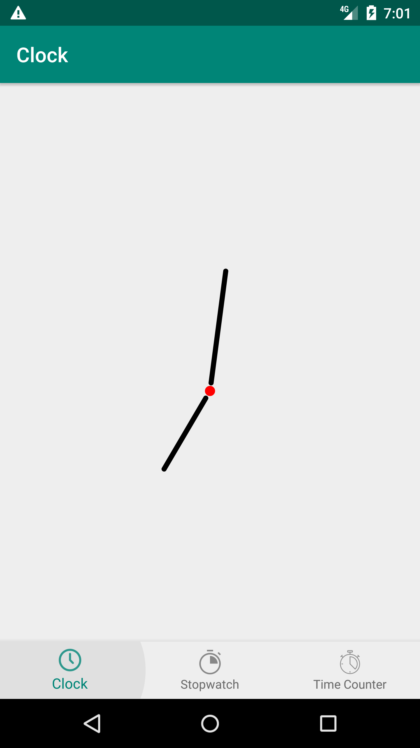
clock.setTheme(analogicalTheme);A little circle that is located inside the hole circular view for the clock and link between different needles.
- show_center : either show or hide center between needles, default value false.
- center_inner_color : color of the center, default value Color.BLACK
- center_outer_color : color of a border around the center, default value Color.LTGRAY
| Example 1 | Example 2 | Example 3 |
|---|---|---|
 |
 |
 |
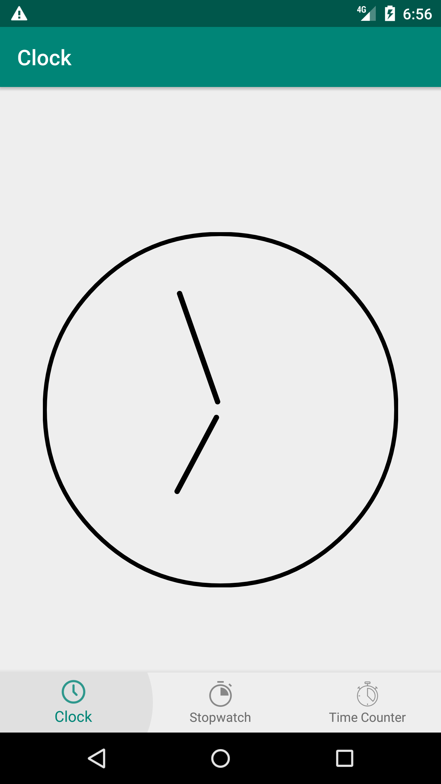
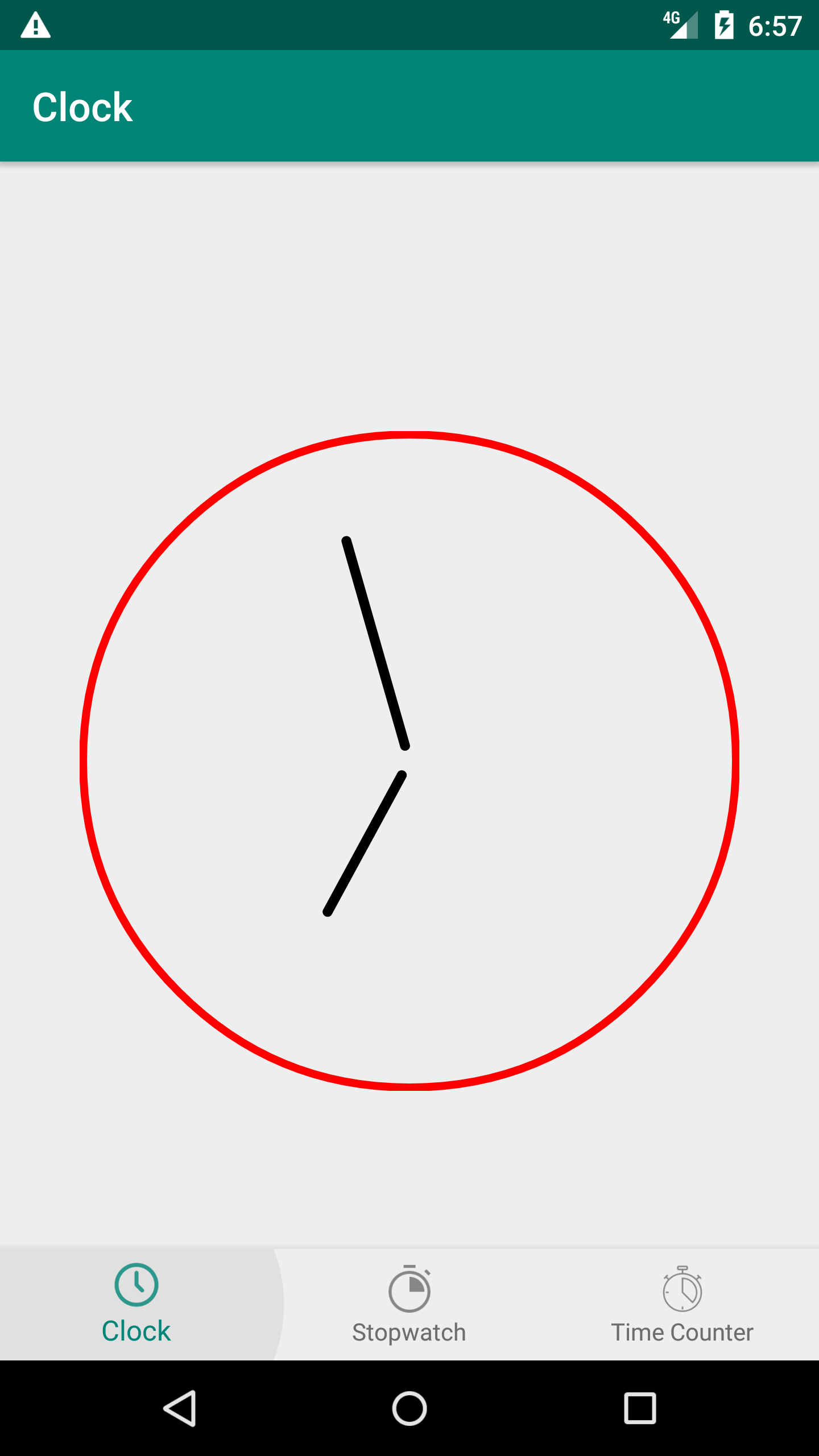
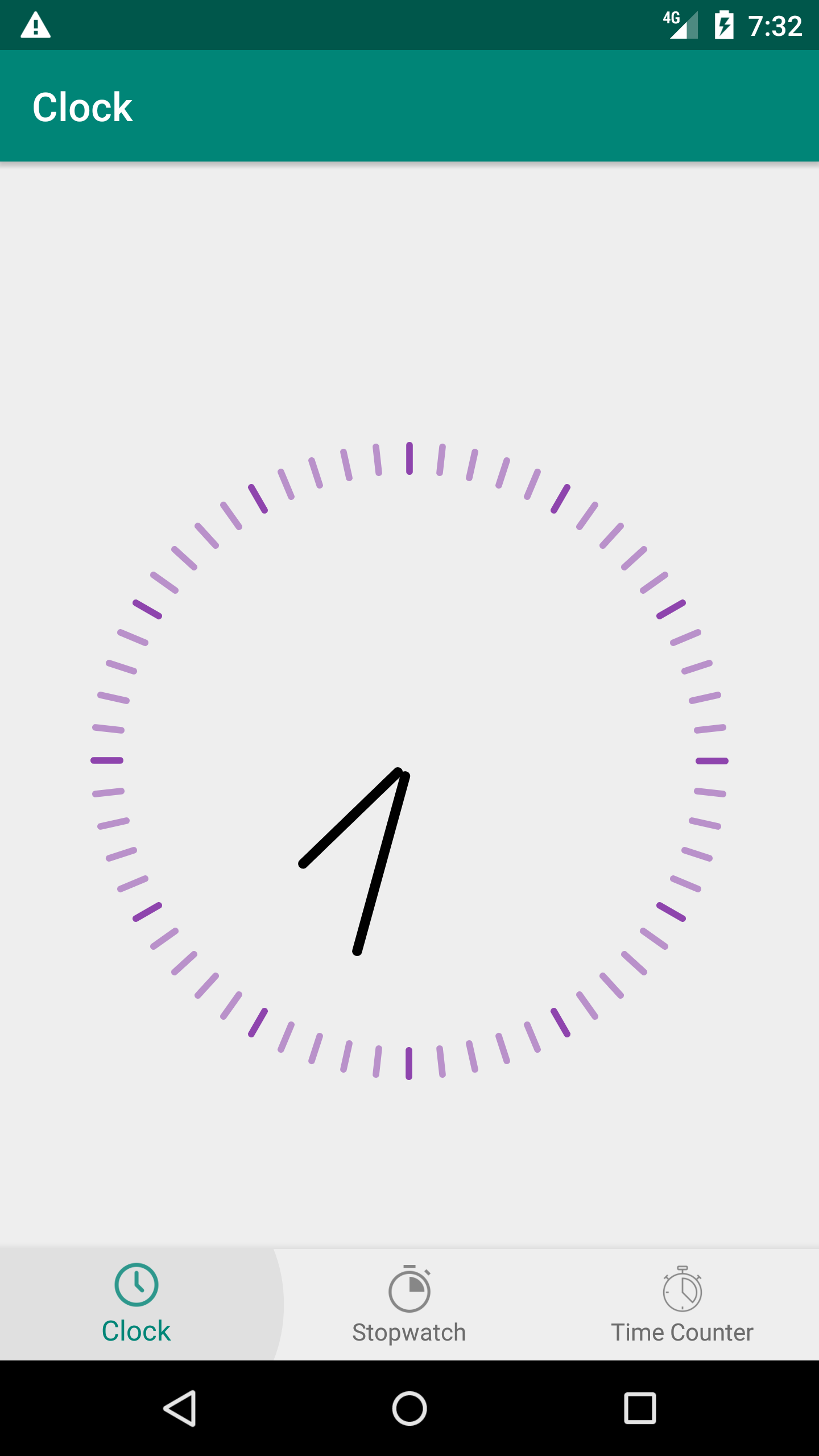
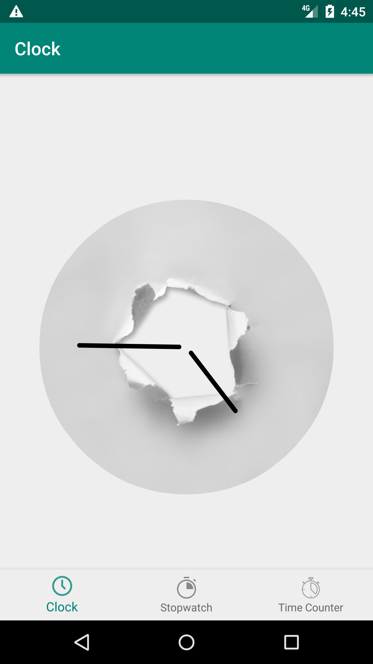
Analogical Clock is a circular shape, so it could have or not a border.
- show_border : either show or hide circular border, default value false.
- border_color : define a color for the border, default value Color.BLACK
| Example 1 | Example 2 | Example 3 |
|---|---|---|
 |
 |
 |
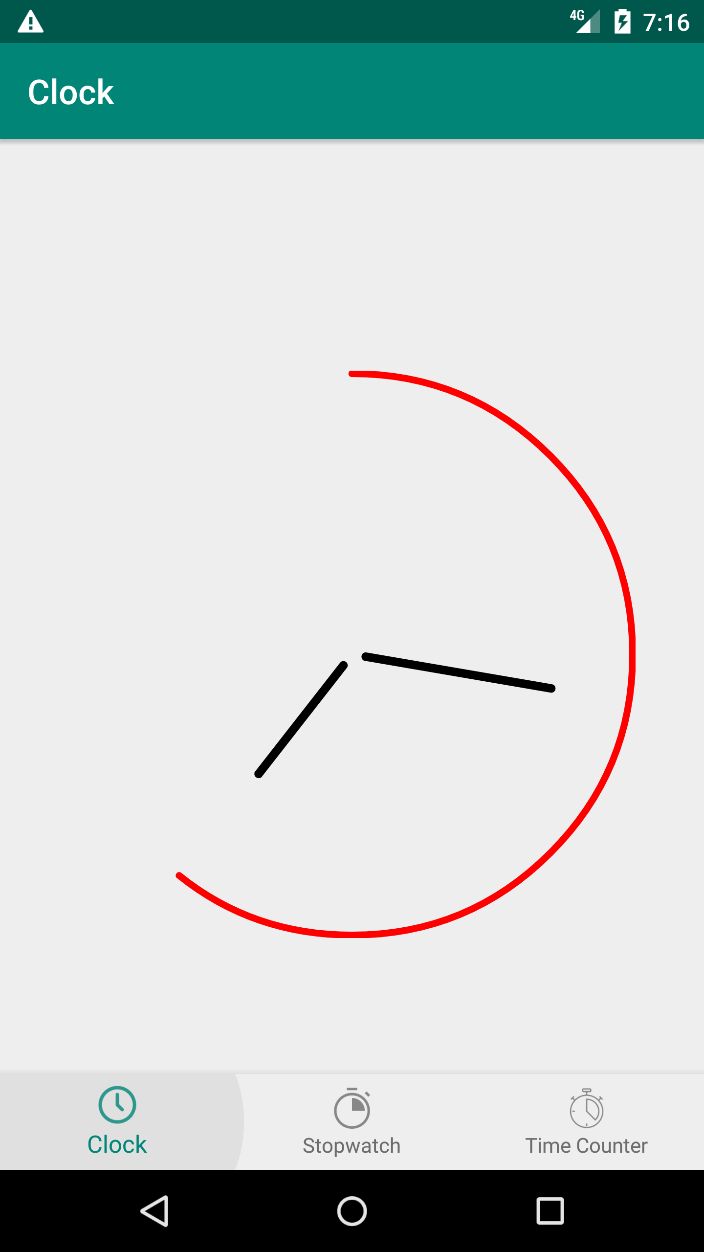
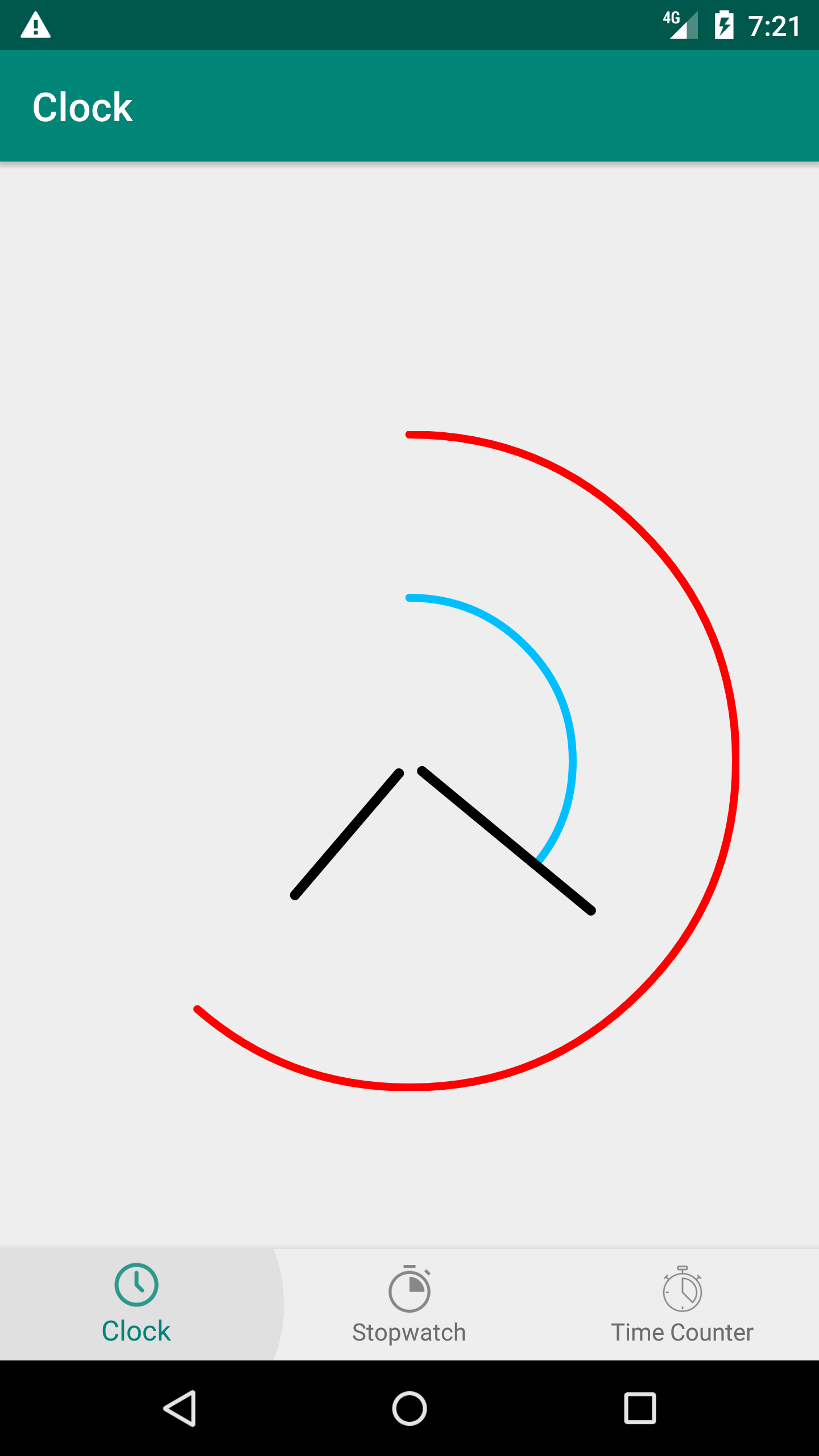
In order to create a custom UI, we use the progress that presents hours, minutes or even seconds values in related circular progress. Developers are free to choose which progress to show or hide, define their colors and their thickness factor
- show_progress : enable showing hours circular progress, default value false
- progress_color : set color for the circular progress that show hours value., default value Color.LTGRAY
- show_minutes_progress : enable showing minutes circular progress, default value false
- minutes_progress_color : set color for the circular progress that show minutes value, default value Color.BLACK
- minutes_progress_factor : set factor for the miutes progress position, should be between 0.2f and 0.5f, default value 0.4f
- show_seconds_progress : enable showing seconds circular progress, default value false
- seconds_progress_color : set color for the circular progress that show seconds value, default value Color.BLACK
- seconds_progress_factor : set factor for the seconds progress position, should be between 0.2f and 0.9f, default value 0.7f
| Example 1 | Example 2 | Example 3 |
|---|---|---|
 |
 |
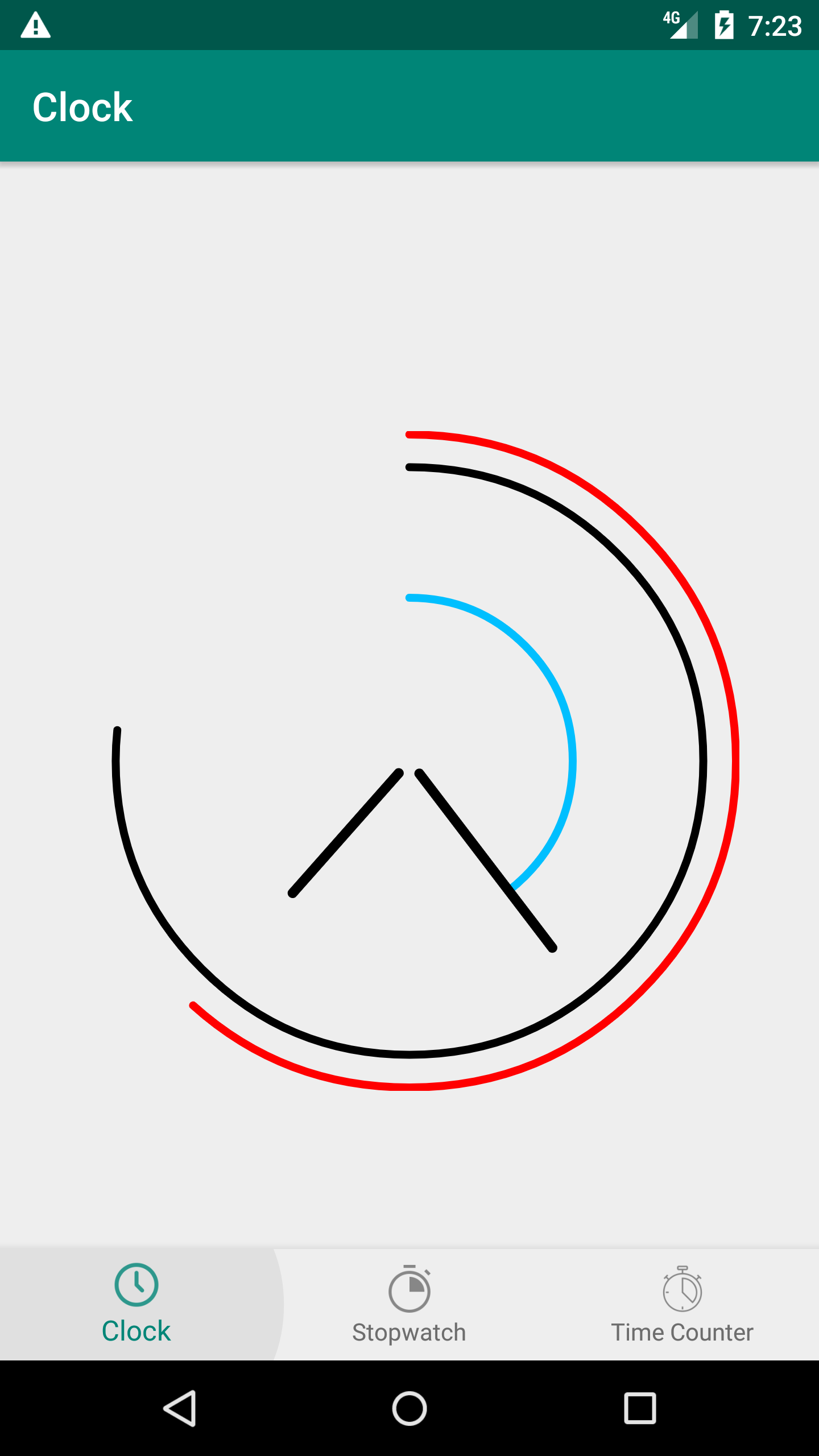 |
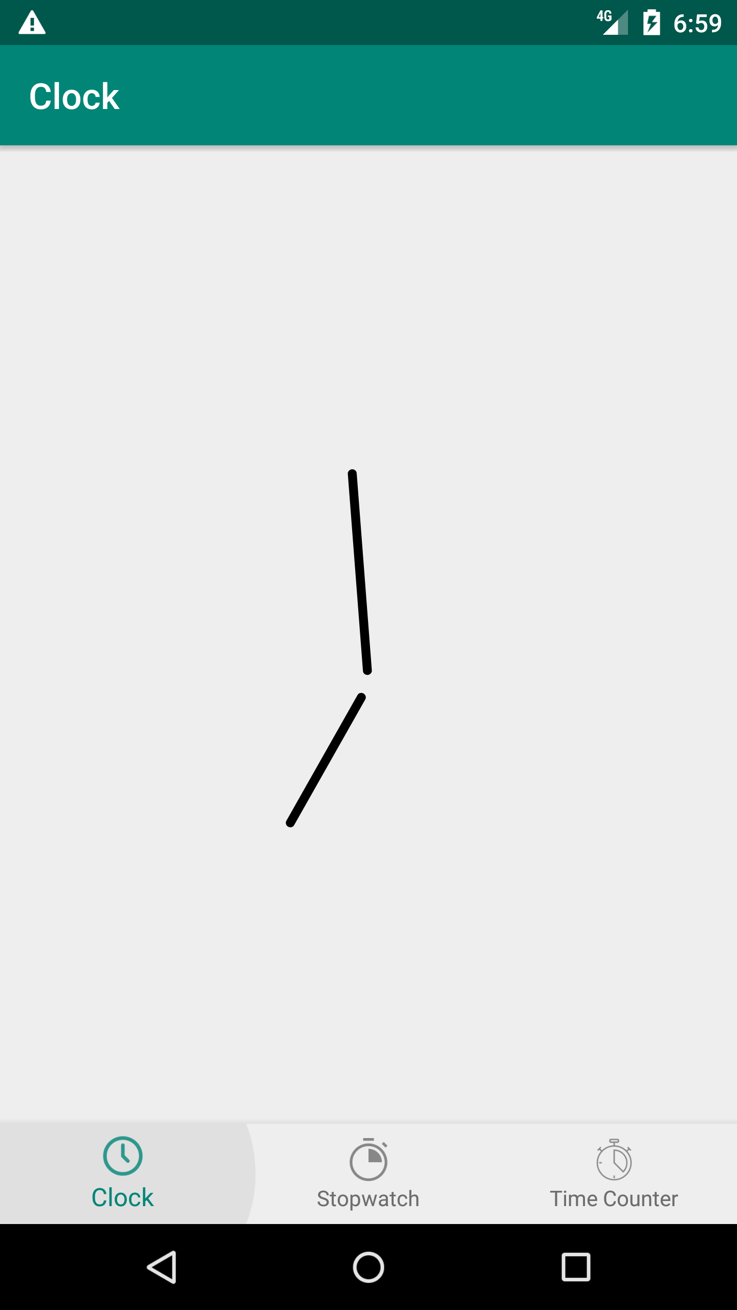
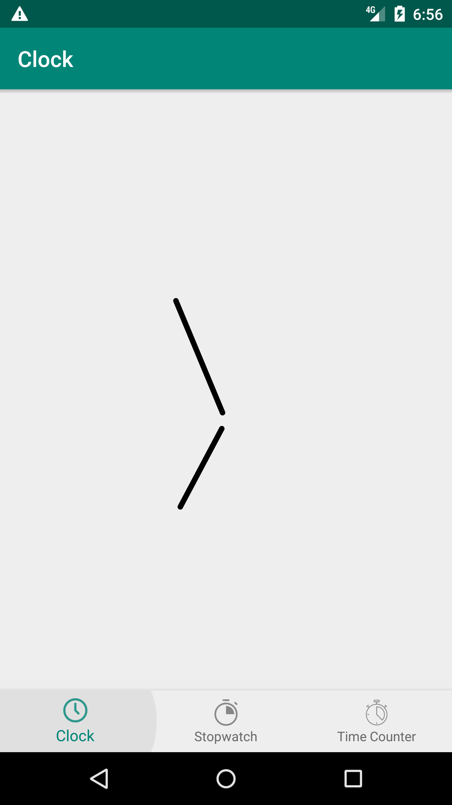
Analogical Clock has basically 2 needles, one for the hours and a second for the minutes values. Developers can choose to add or not a needle for the second's value and change all needles color.
- show_seconds_needle : enable showing needle for the seconds value, default value false.
- seconds_needle_color : set color for the seconds needle once showSecondsNeedle is set to true, default value Color.BLACK
- hours_needle_color : set color for the hours needle, default value Color.BLACK
- minutes_needle_color : set color for the minutes needle, default value Color.BLACK
| Example 1 | Example 2 | Example 3 |
|---|---|---|
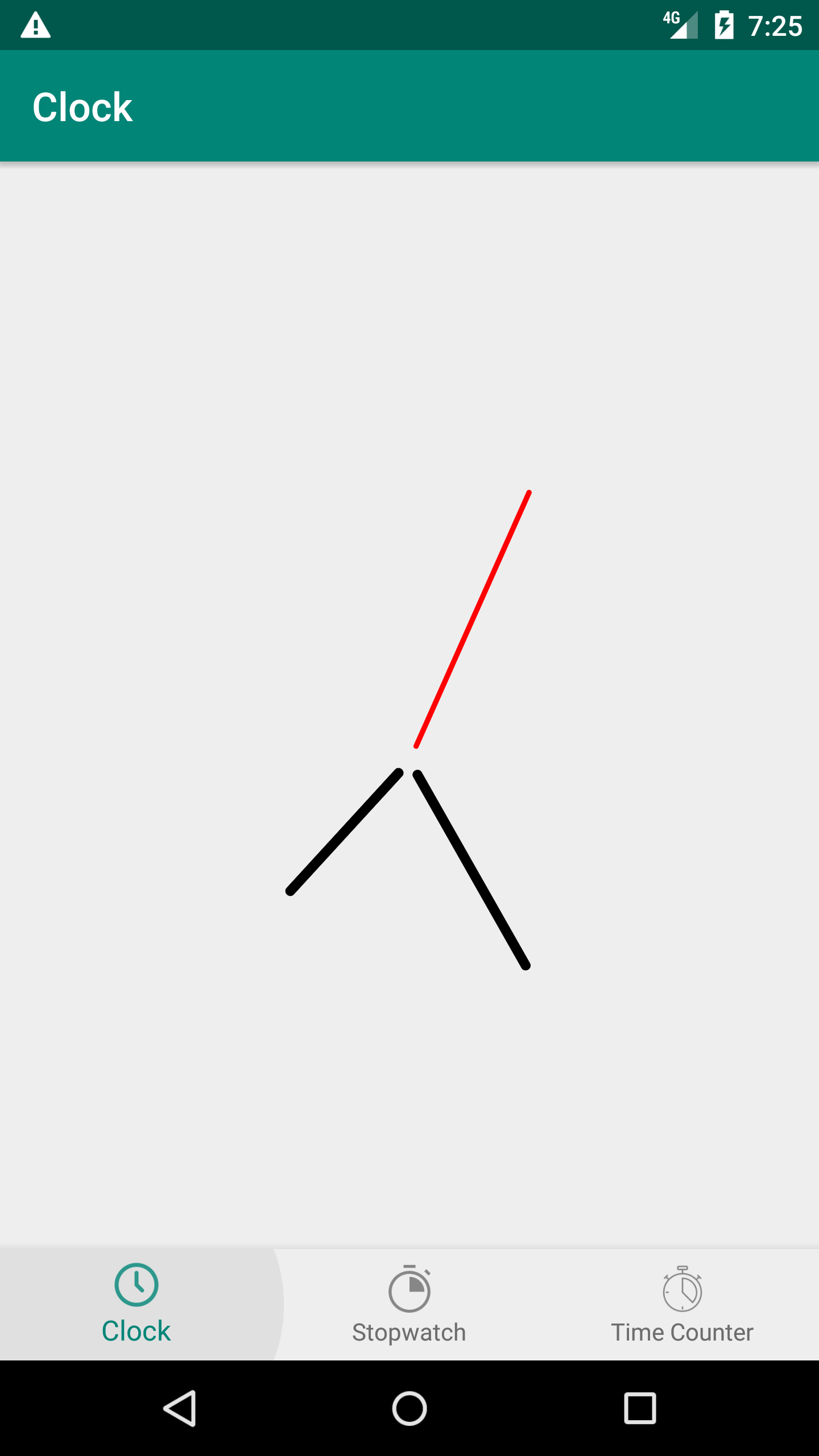 |
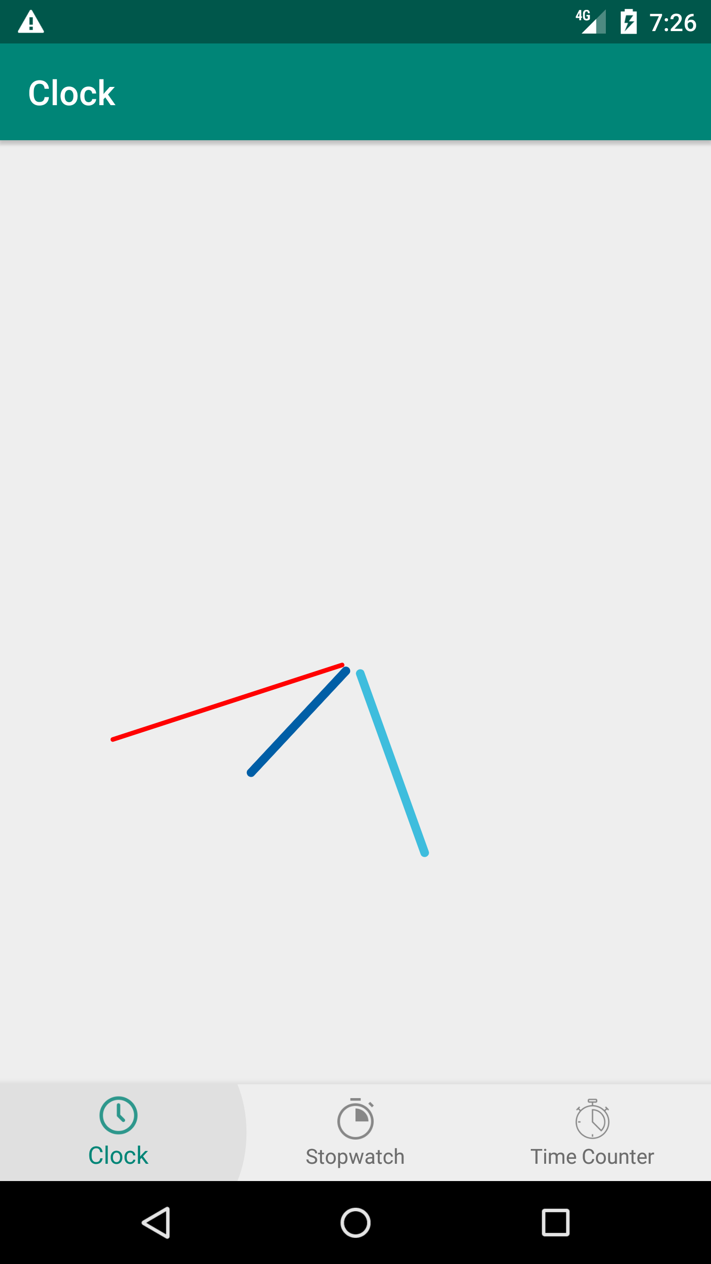 |
 |
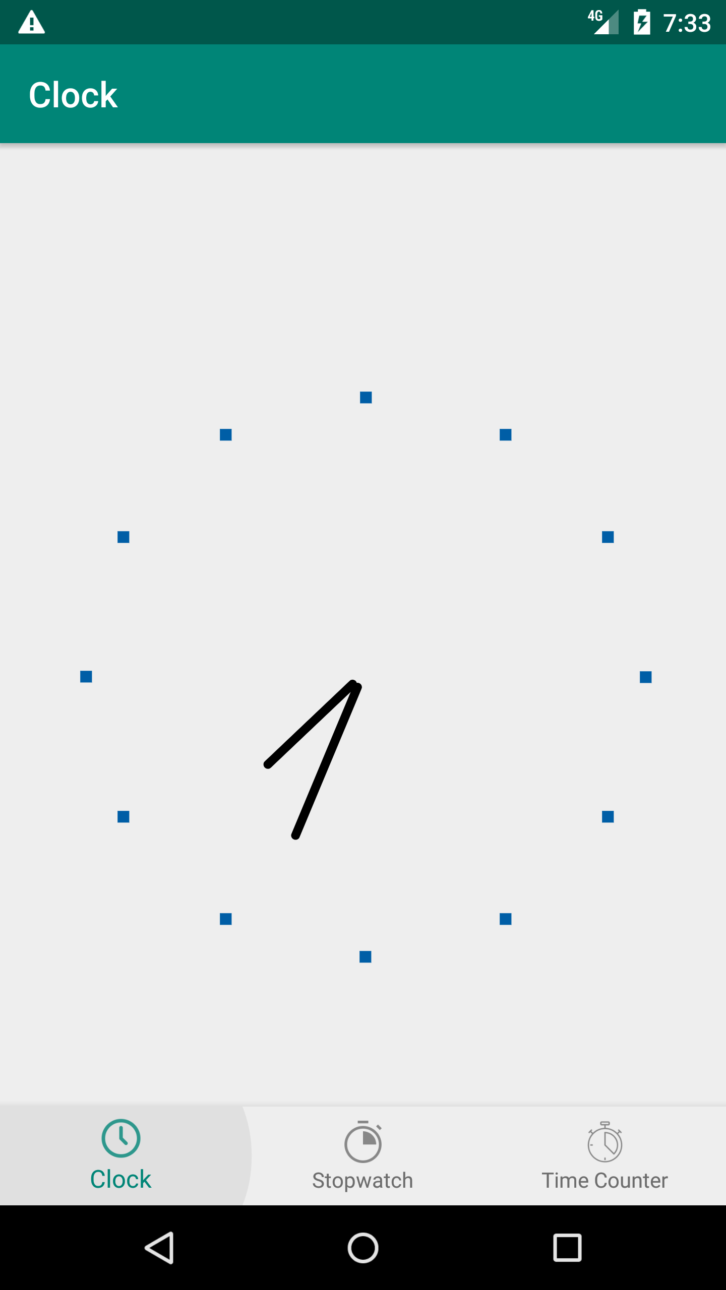
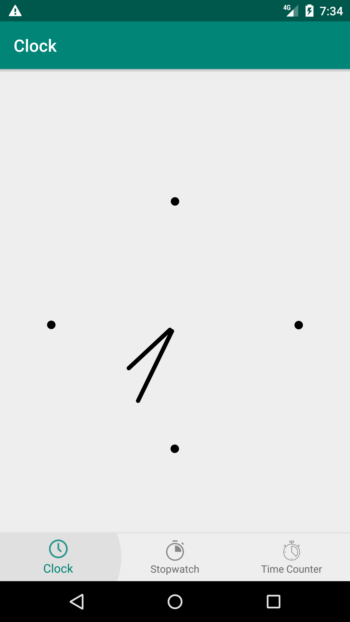
Degrees are also a UI feature that helps developers to image their own design for the Analogical Clock. Developers can also choose either to show or hide the degrees and more important two more enumerations could be used to define degree type and disposition steps.
public enum DegreeType {
    line(0), circle(1), square(2);
}
public enum DegreesStep {
quarter(90), full(6), twelve(30);
}which means the listed attributes :
- show_degree : enable showing or hiding degrees, default value false.
- degree_color : set degrees color., default value Color.BLACK
- degree_type : degrees could be on line, circle or square shapes, default value ClockDegreeType.line
- degree_step : degrees could be set in 3 types : quarter, full or twelve., ClockDegreeStep.full
| Example 1 | Example 2 | Example 3 |
|---|---|---|
 |
 |
 |
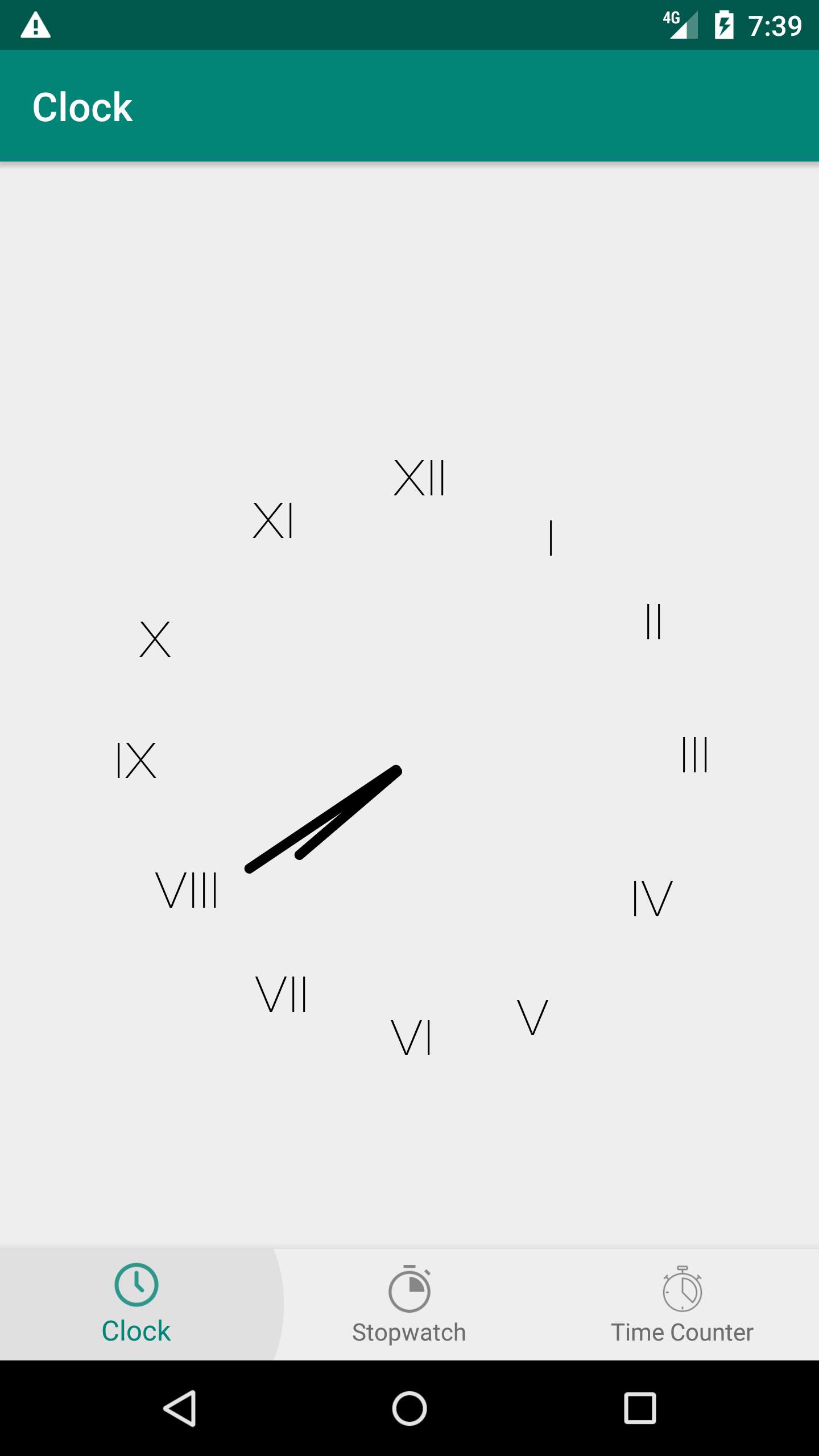
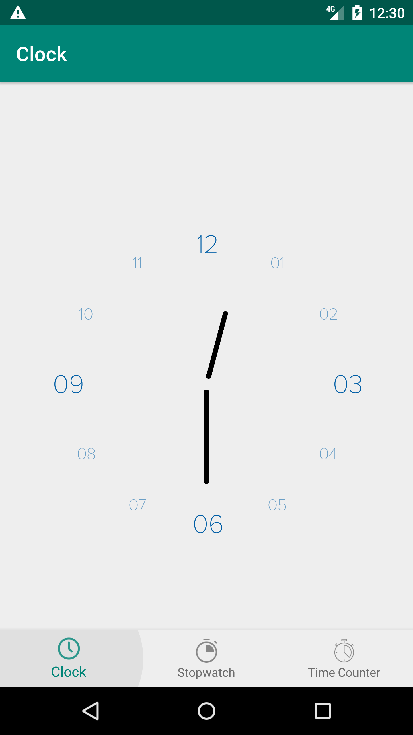
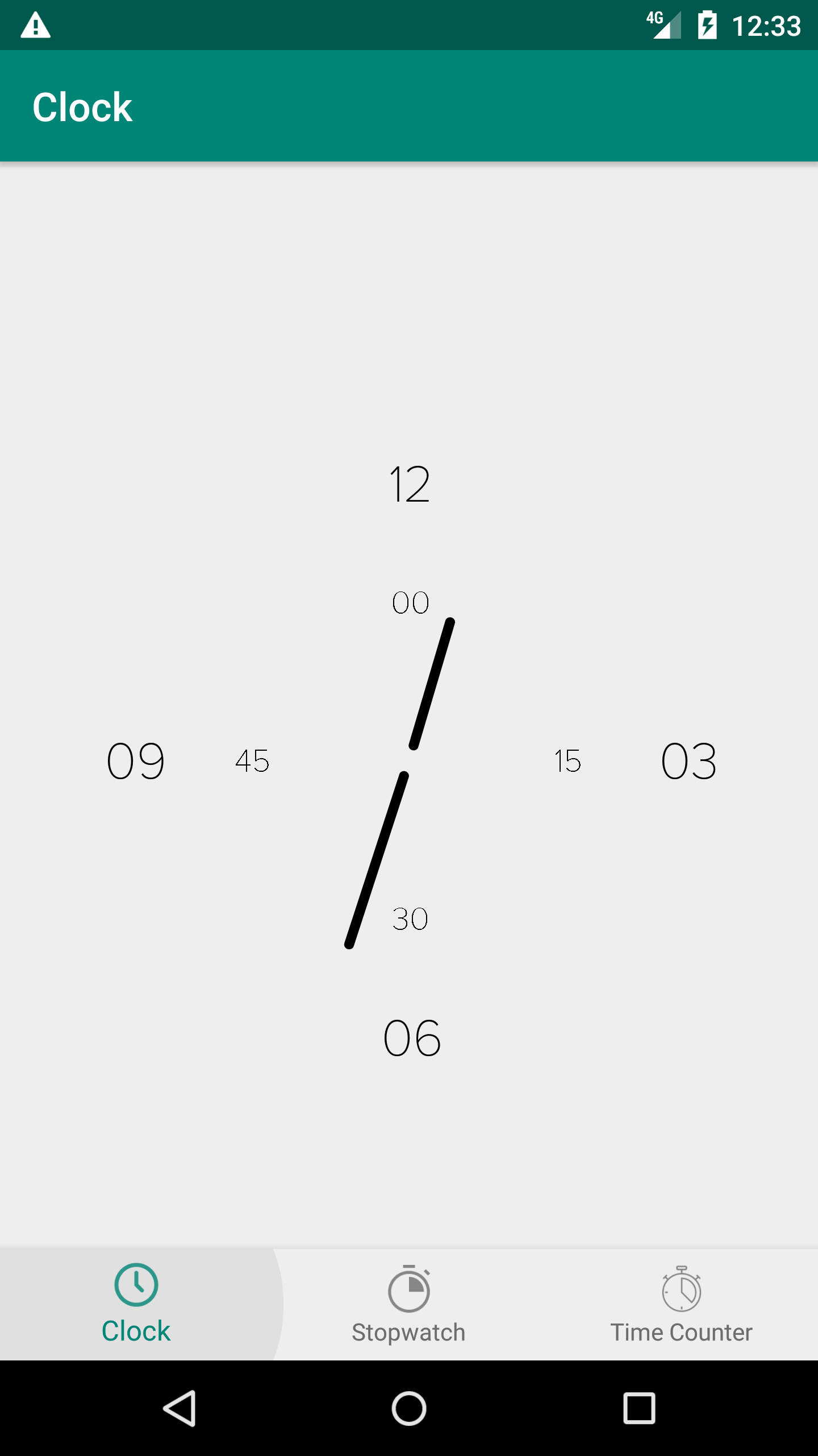
Values are the biggest concentration of attributes because they can enormously define how much the developer is on customizing his own widget. More than enabling the Show/Hide features or the colors, developers can also define the font type of the shown values, the thickness factor, and type, disposition, and step which are defined as enumerations.
public enum ValueType {
    none(-1), roman(0), arabic(1);
}
public enum ValueDisposition {
regular(-1), alternate(0);
}public enum ValueStep {
quarter(90), full(30);
}which lead us to the following attributes :
- values_font : set font for the values, default value R.font.proxima_nova_thin.
- values_color : set color for the values, default value Color.BLACK
- show_hours_values : show clock hours values, default value false
- hours_values_color : set color for hours values, default value Color.BLACK
- show_minutes_value : enable or not showning minutes values, default value false.
- minutes_values_factor : set factor for minutes values disposition. Should be between 0.2f and 0.9f, default value 0.4f
- clock_value_step : set the value step either quarter or full, default value ValueStep.full
- clock_value_type : 2 more types could be set : Romain or Arabic, default value ValueType.none
- clock_value_disposition : set the disposition of the hours values, default value ValueDisposition.regular
| Example 1 | Example 2 | Example 3 |
|---|---|---|
 |
 |
 |
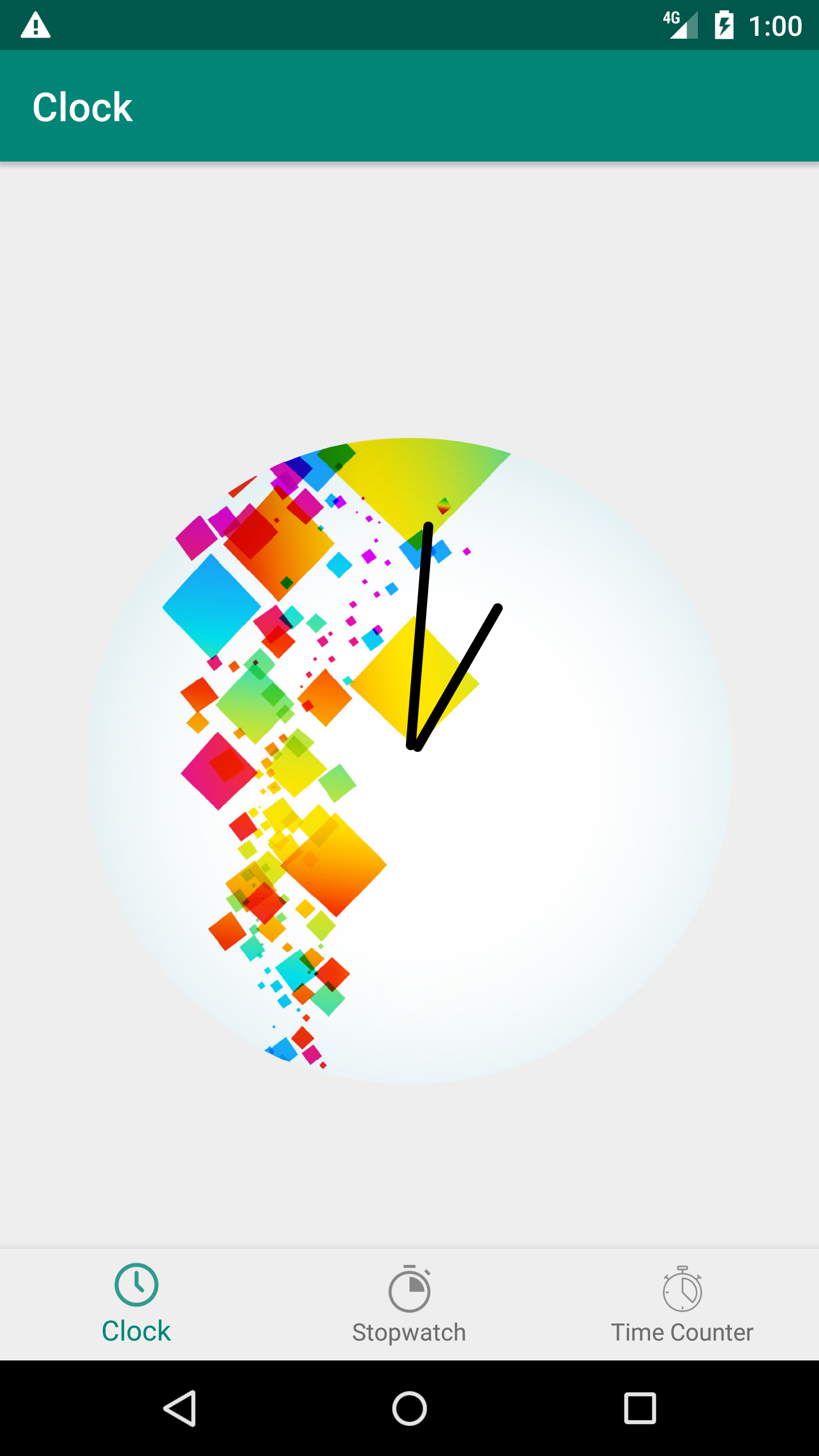
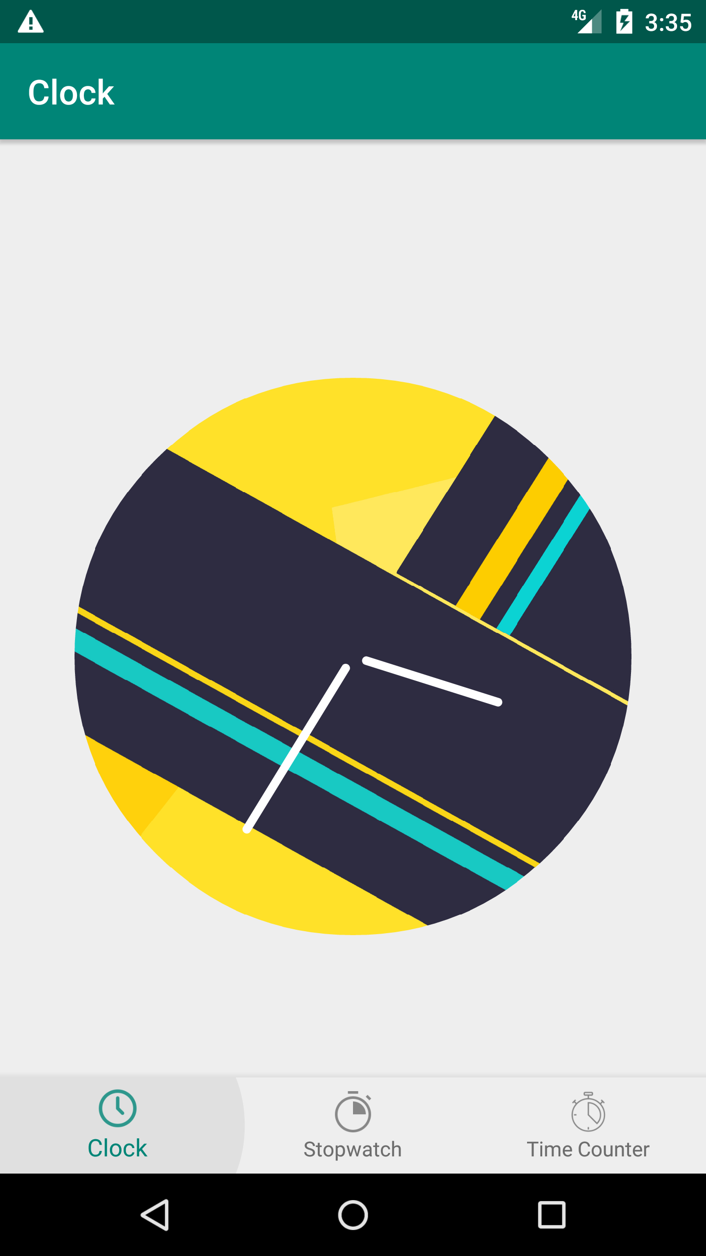
The analogical clock could have also a circular background that can add a more custom UI touch.
- clock_background : set a custom drawable background for the clock, default value NULL
| Example 1 | Example 2 | Example 3 |
|---|---|---|
 |
 |
 |