![]()


Welcome to the Vizura package, a comprehensive tool for analyzing and visualizing basic statistics.
Vizura is a data analysis and visualization tool developed using Python and Streamlit. It provides valuable insights into datasets by generating summary statistics and offering interactive visualizations.
To install Vizura, execute the following command:
pip install git+https://github.com/ash-sha/vizura.git #on Project Root directoryor use the standard installation via PyPI:
pip install vizura
import vizura
# Refer https://dash.plotly.com for run_server parameters
# Example usage of vizura
data = ...  # Load your dataset

#refer dash docs for run_server parameters

app = numerical(data) # Generates a dashboard displaying summary statistics for numerical columns in the dataset.
app.run_server(port=8000) # can add port number of choice, but not identical


app = categorical(data) # Displays a dashboard of summary statistics for categorical columns.
app.run_server(port=8001) # can add port number of choice, but not identical

calculate_correlations(data) # Computes correlations between filtered numerical columns using Pearson, Kendall, and Spearman methods.

plot_correlation(data) # Visualizes the correlation matrices for Pearson, Kendall, and Spearman.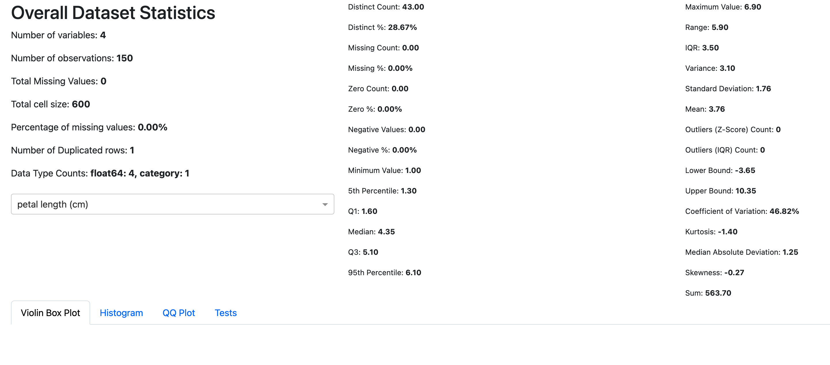
For a live demo and example statistics, you can explore the demo at: https://vizura.streamlit.app
We welcome contributions to improve Vizura! To contribute:
- Fork the repository
- Create a new branch (
git checkout -b feature-name) - Make your changes
- Commit your changes (
git commit -am 'Add new feature') - Push to your branch (
git push origin feature-name) - Create a pull request