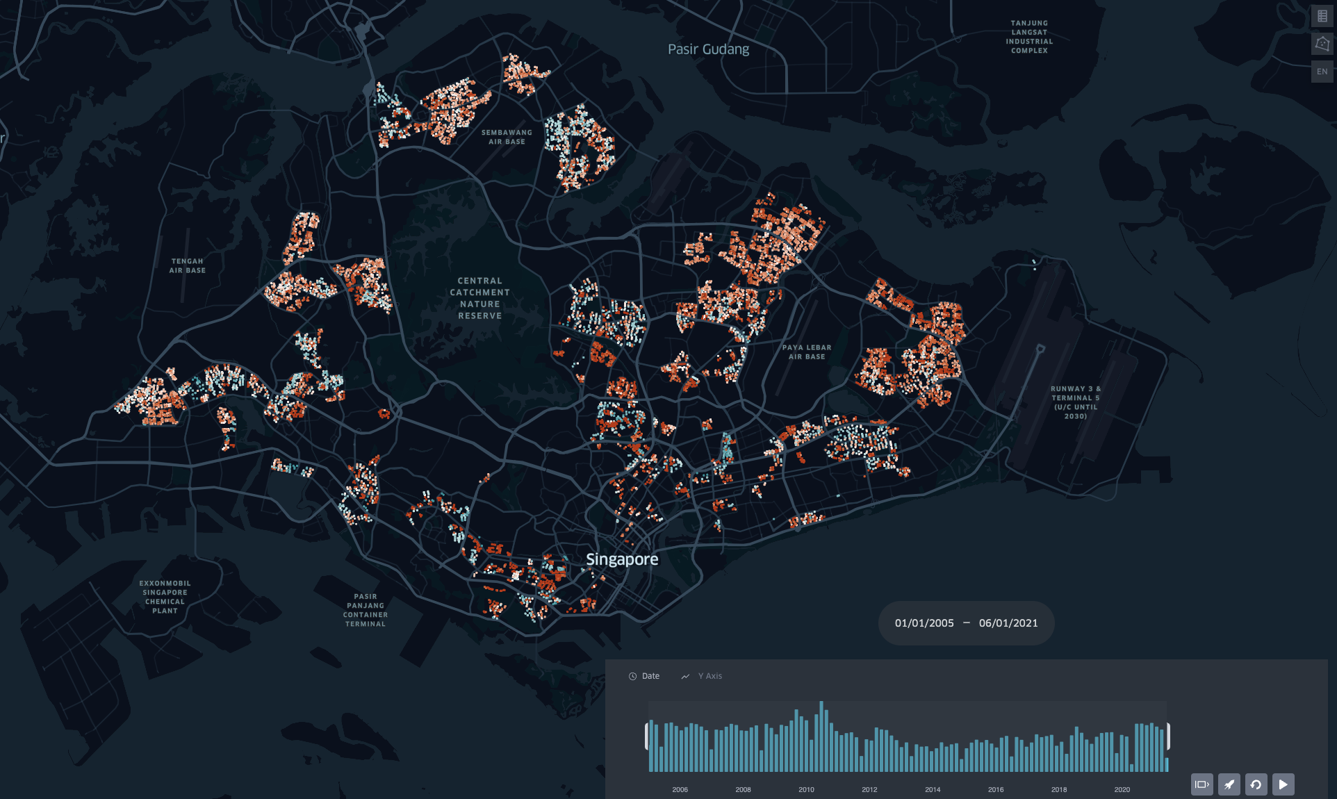
Explore hotspots and the resiliency of HDB prices using this kepler.gl visualisation of HDB resale transactions.
Visualisation provides a high level understanding of price changes, and guides analysts in narrowing down their research for deeper analyses into price trends across towns and flat sizes.
Feel free to download the html file to explore, or visit this visualisation here.
I personally prefer to set the time playback to incremental time window to show changes over time. At a glance, interesting observations can be made such as the effectiveness of 2018 cooling measures.
Resale HDB Transactions from data.gov.sg
Additional notes:
Addresses were reverse geocoded using OneMap and Google Maps since data.gov.sg does not provide postal codes.
CSV was too large to commit via Github UI (max size of 22mb) - used VS Code to commit csv file.
Might explore Streamlit to deploy this repo and geocoder repo next time so I can deploy codes directly.
