feat: add new icons for CSS#2710
Conversation
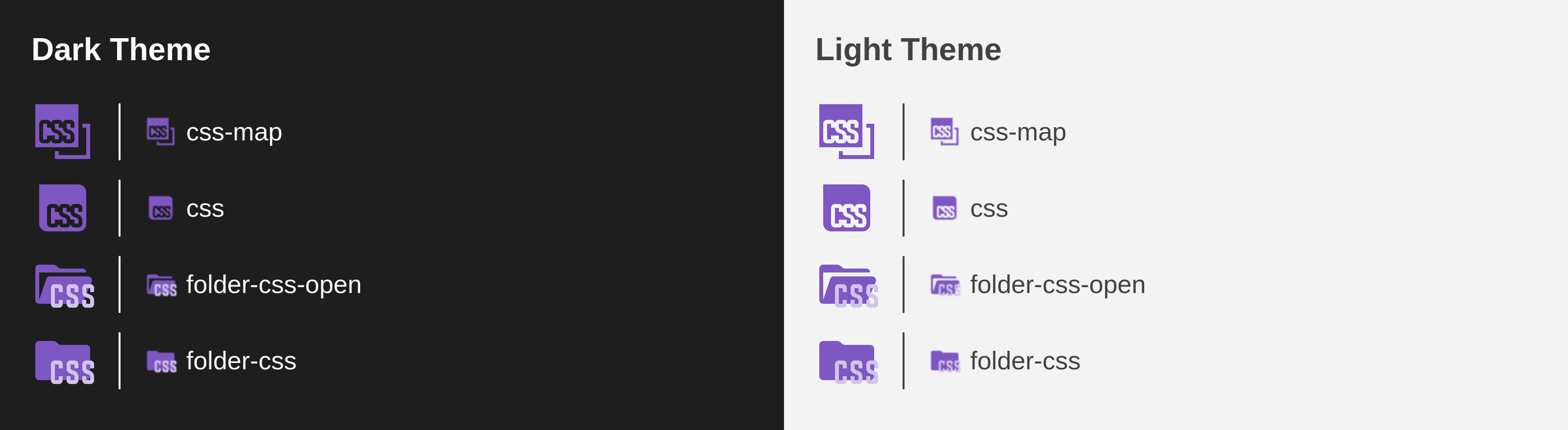
PreviewThank you for creating a pull request. This preview shows you how your icons will look on the different themes: Check how your icons fit in a 16x16 grid with our Pixel Perfect Checker by following this link. You can find more information on how to contribute in the contribution guidelines. |
|
These icons go well with the JS and TS icons, but I think it will be difficult to get used to them... |
|
I also think that they should be lighter, because they are too dark on a dark background, and too contrasting on a light one |
|
They are so ugly. In my opinion it will be detrimental to the main purpose of the pack, which is to help visual distinction. We already have JS and TS that look alike, and now css? |
We are not arguing whether the new logo is ugly or pretty. This is the new official CSS logo and soon everyone will associate it with the language. It would be nice to use a new icon that connects with the new image. |
|
|
I think it is necessary to create a mass forced vote for the best icon among all users of this extension in order to decide whether it is necessary to add a new icon |
|
A notification should pop up that cannot even be closed |
|
Im personally loving the new logo! Here it is in a mock Next.js project!
|

It's actually pretty hard to tell that it's a CSS icon... |

I mean, I personally look at the colours, and I really like the look.
|

|
Here is a look at it in tabs:
|

This comment was marked as spam.
This comment was marked as spam.
|
Because the letters on the icon are not visible |
|
I opened #2716 a few days ago but didn't create a PR anticipating this change was going to be controversial. IMO, It's still too early. The icon is just too new and if we merge this, we will have dozens of issues with the title "CSS icon broken". I would wait some time until the icon is more widely adopted and people is more familiar with it. Also, I agree that the color doesn't play well with dark themes. |
@okineadev I wouldn't do that. This pack is probably top-20 most installed extensions in vscode (26 million downloads). And not all users of this pack care about a css icon. If your main language is rust or cpp or zig, you don't want an imposible-to-close popup asking about css. |
I don't care if they are interested in the CSS or not, we need public opinion! (Actually, I'm writing this to troll Elior 😅) |
|
In my plugin whenever there is a huge change like in angular for example, I always provide both icons. Unless the previous icon was ugly (like the previous yaml, the previous perl). |
|
looks a bit too dark to be readable imo |
|
I mean, it is the official logo for CSS now, I personally don't like the SQLite logo but it is still the logo. |
You could make an option to change it in the config to the old logo, like css-old or something, making this will enable the project to have alternate logos in the future too! Thumbs up from me 👍 |
accessibility is my point, rather than aesthetics |
|
Well, I find this elegant and consistent:
I think it could be improved by coloring the text white and enlarging it a bit. Maybe also using more saturated colors to improve the contrast in dark themes. |

|
yep that works :) |
|
that's fine |
|
Hey thanks for doing this. I use this extension and as the creator of the logo I was also concerned about its readability in the IDEs in dark mode, but I think it's fine to do some color variation to improve readability, since the logo guidelines allow that.
1st - Original color, rebeccapurple, 663399 I prefer the 2nd option if possible, at 15% more lightness than the original looks even better: 8C53C5 |

…material-icon-theme into pr/aixegorri/2710
|
@lucas-labs shall we proceed with it? I have seen that you already created a pixel perfect version of it. Would you mind adding it to this PR? I think we could get it in now |
|
Hi! First column uses Rows are variations of the "CSS" typography. Both are (kinda) pixel perfect at 16px, but the first one is more "rounded". 
Here's the same, but at 16px and with dark/light backgrounds
Thoughts? |

|
The first option seem to have better contrast, but if you only use material colors then I would choose the second one. They're closer to the logo original design |
|
@lucas-labs they look quite similar, but personally I'd also prefer if we use a material color for that icon. Can we invert the icon on the light themes? I mean can we cut out the white shape from the purple shape instead of having a white shape on top of the purple shape? I mean similar how we did it for the typescript or JS file icons: https://github.com/material-extensions/vscode-material-icon-theme/blob/main/icons/typescript.svg |
Hi! If I understood that right, the "CSS" part is already cutted out. The white characters are actually the background, not a white shape on top (that's why it's "black" in the black theme).
|

thanks for the reply, you're right. I didn't see it in the first sight. It looks good like that :) |

|
Alright! This is the end result. Note: the css.map icon is 1px larger than the js.map (has to fit 1 more character 😅).
|


Merge SuccessfulThanks for your contribution! 🎉 The changes will be part of the upcoming update on the Marketplace. |
|
I thought the icon was broken and showing artifacts when I was updated today to this version... |


I agree, thought the same when I loaded up my CSS today. The new logo is really unrecognizable as CSS, especially in dark mode, doesn't show the "CSS" text well. 😕 |


|
I agree, I had no clue what logo I'm looking at as the text is unreadable at that scale, unfortunately. |
|
I am using dark mode and the text is too small to read. It looks like an sd card or a floppy disk. Could we atleast get an unused "css-classic/old" icon that we can manually assign ourselves? |
|
There's no much we can do about the text, fitting 3 characters in 9 pixels is hard. Giving it a brighter color for dark-mode might improve visibility... maybe.
Having an unassigned icon might be an option too. |

|
Why was this approved with dark letters? https://github.com/CSS-Next/logo.css?tab=readme-ov-file#logo-usage-guidelines |
|
Hello from my cave, did I miss something about CSS ? According to W3C's official website, at least... which makes me question : who is this Github account : https://github.com/CSS-Next/ and how are they "official" while speaking about "CSS4" and "CSS5" while the official website clearly says there won't be any further version numbers like this in the nomenclature as CSS works by module. I'm just really confused about wether this Github accound is really and officially related to CSS or not. |
Oh ok, I didn't know.... It seems that when you're not working on a language for a bit of time, things live by themselves and evolve so I'm happy to see it was just me who was left behind, so many knowledge to catch up. Thanks for the information. |
|
Also, AFAIK, @argyleink is the "connecting" person, who is both in the "official" CSS WG and the CG, but maybe they can elaborate more. I do agree the relationships and who has a say on what are not entirely obvious but then again that's kind of a logical consequence of the web standards space and especially W3C being mostly open and open source. |
|
Whatever the case, I don't think anyone would be bothered by the icon change if the letters were actually legible, rather than a jumble of pixels. Like, I'm used to seeing the icon now, so I associate it with css, but I really think scaling-viability should be taken into consideration when implementing icons from logos. |
|
Look at the PR I linked above, they made a favicon (more legible) version as well. Main issue is that this project is using dark letters instead of white ones. |
it appears the colors used arent per the accessibility guidelines in the logo repo; the text should be white not black. if black text is desired, use the white logo. also, consider the "small" variant which spans the letters across the whole box: https://github.com/CSS-Next/logo.css/blob/main/css.dark.small.svg, this will increase legibility at the small size the logo is rendering. |
|
The reason we used black text is to make the overall design of this icon theme feel cohesive. Using white text would "break the visual harmony" of the theme, as all other icons use black text.
Also, mathematically, it's not possible to keep this icon pixel-perfect while adding a 1px separation between the three characters. We're fitting 3 characters at 3px each inside a 10px viewbox. That only leaves 1px of extra space, not 2. So adding space between characters could actually reduce legibility due to blurring. That said, PRs are welcome — if someone has a better alternative that improves the design, we're always happy to review it 😊 |

Description
Added the official new logos for CSS to the icon set.
Closes: #2716
Official info at: https://github.com/CSS-Next/logo.css
Contribution Guidelines