Conversation
PreviewThank you for creating a pull request. This preview shows you how your icon will look on the different themes: Check how your icon fits in a 16x16 grid with our Pixel Perfect Checker by following this link. You can find more information on how to contribute in the contribution guidelines. |
|
Hi @okineadev, following previous discussion.
Should I refine one of them or should we abandon this PR? @PKief it looks like I don't have permission to push to this branch. |


Looks cool, but we need a sign 🚫 over the hand |
I've send you an invite for editing the branch. Please check your notifications to accept the invitation. |
|
@okineadev wdyt? |
 okineadev
left a comment
okineadev
left a comment
There was a problem hiding this comment.
It looks cool, but you still need 1 pixel spacing from the edges, and I also think it's better to make the hand shorter, because it looks kind of long (vertically)
696d801 to
9579cba
Compare
@okineadev, the icon is updated with suggestions. |
|
I'm not super happy with it tbh. I think it would be worth thinking about more options here. Many people and projects use this icon and it has much visibility. We even have the chance of creating a new logo for them if it might look good: lint-staged/lint-staged#606 (comment). What if we think of something new? Even other icon extension maintainers think that this icon is literally sh*t 😂 Edit: more details on this: One suggestion would be to design it in this pattern. Having a cancel icon on top of another symbol but cutting the background symbol to give it enough space:
I'm open for different suggestions too. Once I've little more time I'll try to elaborate on this too. |

I have an idea to use the bug icon, although I don't know if it will be appropriate, because lint-staged hardly protects against bugs, it rather lints the code
|


|
@lucas-labs I just wanted to ping you in case you haven't seen this already. Maybe you have already thought about this and created something in your fork already. Lint-staged is quite popular, so it would be cool if we can have a special icon for it. I didn't have the time yet to get into creativity 😅 Just in case you have some spare time and would like to tackle a challenge, here we go 😉 But no worries, if that isn't the case, it's also fine. |
|
FYI, I created this icon: https://raw.githubusercontent.com/AtomMaterialUI/iconGenerator/ec25f005bd54621390955f52b774e2afb59c52e8/assets/icons/files/lint-staged.svg Represents a broom, for cleaning the lint (don't recommend the color though, I should probably change it) |
Why does it look like a tail 😭 |
|
How about the lint roller icon? 
|
I'm not fond of the icon either, there are better suited icons to represent a broom, like https://fonts.google.com/icons?icon.style=Outlined&icon.query=sweep&icon.set=Material+Symbols&selected=Material+Symbols+Outlined:mop:FILL@0;wght@400;GRAD@0;opsz@24&icon.size=24&icon.color=%23e8eaed Now I remember why it's brown.................. |
|
I like the lint roller idea. But it could be hard to make it clear that it's a lint roller. |
|
What do you think about this format paint icon? |
No, because it does not represent linting or anything related to it, as you can see it is a roller, and it is for drawing, and such an icon is already used for Renovate |
|
I have not seen such lint rollers as on the icon, except for the following: 
|
|
@PKief, maybe we should call someone from https://github.com/lint-staged/lint-staged ? We can write to lint-staged/lint-staged#606 |
yeah but we should come with a few proposals. So that's what we are discussing here first. |
|
I was doing some brainstorming, we also could use a shield and mix it with another icon.
|

|
Also, I was playing with the lint roller idea
|

No, it should be minimalist and Material Design style. |
I thought we were working on an icon suggestion for lint-staged lib. After it can be converted to a material icon theme. Based on this comment:
I suggest @PKief and @okineadev be on the same page because I have worked on an icon for a few days, and now we have a PR that is approved and blocked at the same time. I don't know how to proceed. |
|
Okay, I'll try to draw my own version of the icon later |
I'm dedicating my time and trying to help. Let's be nice! I noticed that some icons are not the official ones, so what is the problem to have a simplified version here?
|


|
@PKief, more ideas.
|


Well, look, if we make a good icon in Material Design and they accept it, why would we make a more complicated icon |


Can we focus on ideas now please? I don't want to read more comments about "do we need 1 or 2 icons". Please add your own ideas and then we can decide what we're doing. If you have a nice idea for one icon which would fit as a logo as well, please post it here. One icon would be beneficial - that's it. Now ideas (only) and no judging please :D |
Nope I haven't done this one for my fork either. I kinda like the |
This comment was marked as off-topic.
This comment was marked as off-topic.
|
The roller idea is nice, however I think the logo should express lint-staged's nature of blocking some staged files from being proceeded. In one of my projects we're using it also to run unit tests, which wouldn't be perfectly covered by the roller right? That's why I came up with these proposals:
AShows a shield with two colors behind an exclamation mark. The red and green colors express the behavior of lint-staged's security gates, that for instance some steps are green and others are red. The exclamation mark is expressing the power of lint-staged to stop a whole process if something is throwing an error. BIt shows a bunch of circles which are expressing the different file patterns and quality gate steps which you can define in a lint-staged config file. The red circle in the middle expresses a failing lint stage step. It's surrounded by an abstract cross which highlights the middle circle. CA very minimalistic proposal. It shows a magnifier on top of a green shield. The shield expresses lint-staged's nature of protecting files from beeing committed after staging. The magnifier expresses the search for mistakes and errors in the staged files. DThis proposal focuses on the staging by showing a "+" symbol in front of a shield. The shield again expresses lint-staged's nature of blocking files from being committed. EInstead of a shield this one is more about the positive way, if checks are successful, things can be merged / proceeded. Note These are just some ideas which still should be refined. |

I like the C icon the most because, unlike the others, it doesn't represent "good" or "bad", it means "need to check" The idea behind the B icon is really cool, but it's too complicated and it's hard to intuitively understand its meaning |

|
Option C. (Maybe replace the color) |
This comment was marked as spam.
This comment was marked as spam.
This comment was marked as spam.
This comment was marked as spam.
|
why we dont the original icon from lib?? |

|
Hi @ViniDevBR, you could read more on #2773, the other guys don't like the original one. We were trying a new icon. |
|
I think we can release a version based on the official icon first, and then replace the icon based on community feedback. This icon may remain a lingering controversy for a long time—it’s hard to satisfy everyone. |
You say "We were"... This is 7 months STOPPED. Nobody is trying nothing. This is simple guys. Im new here but think with me. and... Why dont release the original and if the people dont like we change. But now it's stopped 7 months because people dont like? Impossible to satisfy everyone. Im using this during 3 years and there is a lot of ORIGINAL ICONS and this need to be different because people dont like? |
|
@ViniDevBR Please keep your tone respectful toward maintainers. Comments like yours raise red flags. “We were” refers to myself and other contributors working in our free time to keep this project aligned with our design standards. Saying “nobody is trying” ignores the ongoing work visible in our PRs and issues regarding other icons and requests. We don’t include all original icons — they must fit the Material Design style. The lint-staged icon doesn’t meet our quality standards; if you disagree, you can raise it with the project itself: lint-staged/lint-staged#606. You can also use a different icon theme or add a custom icon as documented here: https://github.com/material-extensions/vscode-material-icon-theme?tab=readme-ov-file#custom-svg-icons. Or you can suggest another icon or an alternative abstraction of the original logo which can go along with the Material Design look and feel. Further disrespectful comments will lead to a permanent ban. |
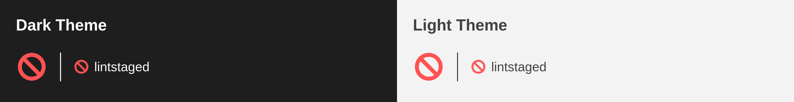
That's actually true, we can't satisfy everyone. But at the same time we're not aiming to simply show any random original icon for every possible file only to just have something. Our goal is that it looks good and the icons should fit together. And for the lintstaged config files we still show our default icons - it's not like if we wouldn't show anything there: 
|
First, SORRY But when i said “nobody is trying”, im saying about this icon and not about all. and today im using the original one with custom svg icons... How can we use a custom svg file inside .vscode in the project? Not the global vscode settings and lets go CONTINUE the discussion to accept one icon for this. Now i can say |
0829a87 to
c47fcf9
Compare
|
I came to the conclusion that this cancel icon without the turd in the background doesn't look that bad. It also fulfills the purpose that it kind of "cancels" a commit in case one of the conditions went wrong. We keep it without that turd and I personally see that as a way to go for that icon (I'm also frequent user of lintstaged and like that project): |
 lucas-labs
left a comment
lucas-labs
left a comment
There was a problem hiding this comment.
I agree, 🚫 is simple and serves the purpose just fine.
LGTM!
Merge SuccessfulThanks for your contribution! 🎉 The changes will be part of the upcoming update on the Marketplace. |
Description
Add lintstaged support
Icon is based on lintstaged avatar: https://github.com/lint-staged
Recreate #2246
Follow up of #2773.
Contribution Guidelines