feat: update prettier icon#2904
Conversation
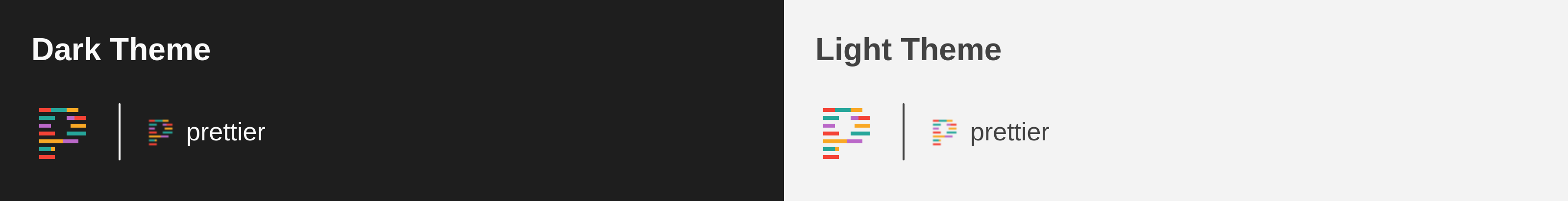
PreviewThank you for creating a pull request. This preview shows you how your icon will look on the different themes: Check how your icon fits in a 16x16 grid with our Pixel Perfect Checker by following this link. You can find more information on how to contribute in the contribution guidelines. |
There was a problem hiding this comment.
I like it!
The only problem I can see is that it's a bit hard to see in light themes. But the same is happening already with the original icon.
We could try using a slightly darker palette and see how it goes.
e.g.:
#00897Binstead of#4DB6AC#BA68C8instead of#CE93D8- ...etc
..within Material color pallette.
|
Shifted 1-2 shades darker. Its a bit better, the yellow will always be a challenge. For side-by-side comparison: Old New |


I think it is nice like that. Thanks for the adjustments. The yellow colors are always a little bit difficult on light themes but I think we found a good solution now :) |
Merge SuccessfulThanks for your contribution! 🎉 The changes will be part of the upcoming update on the Marketplace. |
Description
Update Prettier icon to display better at standard resolution: previously the shapes were all smaller than a pixel at 16x16 which led to it blurring out.
Contribution Guidelines