feat: migrations folder#3187
Conversation
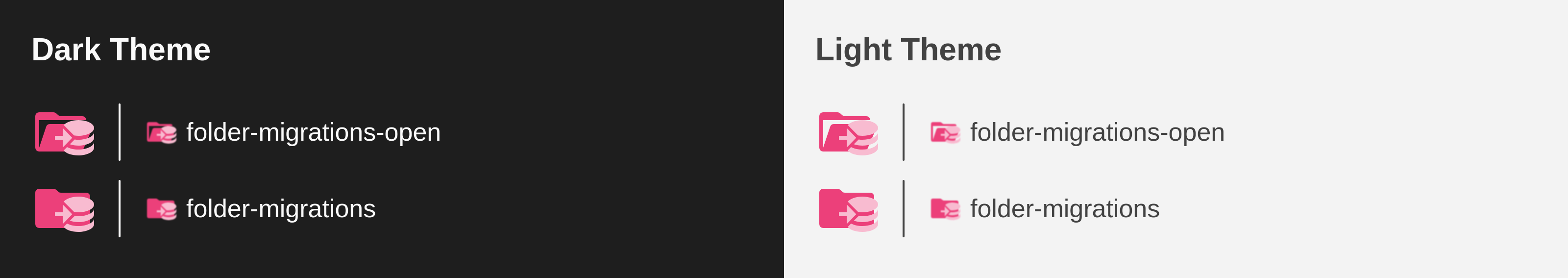
PreviewThank you for creating a pull request. This preview shows you how your icons will look on the different themes: Check how your icons fit in a 16x16 grid with our Pixel Perfect Checker by following this link. You can find more information on how to contribute in the contribution guidelines. |
|
@PKief Should I also align the arrow vertically? Or maybe I should make the database element taller to make it similar to ./icons/folder-database.svg ? |
Yes make the DB icon similar to the folder-database, and also give the arrow more space to breath - I mean little bit more padding around it so that it has a better contrast. |
|
Now it looks too tall because of the arrow, I think I can either
|
|
Maybe moving the arrow to the left or right instead of having it on top? I created this one a few months ago. I like your "db element" better, mine is a bit too minimalistic to say the least haha, that's why I did not open a PR. But, maybe moving the arrow can solve your issue with the element height being too large?
|
@PKief do you agree? if yes, i'll move the arrow or if you have something different, or something better in mind |
33c6a4e to
e7ea71e
Compare
eb474c4 to
1a8bb94
Compare
1a8bb94 to
46de200
Compare
|
Personally, I think that the folder icon is still a little bit too complex by combining that arrow with the database symbol. Is there any possibility to make it more simple in the shape? |
|
I could try to come up with a completely different icon |
|
Something like a circular arrow maybe? |
|
Or https://pictogrammers.com/library/mdi/icon/database-import (make arrow even simpler) |
|
@gameroman I just tested it and I think it would work 
I also tried with a more simple arrow: 
I think the simple arrow is better, because it improves the visibility. Icon in full size: 
|
and also give the arrow more space to breath
46de200 to
b0b753c
Compare
Merge SuccessfulThanks for your contribution! 🎉 The changes will be part of the upcoming update on the Marketplace. |
Description
Migrations folder, from #675
Closes #2938
Closes #895
Contribution Guidelines