refactor: improve certificate icon design#3245
refactor: improve certificate icon design#3245PKief merged 2 commits intomaterial-extensions:mainfrom marlondecol:certificate-file-icon-improvement
certificate icon design#3245Conversation
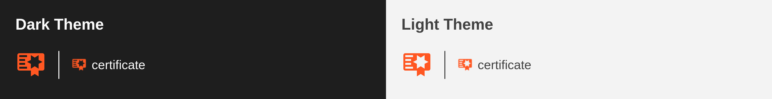
PreviewThank you for creating a pull request. This preview shows you how your icon will look on the different themes: Check how your icon fits in a 16x16 grid with our Pixel Perfect Checker by following this link. You can find more information on how to contribute in the contribution guidelines. |
 PKief
left a comment
PKief
left a comment
There was a problem hiding this comment.
Thanks! The alignment looks slightly better now. From my side, it looks good — though the previous icon was already quite polished and pixel perfect. @lucas-labs what do you think? :)
 lucas-labs
left a comment
lucas-labs
left a comment
There was a problem hiding this comment.
@PKief I just compared them and I think this one looks a bit better. The star and the "ribbon" are a bit bigger and more noticeable at small sizes, without making the whole icon bigger.
IMO, it looks good!

Merge SuccessfulThanks for your contribution! 🎉 The changes will be part of the upcoming update on the Marketplace. |
Description
This pull request introduces small design adjustments to the
certificateicon, aiming to make better use of the available space and enhance its shapes.Design details
The icon’s width has been increased to fill the entire horizontal area, balancing both margins. This adjustment made it possible to enlarge the star, making it sharper and more recognizable compared to the previous version.
Contribution Guidelines