fix: update Blender logo to upstream version#3285
fix: update Blender logo to upstream version#3285PKief merged 5 commits intomaterial-extensions:mainfrom
Conversation
It was noticed in the Blender community chat that the logo used in Gitea appeared to come from the material-extensions source, but was not using the correct logo.

The guidelines and design for the logo can be found at:

  https://www.blender.org/about/logo/

This patch attempts to honor the spirit of the replaced logo, while following the "slanted" look of the upstream logo.
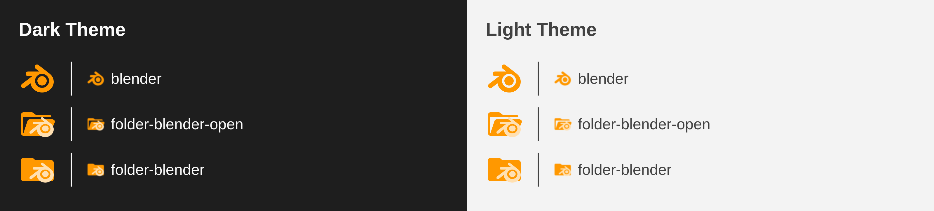
PreviewThank you for creating a pull request. This preview shows you how your icons will look on the different themes: Check how your icons fit in a 16x16 grid with our Pixel Perfect Checker by following this link. You can find more information on how to contribute in the contribution guidelines. |
|
Looks good! |
|
Hi! Thanks for you PR! The blender logo in our current icon is not exactly the same as the official blender logo, because ours was especially made to be pixel perfect at 16x16 px (which is the size vscode renders icons by default). Look here: #3046 
IMHO, the current icon renders sharper at 16px and the difference between our icon and the upstream version is not big enough to be noticeable at such small size. |
|
Hi @lucas-labs, me and @mcgrathd are part of the Blender project and community. Although I can understand the alterations from a ratio point of view, it should resemble the official Blender icon. It's very noticeably the wrong icon to me and a lot of our community members since it doesn't have the slanted look that the original had. Some additional context: The discussion surrounding changing it stemmed from someone noticing that 
We hope you will reconsider merging the icon, or otherwise I would suggest having an |
|
Hi @bartvdbraak, thanks for your reply. In general, I agree @lucas-labs as this project is a little bit opionionated. Our goal is not to be as close as possible to the original logo but to provide "Material Design" like way to align all of our icons together. And on top of that we align the icons to a 16x16 grid to improve the visibility on small resolutions. So far this made our project quite popular and successful. I could read the following statement in your trademark policies:
https://www.blender.org/about/logo/#artwork This would encourage me to say that our project also has its own way to tribute to the blender community. And our adjustment isn't that much different to how the official logo looks like - the icon is still clearly recognizable as the blender logo and we took the creation of the icon fully seriously so that we don't harm the idea of the blender project or community in any way. Let me know your thoughts on this |
|
For comparison...
The current icon distorts and "blows up" the logo quite a bit. That makes it look very cartoony or goofy to me, like a Comic Sans version 👀 This isn't how I'd want the Blender brand to be perceived personally. So while some tweaking to align to a pixel grid can be fine, I think the Blender community would appreciate a representation that isn't "goofy", and closer to the original. Not to be dismissive, some Blender people just care a lot :) |

I've been playing with this one and made a few variations. The first one is the current one. The other 2 are two slightly different variations I came with. Let me know what you think. |
I am sorry if I misunderstand, but was there a problem with the image that I submitted in the PR? It's not quite clear what is unacceptable with my original modifications. |

Hi @mcgrathd! We try to make all of our icons pixel-perfect at 16x16 pixels, which is the size vscode renders all icons in the tree view (with default settings). 
Your's is the semi-transparent blue-ish on top of the one I labeled blender-3_1 in my previous message, in orange. That's the difference, mine is aligned to a 16x16 grid and uses exactly 2 pixels width lines (also aligned) for the three lines. That makes the icon look less blurry at 16x16 px. We have a section on pixel-perfect icons in the contribution guidelnes. |
Ah, that makes sense. I just took the exact SVG contents from the logo kit and put it on some (not all) of the grid, and let the logo fall where it may otherwise. I think this is the heart of the problem though: You want pixel perfect, which aligns great, but isn't our logo. We were asking for the original slanted logo which can never align to the grid at every point due to the design. Granted that it looks like I could have went down a pixel or two! Thanks for taking the time to explain the problem. 👍 |
I think the third icon looks a little bit better, I would like that also 
|

|
I think the 3rd variation (blender-3_1) is a fair enough representation of the original, I think we'd be able to live with that 😜 Although the uppermost "finger" still only partially overlaps a bunch of pixels, so we don't gain much by thickening all that much. I think we can reduce the thickness closer to the original?: And while we're at it :) Will it really introduce much blurriness to slightly reduce the width of the 2nd finger as well? It would still be mostly opaque: This way the logo isn't all that distorted at bigger sizes or higher pixel densities like retina displays. |


@lucas-labs 3_1 looks so much better! Time for a PR? 😊 |
 PKief
left a comment
PKief
left a comment
There was a problem hiding this comment.
Thank you @lucas-labs for the updated icons and the efforts! From my perspective it looks in a way where we still match our guidelines and it looks less "goofy" (I absolutely do not prefer that term if it's describing one of our icons, but it seems that it describes the requirement by the blender community). So I think we're good to merge this now :)
Merge SuccessfulThanks for your contribution! 🎉 The changes will be part of the upcoming update on the Marketplace. |
|
Thank you @lucas-labs @PKief! As soon as there's a new release on NPM, I'll configure our Gitea instance at Blender to start using that |
|
@bartvdbraak FYI a new version has been released with the changes. |
Thanks we'll start to use it! |
It was noticed in the Blender community chat that the logo used in Gitea appeared to come from the material-extensions source, but was not using the correct logo.
The guidelines and design for the logo can be found at:
https://www.blender.org/about/logo/
This patch attempts to honor the spirit of the replaced logo, while following the "slanted" look of the upstream logo.
Description
Replace the current logo with the upstream logo.
Contribution Guidelines