style(signup): improve styling of password advice #7042
Conversation
 ghost
assigned
ghost
assigned
|
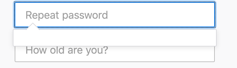
This PR doesn't include the second bubble for the repeat password field. But, if that's a must for this issue, I can close this and go back to the drawing board for a bit. |
|
Aesthetically, this looks great!
Both @davismtl and @ryanfeeley want the 2nd bubble there before removing the text from the first bubble so that the user is informed why the password is important. |
 lmorchard
changed the title
lmorchard
changed the title
|
Alrighty, let's call this WIP then and I'll get to work on the 2nd bubble today |
lmorchard
force-pushed
the
6448-password-advice-style
branch
from
39c2cd9 to
68c7f99
Compare
|
I've stumbled my way toward having both bubbles, but a) not entirely sure the behavior is correct and b) I need to explore adding tests |
lmorchard
force-pushed
the
6448-password-advice-style
branch
from
68c7f99 to
8d3f5df
Compare
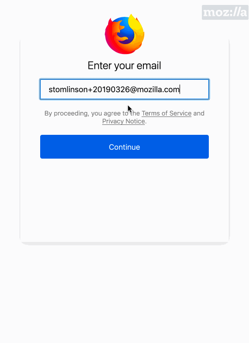
- Tweaked styling and text of first password field bubble

- Add second bubble for the repeat password field

Fixes #6448
lmorchard
force-pushed
the
6448-password-advice-style
branch
from
8d3f5df to
9263051
Compare
lmorchard
changed the title
|
Okay, going to call this no longer in-progress: Got the second bubble added, along with tests. Could use some input on whether the UX is appropriate, etc. |
|
Oh yeah, and... @ryanfeeley / @shane-tomlinson - r? I kind of guessed at UX tweaks around hiding the bubbles when the fields lose focus. And I think the view code is the right shape, but I was a little confused about FormView being used for a field rather than a whole form, |
 shane-tomlinson
left a comment
shane-tomlinson
left a comment
shane-tomlinson
left a comment
There was a problem hiding this comment.
@lmorchard this is fantastic! Overall it looks good, though there are some issues that need to be addressed before we can merge this.
- The original tooltip does not display if the password becomes valid and then the user deletes characters unless the user submits or blurs the element.
- Related, if the user begins to type an invalid password, clicks "mistyped email?", goes back, and then re-submits with the original email, the tooltip on the original password is not displayed but should be:
- The verification password dropdown balloon is has no content on a mobile form factor.
- If the user clicks back into the password field and the password is valid, the tooltip should not be displayed:
- I'm not sure how to handle the vpassword tooltip on mobile. The solution of requiring the user to tap on it to close makes sense, though I wonder how to improve that, I worry some users mobile users may drop off unless they figure that out. I wonder how the tooltip would be above the input element, or if it automatically disappeared after a few seconds.
I will admit the behaviors were really hard to figure out with one tooltip, I imagine it's no easier with 2. I relied heavily on MVC to determine whether to display the original tooltip or not. I suspect the focus and blur events on the password field are causing the problems with displaying when not needed or not displaying when needed. Maybe we go through this together to see if we can figure that part out?
| }, | ||
|
|
||
| createBalloonIfNeeded () { | ||
| createBalloonIfNeeded (ev) { |
| } = FunctionalHelpers; | ||
|
|
||
| registerSuite('password repeat balloon', { | ||
| beforeEach: function () { |
There was a problem hiding this comment.
It might be worth combining this with the password strength functional test suite and ensure the interaction between the two is as expected, e.g., asserting the password balloon goes away when the vpassword balloon is displayed and vice versa.
|
This repo has been deprecated and migrated to https://github.com/mozill/fxa. Please open this PR against that repo. |
2 participants
Fixes #6448