You signed in with another tab or window. Reload to refresh your session.You signed out in another tab or window. Reload to refresh your session.You switched accounts on another tab or window. Reload to refresh your session.Dismiss alert
{{ message }}
This repository was archived by the owner on Apr 6, 2022. It is now read-only.
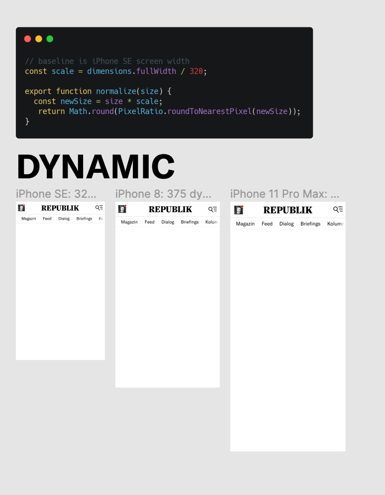
Currently our UI elements, and the header in particular, are made to work with the smallest current mobile device screen width, the iPhone SE (320px). While this guarantees usability for users with small devices, it sacrifices balance and usability on larger screen-sizes, which are much more common today. So much so, that many more users have a suboptimal UI experience than an optimal one.
Suggested Solution:
Certain prominent UI elements should scale with screen size (on mobile devices).
This discussion was converted from issue #512 on February 08, 2021 09:39.
Heading
Bold
Italic
Quote
Code
Link
Numbered list
Unordered list
Task list
Attach files
Mention
Reference
Menu
reacted with thumbs up emoji reacted with thumbs down emoji reacted with laugh emoji reacted with hooray emoji reacted with confused emoji reacted with heart emoji reacted with rocket emoji reacted with eyes emoji
Uh oh!
There was an error while loading. Please reload this page.
-
Currently our UI elements, and the header in particular, are made to work with the smallest current mobile device screen width, the iPhone SE (320px). While this guarantees usability for users with small devices, it sacrifices balance and usability on larger screen-sizes, which are much more common today. So much so, that many more users have a suboptimal UI experience than an optimal one.
Suggested Solution:
Certain prominent UI elements should scale with screen size (on mobile devices).
Example:
https://www.figma.com/file/ZTbL40GSkPvExl01mhO2r2/Dynamic-Type-Sizes?node-id=0%3A1
Beta Was this translation helpful? Give feedback.
All reactions