A pure javascript implementation for Alerts and Pickers. Our goal is to have a high customizable package working for iOS and Android Platforms, reaching the features of the awesome package https://github.com/dillidon/alerts-and-pickers and https://github.com/skywinder/ActionSheetPicker-3.0
- iOS Implementation (in progress)
- Android (Material) Implementation
- Alert Color Picker
- Alert Contacts
- Alert Country Picker
- Alert Country Phone Picker
- Alert Emoji Picker
- Alert Image picker
- Alert Maps
- Alert Text
- Alert DatePicker
- Alert TimePicker
- Declarative API
- High customizable UI
- Lot's of plug-in customizations
You can try on expo: https://exp.host/@rafaelmotta021/eact-native-alerts-and-pickers-demo
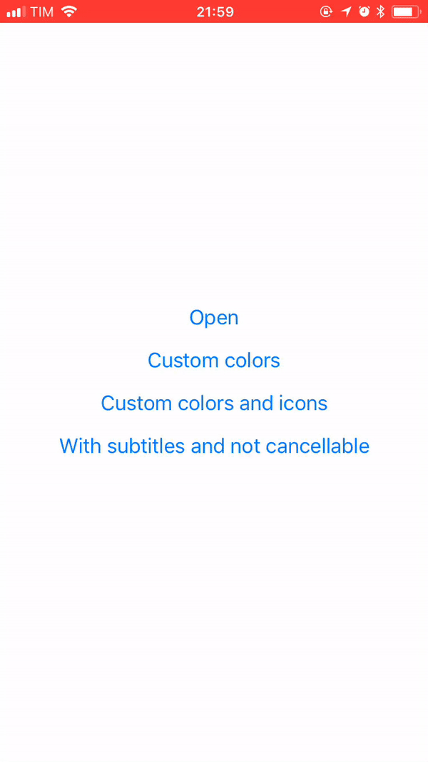
or just check the image bellow:
yarn add eact-native-alerts-and-pickers
or
npm install --save eact-native-alerts-and-pickers
import React from 'react';
import {
  StyleSheet,
  Text,
  View,
  Button,
} from 'react-native';

import {
  ActionSheet,
  ActionSheetTitle,
  ActionSheetContent,
  ActionSheetItem,
  ActionSheetSubmitButton
} from 'react-native-alerts-and-pickers'

import { Ionicons } from '@expo/vector-icons';

export default class App extends React.Component {
  state = {
    show: false
  }

  show = () => {
    this.setState({ show: true })
  }

  hide = () => {
    this.setState({ show: false })
  }

  onItemPress = () => {
    console.log('item pressed')
    this.hide()
  }

  render () {
    return (
      <View style={styles.container}>
        <Button title="Open" onPress={this.show} />
        <ActionSheet
          show={this.state.show}
        >
          <ActionSheetContent>
            <ActionSheetItem
              title="Lorem ipsum"
              onPress={this.onItemPress}
            />
            <ActionSheetItem
              title="Lipsum dolor"
              onPress={this.onItemPress}
            />
          </ActionSheetContent>
          <ActionSheetSubmitButton
            label="Cancel"
            onPress={this.hide}
          />
        </ActionSheet>
      </View>
    )
  }
}

const styles = StyleSheet.create({
  container: {
    flex: 1,
    backgroundColor: '#fff',
    alignItems: 'center',
    justifyContent: 'center',
  },
});| Name | Type | Default | Description |
|---|
| Name | Type | Default | Description |
|---|
| Name | Type | Default | Description |
|---|
| Name | Type | Default | Description |
|---|
| Name | Type | Default | Description |
|---|