A modern, customizable alert box plugin for FilamentPHP with render hooks support. Create beautiful alerts with a fluent, chainable API across 4 different card styles.


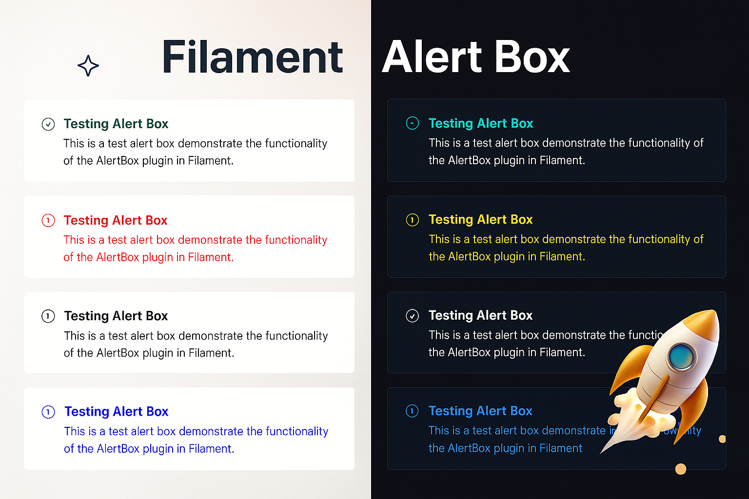
- 🎨 4 Beautiful Card Styles - Banner, Card with Border, Modern Card, and Minimalist
- 🔗 Fluent Chainable API -
AlertBox::make('Title')->success()->modernCard()->show() - 🎯 FilamentPHP Render Hooks - Perfectly integrated with Filament's architecture
- 💾 In-Memory Storage - No database or session dependencies
- 🎭 Auto-Hide & Permanent - Configure timeout or make alerts persistent
- 🎪 Customizable Icons & Colors - Full control over appearance with 5 icon sizes (xs, s, m, lg, xl)
- ⚡ Zero Configuration - Works out of the box
- 📱 Responsive Design - Works on all screen sizes
Install the package via Composer:
composer require rifrocket/filament-alert-boxRegister the plugin in your Panel provider:
use RifRocket\FilamentAlertBox\AlertBoxPlugin;

public function panel(Panel $panel): Panel
{
    return $panel
        ->plugins([
            AlertBoxPlugin::make(),
        ]);
}
Optionally, publish the views:
php artisan vendor:publish --tag=alert-box-viewsuse RifRocket\FilamentAlertBox\Facades\AlertBox;
// Simple success alert
AlertBox::make('Operation Successful')
->success()
->show();
// Error alert with description
AlertBox::make('Error Occurred')
->message('Something went wrong while processing your request.')
->danger()
->permanent()
->show();Choose from 4 beautiful card styles:
// Style 1: Simple Banner (default)
AlertBox::make('Welcome')->success()->bannerStyle()->show();

// Style 2: Card with Border
AlertBox::make('Information')->info()->cardWithBorder()->show();

// Style 3: Modern Card
AlertBox::make('Warning')->warning()->modernCard()->show();

// Style 4: Minimalist
AlertBox::make('Update Available')->info()->minimalistStyle()->show();

// Or use the generic method
AlertBox::make('Custom')->success()->cardStyle(2)->show();Use position-specific methods to control WHERE alerts appear:
AlertBox::make('Header Alert')->success()->pageHeaderAfter()->show();
AlertBox::make('Sidebar Alert')->warning()->sidebarNavEnd()->show();
AlertBox::make('Topbar Alert')->info()->topBarStart()->show();
AlertBox::make('Footer Alert')->info()->footer()->show();Mix card styles with positions for complete control:
// Modern card in header position
AlertBox::make('Welcome')->success()->modernCard()->pageHeaderAfter()->show();

// Minimalist style in topbar
AlertBox::make('Quick Notice')->info()->minimalistStyle()->topBarStart()->show();

// Bordered card at page end
AlertBox::make('Done!')->success()->cardWithBorder()->pageEnd()->show();// Success alerts
AlertBox::make('Success!')->success()->show();
// Error/Danger alerts
AlertBox::make('Error!')->danger()->show();
AlertBox::make('Error!')->error()->show(); // Alias for danger
// Warning alerts
AlertBox::make('Warning!')->warning()->show();
// Info alerts (default)
AlertBox::make('Information')->info()->show();AlertBox::make('Custom Alert')
->message('This is the main message')
->description('Additional description text')
->icon('heroicon-o-check-circle')
->iconColor('#10b981')
->titleColor('#059669')
->success()
->modernCard() // Use modern card style
->pageHeaderAfter() // Position in header
->canBeClose(true)
->autoDisappear(10) // Auto-hide after 10 seconds
->classes('custom-alert-class')
->style('border: 2px solid red;')
->show();// Auto-hide after 5 seconds
AlertBox::make('Auto Hide')
->success()
->autoDisappear(5)
->show();
// Permanent alert (user must close)
AlertBox::make('Important Notice')
->warning()
->permanent()
->show();
// Closeable control
AlertBox::make('Closeable Alert')
->info()
->canBeClose(false) // Cannot be closed by user
->show();Convenience methods for rapid alert creation:
// Quick success alert
AlertBox::success('Operation completed successfully!')->show();

// Quick error alert
AlertBox::error('Something went wrong!')->show();

// Quick warning alert
AlertBox::warning('Please check your input.')->show();

// Quick info alert
AlertBox::info('Here is some information.')->show();

// Chain additional methods with quick methods
AlertBox::success('Data saved!')
    ->modernCard()
    ->autoDisappear(5)
    ->pageHeaderAfter()
->show();| Method | Description | Example |
|---|---|---|
make(string $title = null) |
Create new alert builder | AlertBox::make('Title') |
title(string $title) |
Set alert title | ->title('Alert Title') |
message(string $message) |
Set alert message (alias for description) | ->message('Alert message') |
description(string $description) |
Set alert description | ->description('Alert description') |
cardStyle(int $style) |
Set card style (1-4) | ->cardStyle(2) |
bannerStyle() |
Simple banner style | ->bannerStyle() |
cardWithBorder() |
Card with border style | ->cardWithBorder() |
modernCard() |
Modern card style | ->modernCard() |
minimalistStyle() |
Minimalist style | ->minimalistStyle() |
icon(string $icon) |
Set alert icon | ->icon('heroicon-o-check') |
noIcon(bool $state = true) |
Disable alert icon | ->noIcon() |
iconColor(string $color) |
Set icon color | ->iconColor('#10b981') |
iconSize(string $size) |
Set icon size (xs, s, m, lg, xl) | ->iconSize('lg') |
iconXS() |
Set extra small icon | ->iconXS() |
iconS() |
Set small icon | ->iconS() |
iconM() |
Set medium icon (default) | ->iconM() |
iconLG() |
Set large icon | ->iconLG() |
iconXL() |
Set extra large icon | ->iconXL() |
titleColor(string $color) |
Set title color | ->titleColor('#059669') |
descriptionColor(string $color) |
Set description color | ->descriptionColor('#6b7280') |
success() |
Set as success alert | ->success() |
danger() |
Set as danger alert | ->danger() |
error() |
Alias for danger | ->error() |
warning() |
Set as warning alert | ->warning() |
info() |
Set as info alert | ->info() |
canBeClose(bool $closeable = true) |
Set closeable | ->canBeClose(false) |
autoDisappear(int $seconds) |
Auto-hide timeout | ->autoDisappear(10) |
permanent(bool $permanent = true) |
Make permanent | ->permanent() |
classes(string $classes) |
Add CSS classes | ->classes('my-class') |
style(string $style) |
Add inline styles | ->style('color: red;') |
position(string $position) |
Set custom position | ->position('custom-hook') |
renderHook(string $hook) |
Set render hook | ->renderHook(PanelsRenderHook::PAGE_START) |
show() |
Display the alert | ->show() |
| Method | Description | Hook |
|---|---|---|
pageHeaderAfter() |
After page header widgets | PAGE_HEADER_WIDGETS_AFTER |
pageStart() |
At page start | PAGE_START |
sidebarNavEnd() |
End of sidebar navigation | SIDEBAR_NAV_END |
topbarStart() |
Start of topbar | TOPBAR_START |
pageEnd() |
At page end | PAGE_END |
footer() |
In footer | FOOTER |
use RifRocket\FilamentAlertBox\AlertBoxManager;

// Get alerts for position
$alerts = AlertBoxManager::getAlerts('position');

// Clear alerts for position
AlertBoxManager::clearAlerts('position');

// Clear all alerts
AlertBoxManager::clearAll();

// Get alert count
$count = AlertBoxManager::getAlertCount();Clean, simple banner-style alert with a colored left border. Perfect for basic notifications.
Enhanced card with a full border, more padding, and refined styling. Great for important messages.
Premium card design with gradient top border, enhanced shadows, and sophisticated styling. Best for key announcements.
Compact, clean design with minimal styling. Perfect for subtle notifications and inline messages.
php artisan vendor:publish --tag=alert-box-viewsThe alert styles use Tailwind CSS utility classes exclusively. You can customize the appearance by publishing and modifying the Blade views at resources/views/vendor/alert-box/.
Use any Heroicon or custom icon with different sizes:
AlertBox::make('Custom Icon')
    ->icon('heroicon-o-star')
    ->iconSize('lg') // or ->iconLG()
    ->success()
->show();Choose from 5 different icon sizes:
// Extra Small (3x3)
AlertBox::make('Minimal Alert')->iconXS()->info()->show();

// Small (4x4)
AlertBox::make('Small Alert')->iconS()->warning()->show();

// Medium (6x6) - Default
AlertBox::make('Normal Alert')->iconM()->success()->show();

// Large (8x8)
AlertBox::make('Important Alert')->iconLG()->danger()->show();

// Extra Large (10x10)
AlertBox::make('Critical Alert')->iconXL()->error()->show();- PHP 8.1+
- FilamentPHP 3.0+
- Laravel 10.0+ or 11.0+
Contributions are welcome! Please feel free to submit a Pull Request.
The MIT License (MIT). Please see License File for more information.
If you find this package helpful, please consider starring the repository!