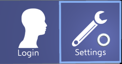
-
Notifications
You must be signed in to change notification settings - Fork 1
Buttons
Note that there is a template available which can be used to create buttons and menus based on the existing design.
The framework offers three types of buttons:
This button can display an icon and a text caption.
The FocusableButton button component realizes its behavior:
If the user focuses the button with the gaze cursor, the button gets highlighted by a frame.
Furthermore, the button reacts with a slight backwards-movement if the button is pressed down.
If the button is pressed, it moves backwards and stays pressed until the user releases the button. When placing the button, make sure that there is enough space behind the button so that it does not move behind another object or collider.

The check button is an extension of the standard button.
Additonally, it has an "LED" which can display a on/off state.
This state can be changed by pressing the button.
The functionality for this button is implemented in the FocusableCheckButton class.

The content button is an extension of the standard button.
It has a second text label where an additional value can be displayed, e.g. a user setting.
This functionality is implemented in the FocusableContentButton class.

The design guidelines are only relevant if the button is designed from scratch while using the button classes. However, this is not recommended as there is a template available which can be used as a starting point.
FocusableButton and all classes which inherit from this expect certain objects and naming conventions in order to manipulate the button in the correct way:
- Make sure that the button component, e.g.
FocusableButtonis placed on the game object which encapsulates all button components, i.e. on the main button object and not on any children. If you are using theButton Configurationcomponent, this will automatically take care of this.
The following child game objects of the button are used to realize functionalities.
FocusableButton or any of its child classes try to find them by their name.
The names of the game objects should match the names denoted here (including capitalization).
- Icon: This game object should contain a Sprite Renderer component in order to show the button's icon.
-
Caption: The caption game object should possess a Text Mesh component.
If the property
Captionon the button script is changed, the text is displayed on this text mesh. - Frame: The frame can be any game object but it is recommended to use a 9-patch sprite. The frame should be a highlight frame around the button. This game object is automatically activated if the user focuses the button and it is deactivated otherwise.
-
LED: This component is only used by the
FocusableCheckButton. If its propertyButtonCheckedis altered, the script changes the emissive value of the game object's material. Thus, the game object should possess an assigned material. -
Content: Similarly, to Caption, this game object requires a Text Mesh component.
It is only used by the
FocusableContentButtonto display the string which is stored in theContentproperty.