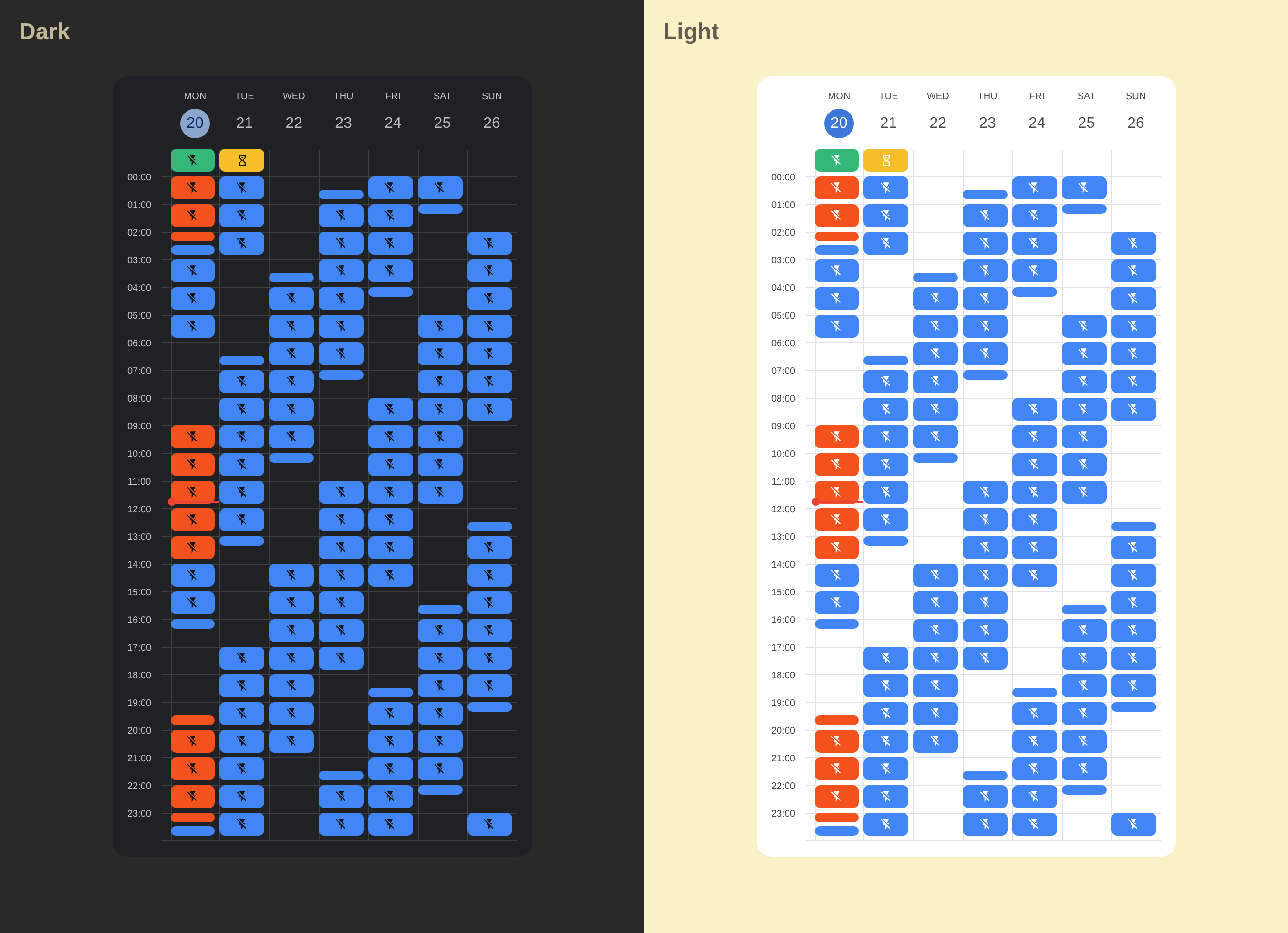
A custom Home Assistant card that displays calendar events in a week grid format. Check out the Demo
The easiest way to install Calendar Week Grid Card is via HACS (Home Assistant Community Store).

If it doesn't work, add this repository to HACS manually:
- Ensure HACS is installed in Home Assistant.
- Go to HACS → 3 dots (top right) → Custom Repositories.
- Add this repository:
https://github.com/smithumble/ha-calendar-week-grid-cardas typeDashboard - Install Calendar Week Grid Card from HACS.
- Clear your browser cache and reload Home Assistant.
Manual Installation Steps
- Download the latest release: calendar-week-grid-card.js
- Place it in your
wwwfolder (e.g./config/www/calendar-week-grid-card.js). - Add a reference to
calendar-week-grid-card.js.
There are two ways to add a reference:
- Go to Settings → Dashboards → 3 dots (top right) → Resources.
[!NOTE] If you do not see the Resources Tab, you will need to enable Advanced Mode in your User Profile.
- Click the Add Resource button.
- Set Url to
/local/calendar-week-grid-card.js?v=1.
[!NOTE] After any update of the file you will have to edit
/local/calendar-week-grid-card.js?v=1and change the version to any higher number.
- Set Resource type to
JavaScript module.
Add the resource to your yaml configuration:
url: /local/calendar-week-grid-card.js
type: moduleThis card supports Home Assistant's visual editor, providing an intuitive interface to configure all card options without writing YAML.
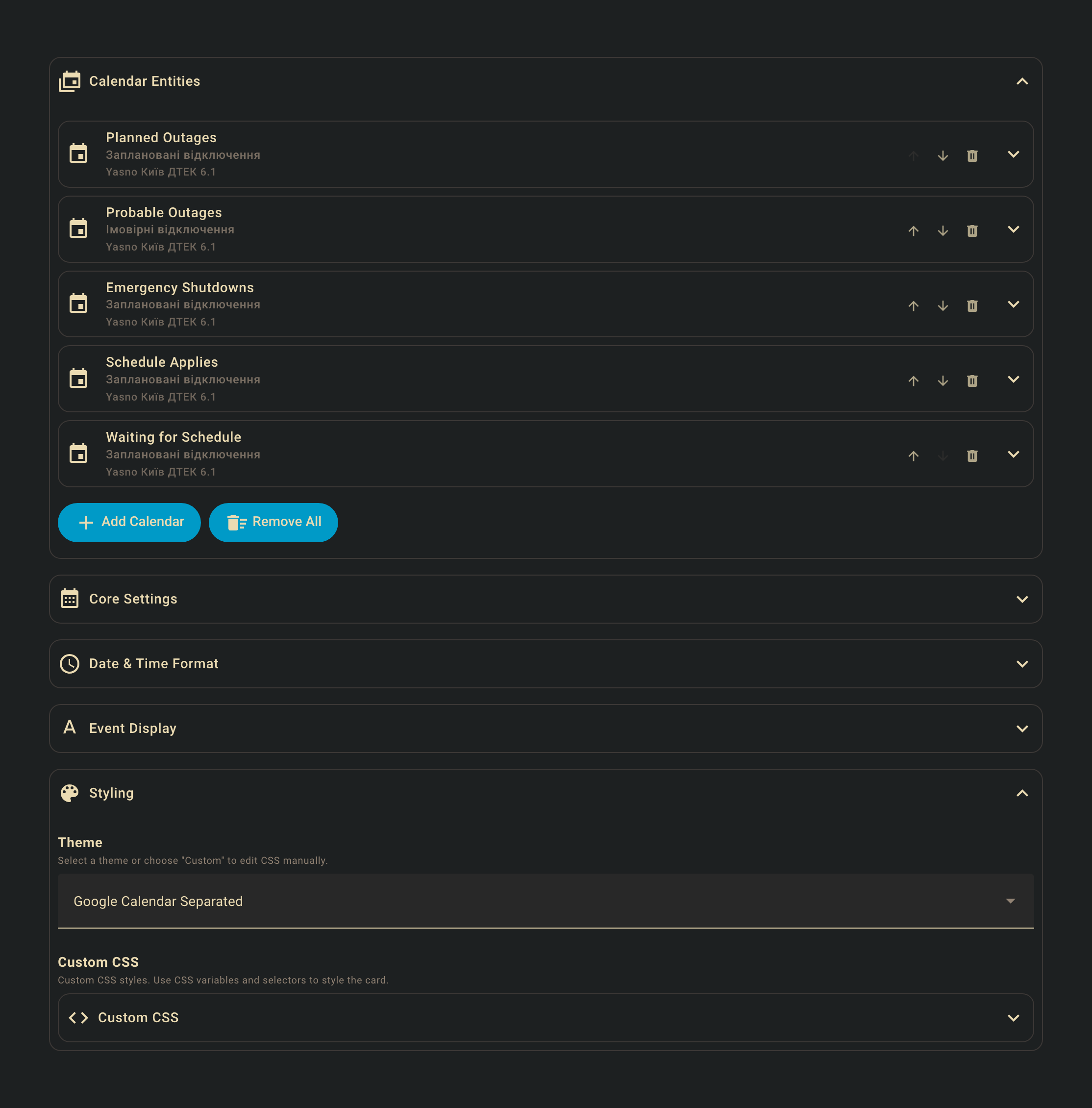
Simply click the Configure button when editing your dashboard to access the visual editor.
The editor allows you to:
- Add and configure calendar entities
- Customize date and time formats
- Set up event styling and icons
- Configure theme variables
- Adjust display options like week start, days shown, and theme mode
All configuration options available in YAML are accessible through the visual editor interface.
YAML Configuration Options
| Name | Type | Required | Description |
|---|---|---|---|
type |
string | Yes | custom:calendar-week-grid-card |
entities |
list | Yes | List of calendar entities or objects. |
language |
string | No | Language code for days (e.g., en, fr). |
primary_date_format |
object | No | Primary date format options for day headers. Default: { weekday: 'short' }. See Date Format. |
secondary_date_format |
object | No | Secondary date format options for day headers (displayed below primary). Optional. See Date Format. |
time_format |
string/object | No | Time format pattern (string) or options (object). Default: h A (string) or { hour: 'numeric' } (object). See Time Format. |
time_range |
boolean | No | Display time as a range (e.g., "09 - 10" instead of "09"). Default: false. |
start_hour |
number | No | First hour to display (0-23). Default: 0. |
end_hour |
number | No | Last hour to display (0-23). Default: 24. |
filter |
string | No | Global filter text for event summary. |
icons_container |
string | No | Where to render icons: cell (in the cell) or event (in event blocks). Default: cell. |
icons_mode |
string | No | Which events show icons: top (only main event) or all (all events). Default: top. |
event |
object | No | Default event configuration with icon and theme_values. See Event Configuration. |
blank_event |
object | No | Configuration for cells with no events with icon and theme_values. See Event Configuration. |
blank_all_day_event |
object | No | Configuration for all-day cells with no events with icon and theme_values. See Event Configuration. |
all_day |
string | No | Where to display all-day events: grid (in the grid), row (in a separate row), or both (in both the grid and a separate row). Default: grid. |
all_day_label |
string | No | Label text for the all-day row in the time column. Default: empty string. |
theme_variables |
object | No | Theme variables definition for the visual editor. See Theme Variables. |
theme_values_examples |
array | No | Example theme values for the visual editor. See Theme Variables. |
week_start |
string | No | Day of the week to start the calendar: today, sunday, monday, tuesday, wednesday, thursday, friday, or saturday. Default: today. |
days |
number | No | Number of days to display. Default: 7. |
css |
string | No | CSS styles for the card. |
The primary_date_format and secondary_date_format options use Intl.DateTimeFormatOptions to format day headers. The primary format is displayed as the main label, and the secondary format (if provided) is displayed below it in smaller text.
Default: { weekday: 'short' } (e.g., "Mon", "Tue", "Wed")
Optional. Displayed below the primary format.
weekday:'narrow'|'short'|'long'- Day of week (e.g., "M", "Mon", "Monday")day:'numeric'|'2-digit'- Day of month (e.g., "15", "05")month:'numeric'|'2-digit'|'narrow'|'short'|'long'- Month (e.g., "3", "03", "M", "Mar", "March")year:'numeric'|'2-digit'- Year (e.g., "2024", "24")
# Primary: weekday, Secondary: day and month
primary_date_format:
  weekday: 'short'
secondary_date_format:
  day: 'numeric'
  month: 'short'
# Results: "Mon" (primary), "15 Jan" (secondary)

# Primary: long weekday, Secondary: full date
primary_date_format:
  weekday: 'long'
secondary_date_format:
  day: 'numeric'
  month: 'long'
  year: 'numeric'
# Results: "Monday" (primary), "15 January 2024" (secondary)The time_format option supports two formats:
Custom pattern with tokens. Default: h A.
Available tokens:
H: Hour (0-23)HH: Hour (00-23)h: Hour (1-12)hh: Hour (01-12)m: Minute (0-59)mm: Minute (00-59)a: am/pmA: AM/PM
Examples:
time_format: "h A"→9 AMtime_format: "HH:mm"→09:00time_format: "hh:mm A"→09:00 AM
Uses Intl.DateTimeFormatOptions for locale-aware formatting. Default: { hour: 'numeric' }
Available options:
hour:'numeric'|'2-digit'- Hour formatminute:'numeric'|'2-digit'- Minute formatsecond:'numeric'|'2-digit'- Second formathour12:true|false- 12-hour vs 24-hour format
Examples:
# 12-hour format with AM/PM
time_format:
  hour: 'numeric'
  hour12: true
# Results: "9 AM", "3 PM" (locale-aware)

# 24-hour format with minutes
time_format:
  hour: '2-digit'
  minute: '2-digit'
# Results: "09:00", "15:00"

# 12-hour format with minutes
time_format:
  hour: 'numeric'
  minute: '2-digit'
  hour12: true
# Results: "9:00 AM", "3:00 PM"When time_range: true is set, time labels are displayed as ranges showing the current hour and the next hour (e.g., "09 - 10" for the 9:00-10:00 time slot).
Note: When using object format with time_range, if hour12 is not explicitly set, it will default to 24-hour format (hour12: false) for consistency.
Examples:
# 24-hour range format (default for ranges)
time_format:
  hour: '2-digit'
time_range: true
# Results: "00 - 01", "09 - 10", "15 - 16"

# Explicit 24-hour range format
time_format:
  hour: '2-digit'
  hour12: false
time_range: true
# Results: "00 - 01", "09 - 10", "15 - 16"

# 12-hour range format (must explicitly set hour12: true)
time_format:
  hour: 'numeric'
  hour12: true
time_range: true
# Results: "12 AM - 1 AM", "9 AM - 10 AM", "3 PM - 4 PM"

# String format with range
time_format: 'HH'
time_range: true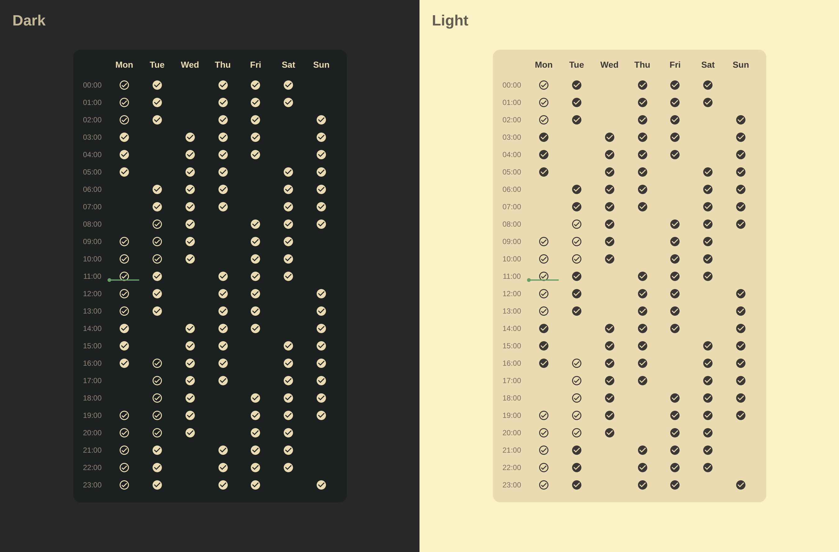
# Results: "00 - 01", "09 - 10", "15 - 16"The event, blank_event, and blank_all_day_event options allow you to configure default event styling and icons.
| Name | Type | Description |
|---|---|---|
icon |
string | Icon for the event type. |
theme_values |
object | Theme values to apply. These can reference variables defined in theme_variables. |
# Default event configuration
event:
  icon: mdi:check-circle
  theme_values:
    color: var(--primary-color)
    opacity: 0.2

# Blank event (cells with no events)
blank_event:
  icon: mdi:checkbox-blank-circle-outline
  theme_values:
    icon-opacity: 0.3
    opacity: 0
    border-opacity: 0.3

# Blank all-day event
blank_all_day_event:
icon: mdi:checkbox-blank-circleThe theme_variables and theme_values_examples options are used by the visual editor to provide a user-friendly interface for customizing event appearance.
Define custom variables that can be used in theme_values. Each variable can have a name and description for the editor.
theme_variables:
  color:
    name: Event Color
    description: The color of the event.
  opacity:
    name: Opacity
    description: The opacity of the event background (0.1 to 1.0).
  border-style:
    name: Border Style
description: The border style of the event (solid, dashed, dotted, double).Provide example configurations that the visual editor can use as presets.
theme_values_examples:
  - color: var(--error-color)
    opacity: 0.1
    border-style: solid
  - color: var(--warning-color)
    opacity: 0.1
border-style: dashed| Name | Type | Required | Description |
|---|---|---|---|
name |
string | No | Friendly name for the entity. |
entity |
string | Yes | The entity_id of the calendar. |
filter |
string | No | Filter text for events. |
icon |
string | No | Icon for the entity. |
type |
string | No | Type identifier for the entity. |
theme_values |
object | No | Theme values to apply. These can reference variables defined in theme_variables. |
under |
array | No | Events to render underneath this one. See Event Layering. |
over |
array | No | Events to render on top of this one. See Event Layering. |
hide |
array | No | Events to hide when this event is present. See Event Hiding. |
Event elements (.event-wrapper and .event-icon) include the following data attributes that can be used for CSS styling:
| Attribute | Description |
|---|---|
data-name |
The friendly name from the entity configuration. |
data-entity |
The entity_id of the calendar. |
data-filter |
The filter text for events. |
data-type |
The type identifier from the entity configuration. |
The under and over options allow you to control the rendering order (z-index) of overlapping events. Events are matched using OR logic - if an event matches any of the criteria in the list, it will be repositioned.
Each item in under or over can be:
- A string: Treated as a
namematch - An object with one or more of:
name: Match by entity nametype: Match by entity typeentity: Match by entity IDfilter: Match by filter text
Events matching under criteria that appear after the current event will be moved before it, rendering them underneath (behind) the current event.
Events matching over criteria that appear before the current event will be moved after it, rendering them on top (in front) of the current event.
The hide option allows you to hide specific events when the current event is present in the same cell. Events are matched using OR logic - if an event matches any of the criteria in the list, it will be removed from the display.
Each item in hide can be:
- A string: Treated as a
namematch - An object with one or more of:
name: Match by entity nametype: Match by entity typeentity: Match by entity IDfilter: Match by filter text
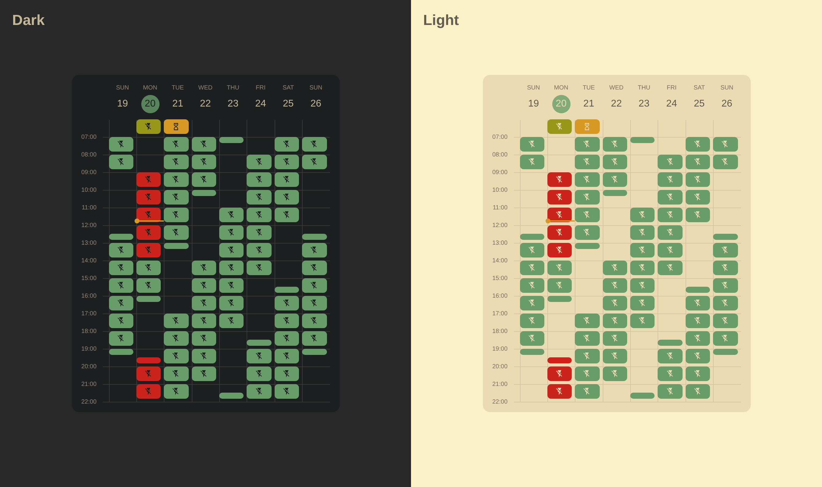
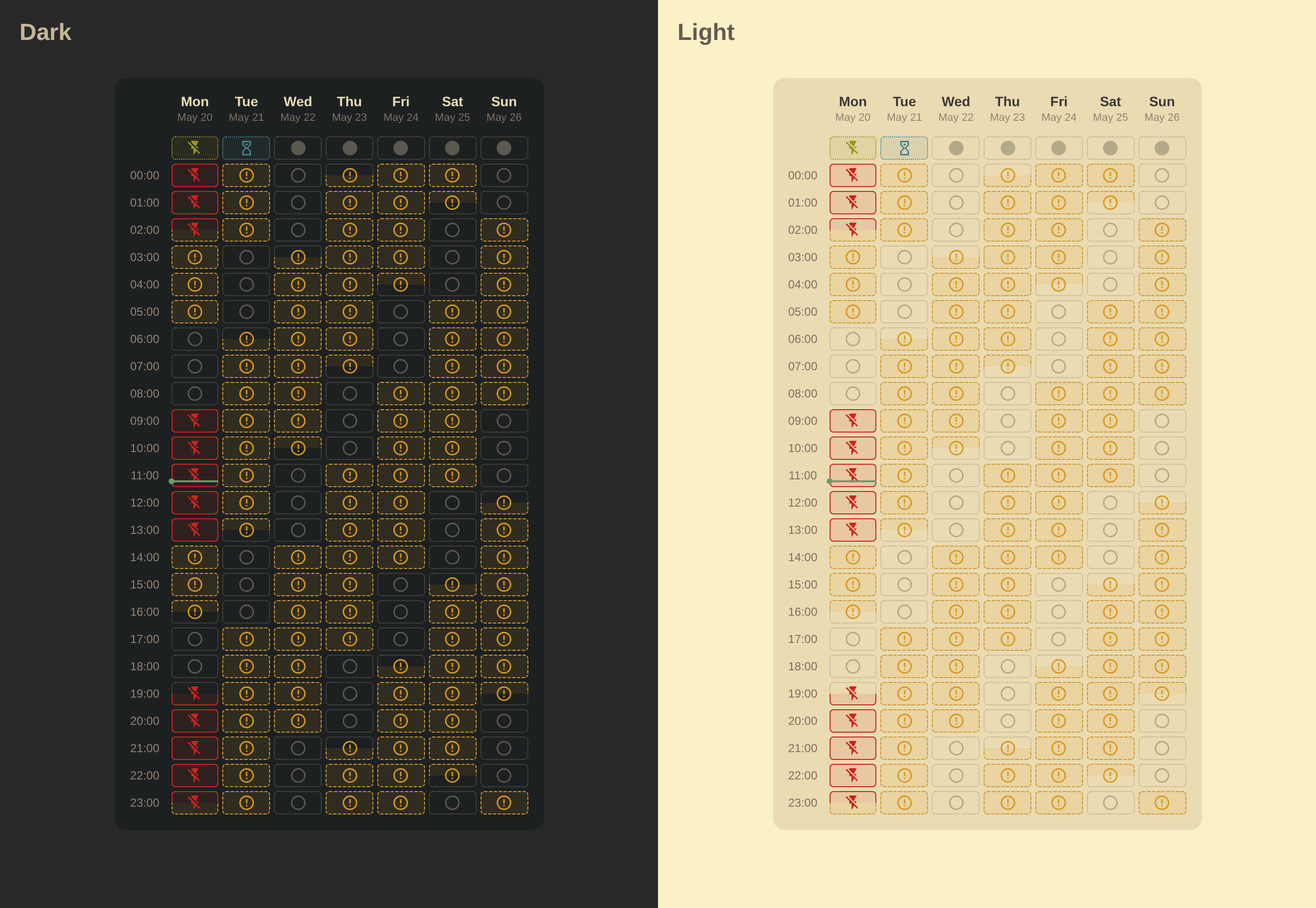
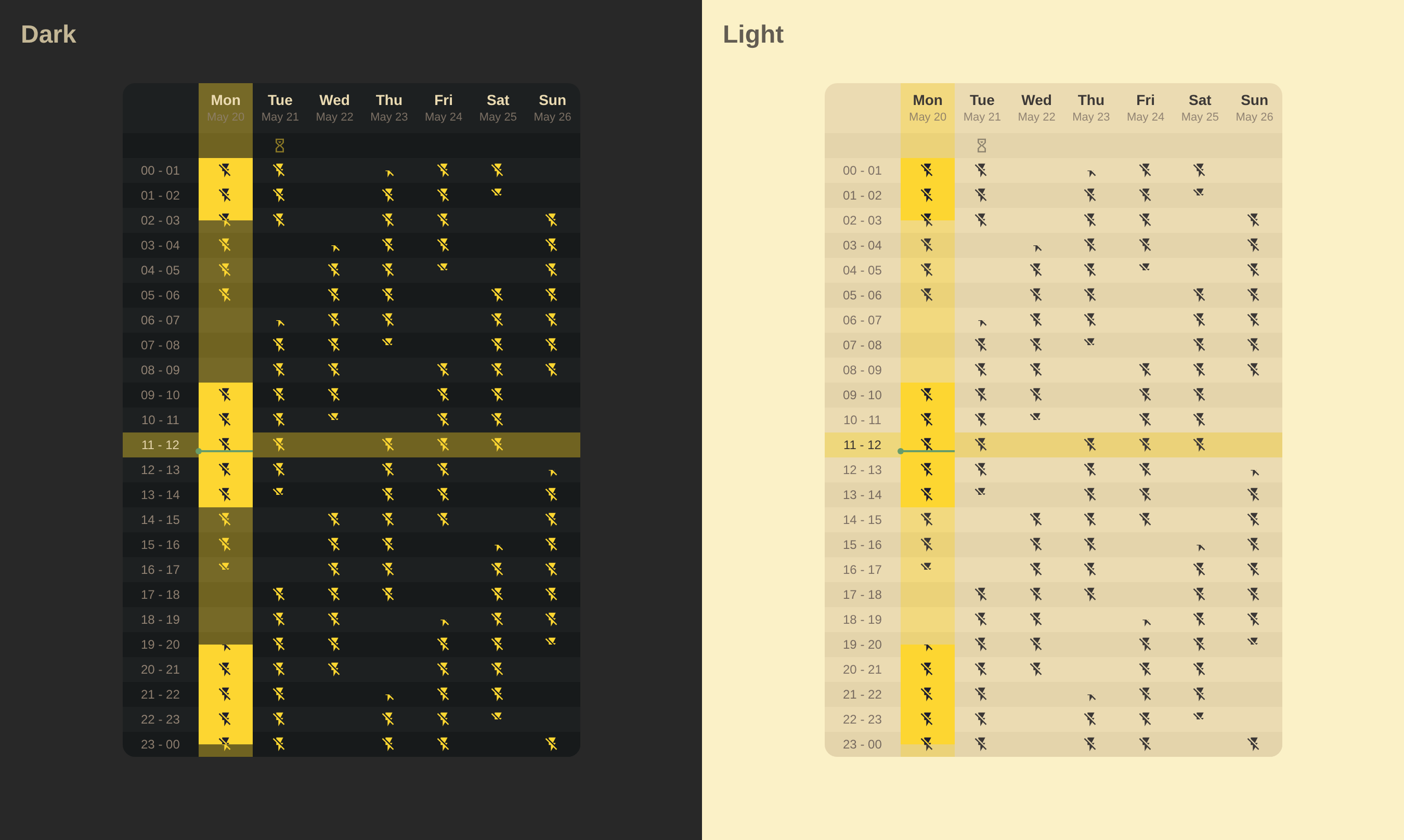
Themes from those examples are available in Visual Editor -> Styling -> Theme or can be configured via the YAML Editor.
Note
The examples use the HA Yasno Outages integration calendar, which shows outages in Ukraine caused by Russian attacks on civilian and energy infrastructure during the invasion of Ukraine.
YAML Configuration
type: custom:calendar-week-grid-card
language: en
time_format:
  hour: 2-digit
  minute: 2-digit
  hour12: false
time_range: false
icons_mode: top
icons_container: cell
entities:
  - name: Planned Outages
    entity: calendar.planned_outages
    filter: Outage
    icon: mdi:check-circle-outline
  - name: Probable Outages
    entity: calendar.probable_outages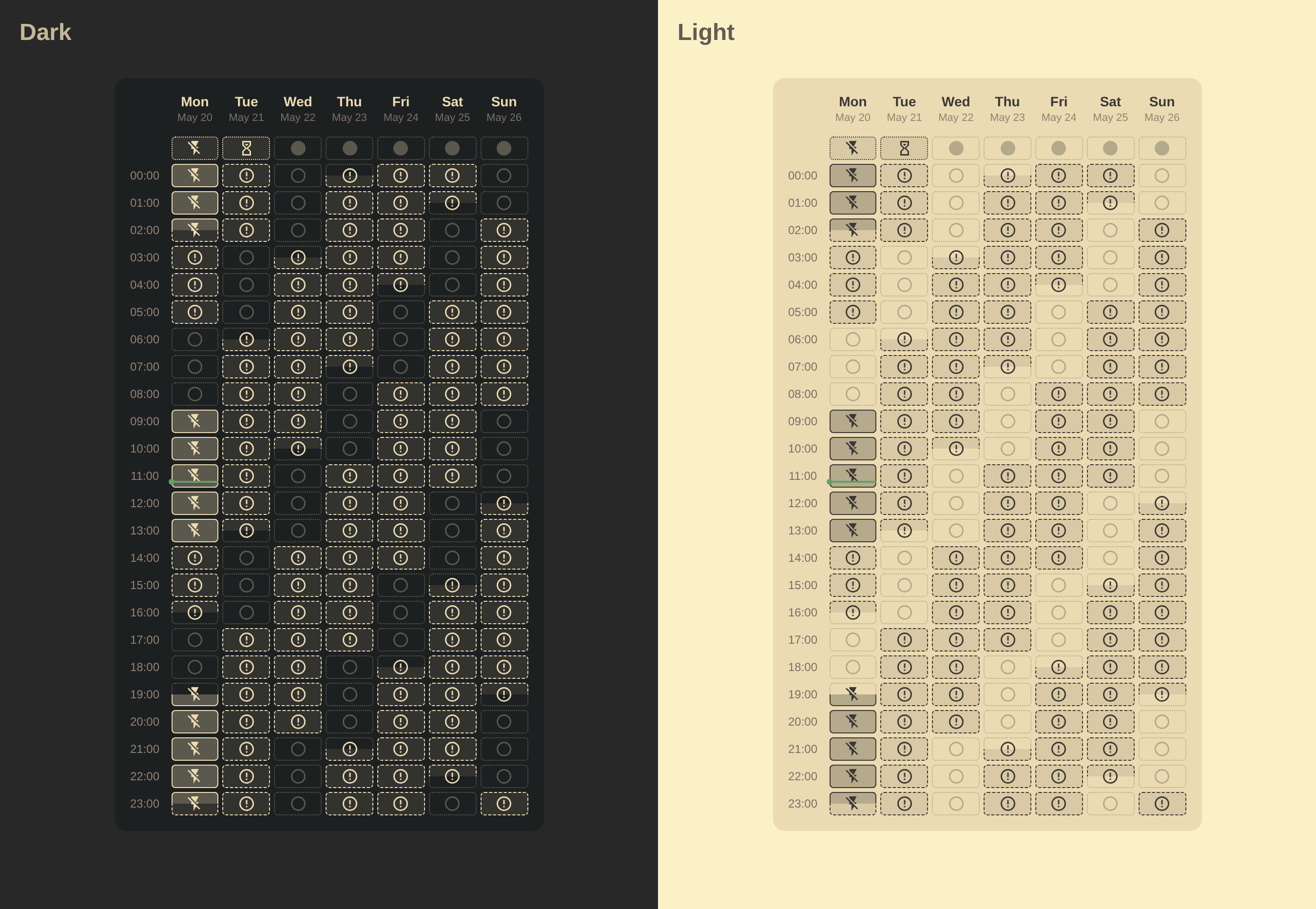
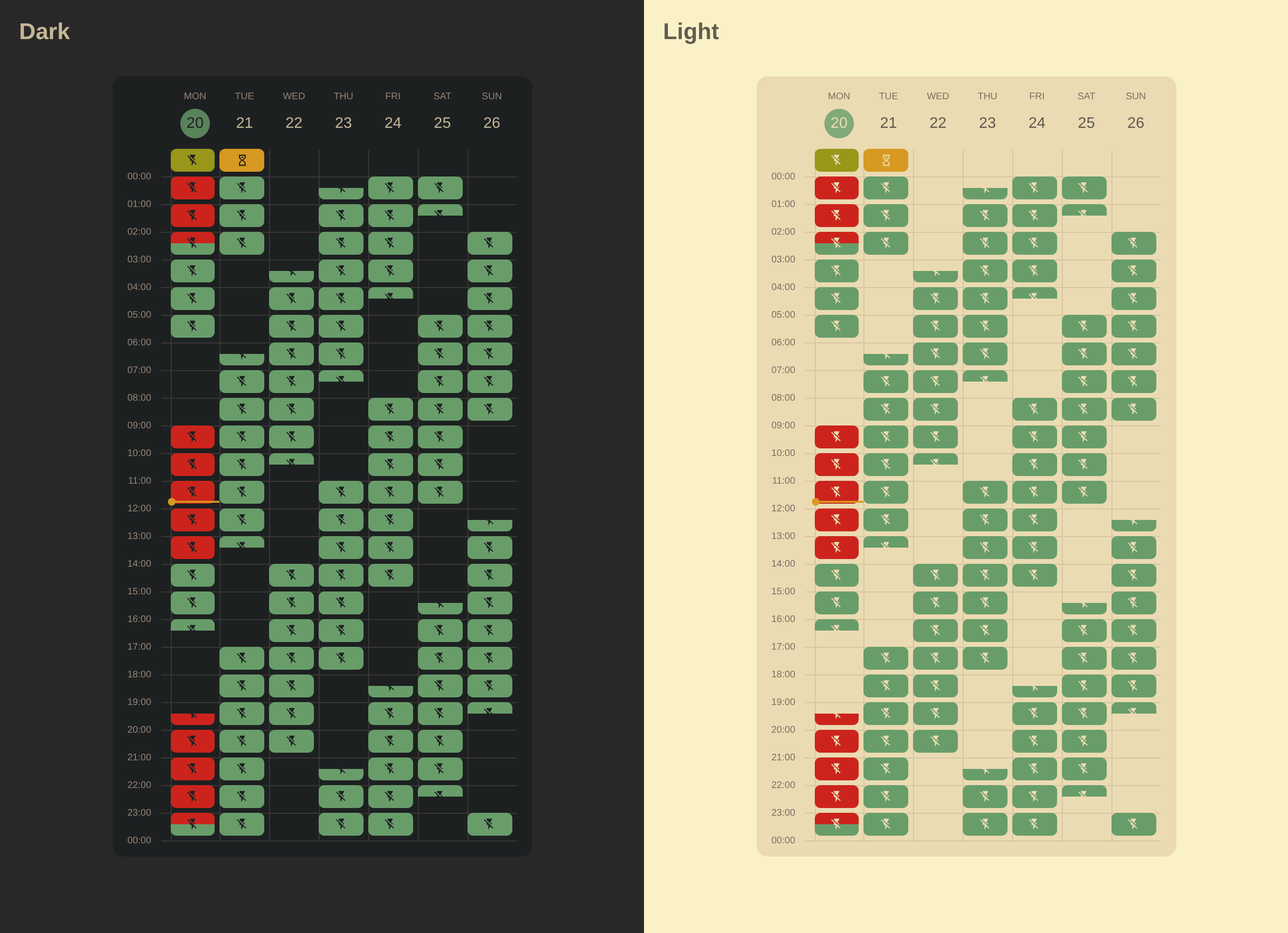
YAML Configuration
type: custom:calendar-week-grid-card
primary_date_format:
  weekday: short
secondary_date_format:
  day: numeric
  month: short
time_format:
  hour: 2-digit
  minute: 2-digit
  hour12: false
time_range: false
icons_mode: top
icons_container: cell
all_day: row
theme_variables:
  icon-opacity:
    name: Icon Opacity
    description: The opacity of the event icon (0.0 to 1.0).
  opacity:
    name: Opacity
    description: The opacity of the event background (0.1 to 1.0).
  border-opacity:
    name: Border Opacity
    description: The opacity of the event border (0.0 to 1.0).
  border-style:
    name: Border Style
    description: The border style of the event (solid, dashed, dotted, double).
blank_event:
  icon: mdi:checkbox-blank-circle-outline
  theme_values:
    icon-opacity: 0.3
    opacity: 0
    border-opacity: 0.3
blank_all_day_event:
  icon: mdi:checkbox-blank-circle
entities:
  - name: Planned Outages
    entity: calendar.planned_outages
    filter: Outage
    icon: mdi:flash-off
    theme_values:
      opacity: 0.3
      border-style: solid
  - name: Probable Outages
    entity: calendar.probable_outages
    icon: mdi:alert-circle-outline
    theme_values:
      opacity: 0.1
      border-style: dashed
  - name: Emergency Shutdowns
    entity: calendar.planned_outages
    filter: Emergency Shutdowns
    icon: mdi:transmission-tower-off
    theme_values:
      opacity: 0.2
      border-style: double
  - name: Schedule Applies
    entity: calendar.planned_outages
    filter: Schedule Applies
    icon: mdi:flash-off
    theme_values:
      opacity: 0.1
      border-style: dotted
  - name: Waiting for Schedule
    entity: calendar.planned_outages
    filter: Waiting for Schedule
    icon: mdi:timer-sand
    theme_values:
      opacity: 0.1
      border-style: dotted
    hide:
      - Planned Outages
css: |
  .event-block {
    border-radius: 4px;
    border: 1px var(--border-style, dotted) rgb(from var(--primary-text-color) r g b / var(--border-opacity, 1.0));
  }

  .event-icon {
    opacity: var(--icon-opacity, 1.0);
  }

  .event-sub-block {
    background-color: rgb(from var(--primary-text-color) r g b / var(--opacity, 0.1));
  }
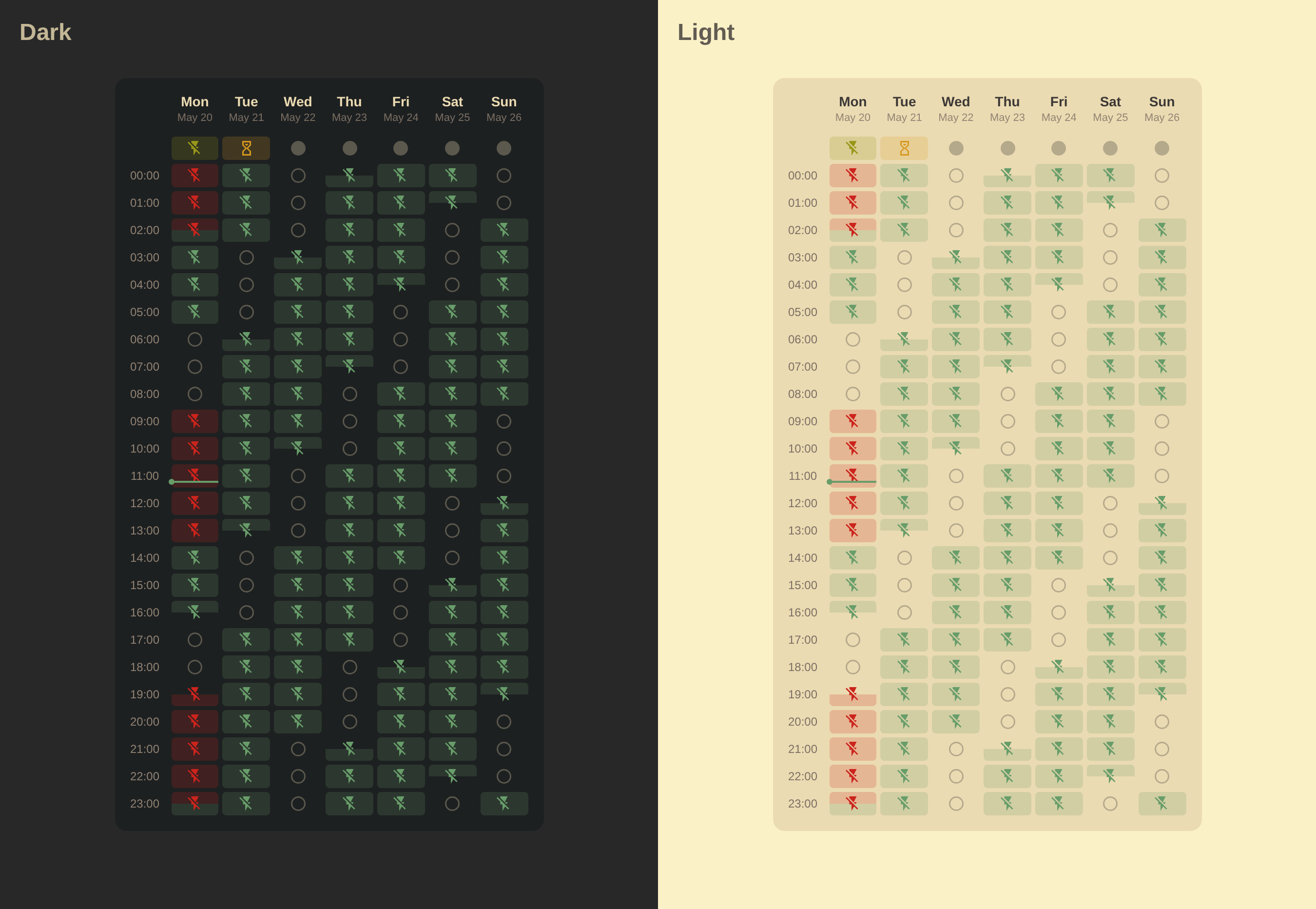
YAML Configuration
type: custom:calendar-week-grid-card
primary_date_format:
  weekday: short
secondary_date_format:
  day: numeric
  month: short
time_format:
  hour: 2-digit
  minute: 2-digit
  hour12: false
time_range: false
icons_mode: top
icons_container: cell
all_day: row
theme_variables:
  icon-opacity:
    name: Icon Opacity
    description: The opacity of the event icon (0.0 to 1.0).
  color:
    name: Event Color
    description: The color of the event.
  opacity:
    name: Opacity
    description: The opacity of the event background (0.1 to 1.0).
  border-style:
    name: Border Style
    description: The border style of the event (solid, dashed, dotted, double).
  border-opacity:
    name: Border Opacity
    description: The opacity of the event border (0.0 to 1.0).
blank_event:
  icon: mdi:checkbox-blank-circle-outline
  theme_values:
    icon-opacity: 0.3
    opacity: 0
    border-opacity: 0.3
blank_all_day_event:
  icon: mdi:checkbox-blank-circle
entities:
  - name: Planned Outages
    entity: calendar.planned_outages
    filter: Outage
    icon: mdi:flash-off
    theme_values:
      color: var(--error-color)
      opacity: 0.1
      border-style: solid
  - name: Probable Outages
    entity: calendar.probable_outages
    icon: mdi:alert-circle-outline
    theme_values:
      color: var(--warning-color)
      opacity: 0.1
      border-style: dashed
  - name: Emergency Shutdowns
    entity: calendar.planned_outages
    filter: Emergency Shutdowns
    icon: mdi:transmission-tower-off
    theme_values:
      color: var(--error-color)
      opacity: 0.2
      border-style: double
  - name: Schedule Applies
    entity: calendar.planned_outages
    filter: Schedule Applies
    icon: mdi:flash-off
    theme_values:
      color: var(--success-color)
      opacity: 0.1
      border-style: dotted
  - name: Waiting for Schedule
    entity: calendar.planned_outages
    filter: Waiting for Schedule
    icon: mdi:timer-sand
    theme_values:
      color: var(--info-color)
      opacity: 0.1
      border-style: dotted
    hide:
      - Planned Outages
css: |
  .event-block {
    border-radius: 4px;
    border: 1px var(--border-style, dotted) rgb(from var(--color, var(--primary-text-color)) r g b / var(--border-opacity, 1.0));
  }

  .event-icon {
    color: var(--color, var(--primary-text-color));
    opacity: var(--icon-opacity, 1.0);
  }

  .event-sub-block {
    background-color: rgb(from var(--color, var(--primary-text-color)) r g b / var(--opacity, 0.1));
  }
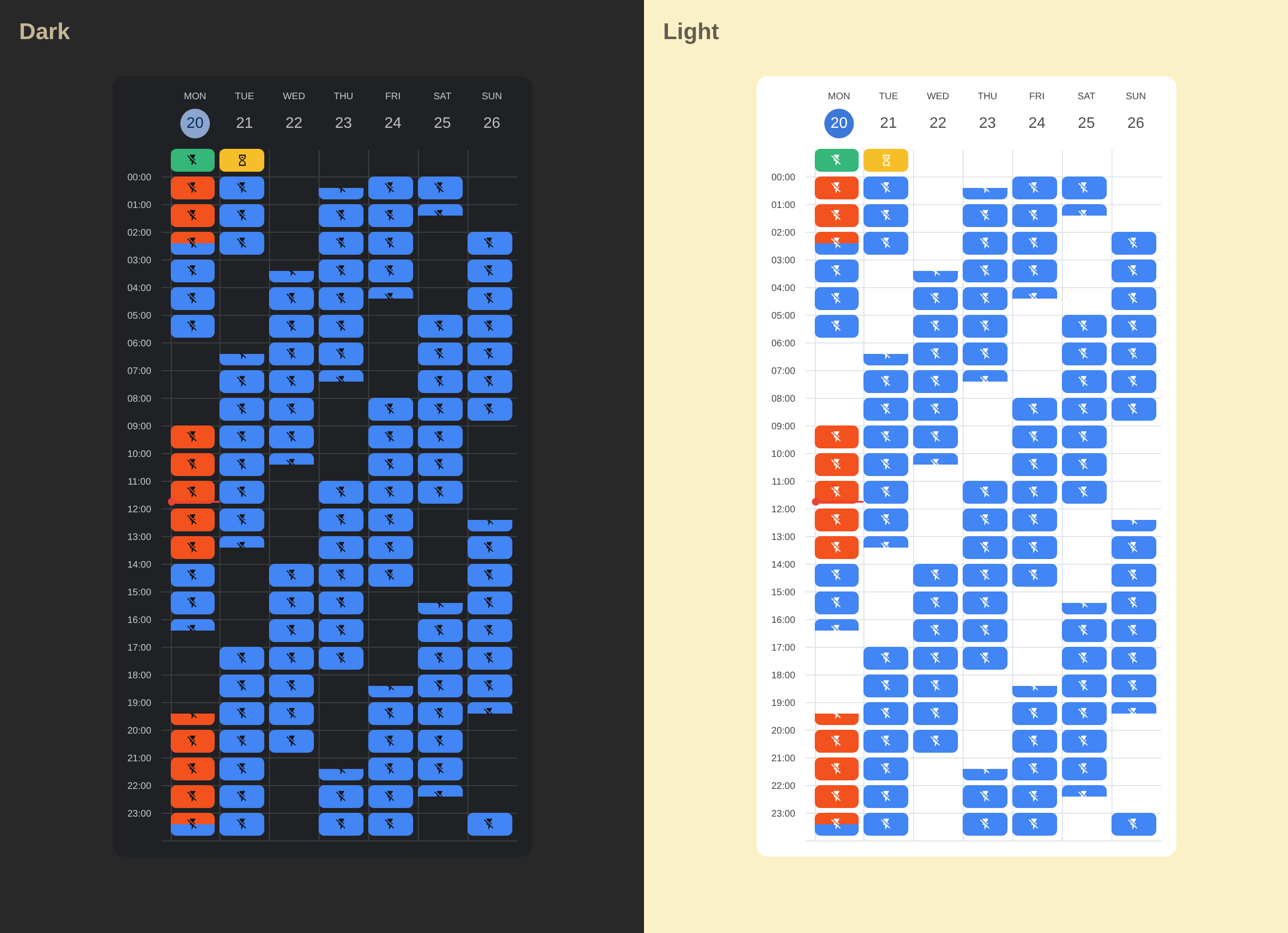
YAML Configuration
type: custom:calendar-week-grid-card
primary_date_format:
  weekday: short
secondary_date_format:
  day: numeric
  month: short
time_format:
  hour: 2-digit
  minute: 2-digit
  hour12: false
time_range: false
icons_mode: top
icons_container: cell
all_day: row
theme_variables:
  icon-opacity:
    name: Icon Opacity
    description: The opacity of the event icon (0.0 to 1.0).
  color:
    name: Event Color
    description: The color of the event.
  opacity:
    name: Opacity
    description: The opacity of the event background (0.1 to 1.0).
blank_event:
  icon: mdi:checkbox-blank-circle-outline
  theme_values:
    icon-opacity: 0.3
    opacity: 0
blank_all_day_event:
  icon: mdi:checkbox-blank-circle
entities:
  - name: Planned Outages
    entity: calendar.planned_outages
    filter: Outage
    icon: mdi:flash-off
    theme_values:
      color: var(--error-color)
      opacity: 0.2
  - name: Probable Outages
    entity: calendar.probable_outages
    icon: mdi:flash-off
    theme_values:
      color: var(--primary-color)
      opacity: 0.2
  - name: Emergency Shutdowns
    entity: calendar.planned_outages
    filter: Emergency Shutdowns
    icon: mdi:transmission-tower-off
    theme_values:
      color: var(--error-color)
      opacity: 0.4
  - name: Schedule Applies
    entity: calendar.planned_outages
    filter: Schedule Applies
    icon: mdi:flash-off
    theme_values:
      color: var(--success-color)
      opacity: 0.2
  - name: Waiting for Schedule
    entity: calendar.planned_outages
    filter: Waiting for Schedule
    icon: mdi:timer-sand
    theme_values:
      color: var(--warning-color)
      opacity: 0.2
    hide:
      - Planned Outages
css: |
  .event-block {
    border-radius: 4px;
  }

  .event-icon {
    color: var(--color, var(--primary-text-color));
    opacity: var(--icon-opacity, 1.0);
  }

  .event-sub-block {
    background-color: rgb(from var(--color, var(--primary-text-color)) r g b / var(--opacity, 0.2));
  }
YAML Configuration
type: custom:calendar-week-grid-card
primary_date_format:
  weekday: short
secondary_date_format:
  day: numeric
  month: short
time_format:
  hour: 2-digit
  minute: 2-digit
  hour12: false
time_range: false
icons_mode: top
icons_container: cell
all_day: row
theme_variables:
  icon-opacity:
    name: Icon Opacity
    description: The opacity of the event icon (0.0 to 1.0).
  color:
    name: Event Color
    description: The color of the event.
  opacity:
    name: Opacity
    description: The opacity of the event background (0.1 to 1.0).
  background:
    name: Background
    description: The background of the event (color or repeating-linear-gradient).
blank_event:
  icon: mdi:lightning-bolt
  theme_values:
    icon-opacity: 0.7
    color: var(--neon-green)
    opacity: 0.01
blank_all_day_event:
  icon: mdi:circle-outline
entities:
  - name: Planned Outages
    entity: calendar.planned_outages
    filter: Outage
    icon: mdi:flash-off
    theme_values:
      color: '#FF5252'
      opacity: 0.08
      background: 'repeating-linear-gradient(45deg, rgb(from #FF5252 r g b / 0.08), rgb(from #FF5252 r g b / 0.08) 10px, rgb(from #FF5252 r g b / 0.15) 10px, rgb(from #FF5252 r g b / 0.15) 20px)'
  - name: Probable Outages
    entity: calendar.probable_outages
    icon: mdi:alert-circle-outline
    theme_values:
      color: '#FF9800'
      opacity: 0.08
      background: 'repeating-linear-gradient(45deg, rgb(from #FF9800 r g b / 0.08), rgb(from #FF9800 r g b / 0.08) 10px, rgb(from #FF9800 r g b / 0.15) 10px, rgb(from #FF9800 r g b / 0.15) 20px)'
  - name: Emergency Shutdowns
    entity: calendar.planned_outages
    filter: Emergency Shutdowns
    icon: mdi:transmission-tower-off
    theme_values:
      color: '#FF8A80'
      opacity: 0.2
  - name: Schedule Applies
    entity: calendar.planned_outages
    filter: Schedule Applies
    icon: mdi:calendar-check
    theme_values:
      color: '#29B6F6'
      opacity: 0.05
  - name: Waiting for Schedule
    entity: calendar.planned_outages
    filter: Waiting for Schedule
    icon: mdi:timer-sand
    theme_values:
      color: '#90A4AE'
      opacity: 0.05
    hide:
      - Planned Outages
css: |
  ha-card {
    --neon-green: #00E676;
    --neon-green-shadow: rgba(0, 230, 118, 0.3);
    --icon-size: 18px;
  }

  .cell {
    height: 28px;
    border-radius: 6px;
  }

  .event-icon {
    color: var(--color, var(--primary-text-color));
    opacity: var(--icon-opacity, 1.0);
    filter: drop-shadow(0 0 2px rgb(from var(--color, var(--primary-text-color)) r g b / 0.3));
  }

  .event-wrapper .event-sub-block {
    background: var(--background, rgb(from var(--color, var(--primary-text-color)) r g b / var(--opacity, 0.1)));
  }
YAML Configuration
type: custom:calendar-week-grid-card
primary_date_format:
  weekday: short
secondary_date_format:
  day: numeric
  month: short
time_format:
  hour: 2-digit
  minute: 2-digit
  hour12: false
time_range: false
icons_container: event
icons_mode: all
all_day: row
theme_variables:
  color:
    name: Event Color
    description: The color of the event icon.
  background:
    name: Background
    description: The background color of the event.
blank_event:
  icon: mdi:circle-outline
  theme_values:
    color: '#E0E0E0'
    background: '#F5F5F5'
blank_all_day_event:
  icon: mdi:checkbox-blank-circle
entities:
  - name: Planned Outages
    entity: calendar.planned_outages
    filter: Outage
    icon: mdi:close-circle
    theme_values:
      color: '#FFFFFF'
      background: '#FF8A80'
  - name: Probable Outages
    entity: calendar.probable_outages
    icon: mdi:close-circle
    theme_values:
      color: '#1B5E20'
      background: '#B9F6CA'
  - name: Emergency Shutdowns
    entity: calendar.planned_outages
    filter: Emergency Shutdowns
    icon: mdi:alert-circle
    theme_values:
      color: '#FFFFFF'
      background: '#FF80AB'
  - name: Schedule Applies
    entity: calendar.planned_outages
    filter: Schedule Applies
    icon: mdi:circle-outline
    theme_values:
      color: '#F57F17'
      background: '#FFF176'
  - name: Waiting for Schedule
    entity: calendar.planned_outages
    filter: Waiting for Schedule
    icon: mdi:clock-outline
    theme_values:
      color: '#006064'
      background: '#80DEEA'
    hide:
      - Planned Outages
css: |
  ha-card {
    --text-color: #444;
    --text-primary: var(--text-color);
    --text-secondary: var(--text-color);
  }

  ha-card {
    background: #FFFFFF;
    border-radius: 24px;
    box-shadow: 0 8px 16px rgba(0,0,0,0.1);
  }

  .grid-container {
    gap: 8px;
  }

  .cell-wrapper {
    min-height: 28px;
  }

  .cell {
    height:34px;
    border-radius: 17px;
  }

  .event-icon {
    --icon-size: 20px;
    color: var(--color, var(--primary-text-color));
  }

  .event-block {
    background-color: var(--background, #F5F5F5);
  }
YAML Configuration
type: custom:calendar-week-grid-card
primary_date_format:
  weekday: short
secondary_date_format:
  day: numeric
  month: short
time_format:
  hour: 2-digit
  hour12: false
time_range: true
icons_container: event
icons_mode: all
all_day: row
theme_variables:
  color:
    name: Event Color
    description: The color of the event icon.
  background:
    name: Background
    description: The background color of the event.
  opacity:
    name: Opacity
    description: The opacity of the event icon (0.0 to 1.0).
blank_event:
  icon: null
  theme_values:
    opacity: 0.3
entities:
  - name: Planned Outages
    entity: calendar.planned_outages
    filter: Outage
    type: highlight
    icon: mdi:flash-off
    theme_values:
      color: var(--color-highlight-icon)
      background: var(--color-highlight)
  - name: Probable Outages
    entity: calendar.probable_outages
    icon: mdi:flash-off
    theme_values:
      color: var(--color-highlight-light-icon)
  - name: Emergency Shutdowns
    entity: calendar.planned_outages
    filter: Emergency Shutdowns
    icon: mdi:transmission-tower-off
  - name: Waiting for Schedule
    entity: calendar.planned_outages
    filter: Waiting for Schedule
    icon: mdi:timer-sand
    theme_values:
      color: var(--color-highlight-light-icon)
      opacity: 0.5
    hide:
      - Planned Outages
css: |
  ha-card {
    --color-highlight: #FDD631;
    --color-highlight-icon: #1e1e2e;
    --color-highlight-light: #FDD631;
    --color-highlight-light-icon: var(--primary-text-color);
    padding: 0;
  }

  ha-card.theme-dark {
    --color-highlight-light-icon: #FDD631;
  }

  .grid-container {
    gap: 0px;
  }

  .event-icon {
    --icon-size: 16px;
  }

  .event-block, .time-label {
    background-color: var(--card-background-color);
  }

  .time-label {
    padding: 0 18px;
  }

  .time-label.now {
    color: var(--primary-text-color);
  }

  .today, .now {
    &.day-header, &.time-label, .event-sub-block {
      background-color: rgb(from var(--color-highlight-light) r g b / 0.4);
    }
  }

  .event-block, .day-header {
    border-radius: 0px;
  }

  .event-icon {
    color: var(--color, var(--primary-text-color));
    opacity: var(--opacity, 1.0);
  }

  .event-block {
    background-color: var(--background, var(--card-background-color));
  }

  .grid-container > .row-odd {
    .event-wrapper:not([data-type="highlight"]) .event-block, .time-label {
      filter: contrast(1.05) brightness(0.95);
    }
  }
YAML Configuration
type: custom:calendar-week-grid-card
primary_date_format:
  weekday: short
secondary_date_format:
  day: numeric
time_format:
  hour: 2-digit
  minute: 2-digit
  hour12: false
time_range: true
icons_mode: all
icons_container: event
all_day: row
theme_variables:
  color:
    name: Event Color
    description: The color of the event.
blank_event:
  theme_values:
    color: transparent
entities:
  - name: Planned Outages
    entity: calendar.planned_outages
    filter: Outage
    icon: mdi:flash-off
    theme_values:
      color: var(--error-color)
  - name: Probable Outages
    entity: calendar.probable_outages
    icon: mdi:flash-off
    theme_values:
      color: var(--primary-color)
  - name: Emergency Shutdowns
    entity: calendar.planned_outages
    filter: Emergency Shutdowns
    icon: mdi:transmission-tower-off
    theme_values:
      color: var(--error-color)
  - name: Schedule Applies
    entity: calendar.planned_outages
    filter: Schedule Applies
    icon: mdi:flash-off
    theme_values:
      color: var(--success-color)
  - name: Waiting for Schedule
    entity: calendar.planned_outages
    filter: Waiting for Schedule
    icon: mdi:timer-sand
    theme_values:
      color: var(--warning-color)
    hide:
      - Planned Outages
css: |
  ha-card {
    --grid-bg: var(--card-background-color, #FFF);
    --grid-border-color: var(--divider-color, #dde3ea);
    --grid-primary-text-color: var(--primary-text-color, #1f1f1f);
    --grid-secondary-text-color: var(--secondary-text-color, #444746);
    --grid-event-text-color: var(--card-background-color, #fff);
    --grid-accent-color: var(--primary-color, #0b57d0);
    --grid-accent-text-color: var(--card-background-color, #fff);
  }

  ha-card.theme-dark {
    --grid-bg: var(--card-background-color, #202124);
    --grid-border-color: var(--divider-color, #3c4043);
    --grid-primary-text-color: var(--primary-text-color, #e3e3e3);
    --grid-secondary-text-color: var(--secondary-text-color, #c4c7c5);
    --grid-event-text-color: var(--card-background-color, #131314);
    --grid-accent-color: var(--primary-color, #a8c7fa);
    --grid-accent-text-color: var(--card-background-color, #062e6f);
  }

  ha-card {
    background-color: var(--grid-bg);
    font-family: 'Google Sans', Roboto, Arial, sans-serif;
  }

  /* Grid Styling */

  .grid-container {
    gap: 0px;
  }

  .time-label-wrapper::after {
    content: '';
    position: absolute;
    bottom: 0;
    right: 0;
    width: 10px;
  }

  .time-label-wrapper + .cell-wrapper,
  .cell-wrapper + .cell-wrapper,
  .time-label-wrapper::after {
    border-bottom: 1px solid var(--grid-border-color);
  }

  .time-label-wrapper + .cell-wrapper,
  .cell-wrapper + .cell-wrapper {
    border-left: 1px solid var(--grid-border-color);
    padding-right: 4px;
    padding-bottom: 4px;
  }

  .cell {
    position: relative;
    top: -1px;
    left: -1px;
    height: 24px;
  }

  .day-header {
    padding-bottom: 12px;
  }

  .day-header.today {
    color: var(--grid-accent-color);
  }

  .day-header-primary {
    text-transform: uppercase;
    font-size: 10px;
    font-weight: 500;
    color: var(--grid-secondary-text-color);
  }

  .day-header-secondary {
    position: relative;
    font-size: 16px;
    font-weight: 400;
    color: var(--grid-primary-text-color);
    display: flex;
    align-items: center;
    justify-content: center;
    text-align: center;
    margin-top: 4px;
    padding: 6px;
    aspect-ratio: 1/1;
    line-height: 1.2;
    min-width: fit-content;
  }

  .day-header.today .day-header-secondary {
    color: var(--grid-accent-text-color);
  }

  .day-header.today .day-header-secondary:before {
    content: '';
    position: absolute;
    z-index: -1;
    top: 0;
    left: 0;
    right: 0;
    bottom: 0;
    border-radius: 50%;
    background-color: var(--grid-accent-color);
  }

  .time-label-wrapper {
    position: relative;
  }

  .time-label {
    display: block;
    position: relative;
    font-size: 10px;
    line-height: 10px;
    color: var(--grid-secondary-text-color);
    padding-right: 0;
    margin-right: 20px;
    text-align: right;
  }

  .time-label-all-day {
    font-size: 8px;
  }

  .time-label-hour-separator {
    display: none;
  }

  .time-label-hour-start,
  .time-label-all-day,
  .time-label-hour-end {
    display: block;
  }

  .time-label-hour:not(.time-label-hour-end),
  .time-label-all-day {
    position: relative;
    top: -5px;
    right: 0;
  }

  .time-label-hour-end {
    position: absolute;
    right: 0;
    bottom: -5px;
  }

  .time-label-wrapper:has(~ .time-label-wrapper) .time-label-hour-end {
    visibility: hidden;
  }

  .event-block {
    border-radius: 6px;
  }

  /* Icons: Subtle placement */

  .event-icon {
    color: var(--grid-event-text-color);
    --icon-size: 14px;
  }

  /* Current Time Line */

  .current-time-line {
    background-color: var(--warning-color);
    height: 2px;
  }
  .current-time-circle {
    background-color: var(--warning-color);
    width: 8px;
    height: 8px;
    left: -4px;
    top: -3px;
  }

  /* Default Event Styles */

  .event-sub-block {
    background-color: var(--color, var(--grid-primary-text-color));
  }
YAML Configuration
type: custom:calendar-week-grid-card
primary_date_format:
  weekday: short
secondary_date_format:
  day: numeric
time_format:
  hour: 2-digit
  minute: 2-digit
  hour12: false
time_range: true
icons_mode: all
icons_container: event
all_day: row
theme_variables:
  color:
    name: Event Color
    description: The color of the event.
blank_event:
  theme_values:
    color: transparent
entities:
  - name: Planned Outages
    entity: calendar.planned_outages
    filter: Outage
    icon: mdi:flash-off
    theme_values:
      color: var(--error-color)
  - name: Probable Outages
    entity: calendar.probable_outages
    icon: mdi:flash-off
    theme_values:
      color: var(--primary-color)
  - name: Emergency Shutdowns
    entity: calendar.planned_outages
    filter: Emergency Shutdowns
    icon: mdi:transmission-tower-off
    theme_values:
      color: var(--error-color)
  - name: Schedule Applies
    entity: calendar.planned_outages
    filter: Schedule Applies
    icon: mdi:flash-off
    theme_values:
      color: var(--success-color)
  - name: Waiting for Schedule
    entity: calendar.planned_outages
    filter: Waiting for Schedule
    icon: mdi:timer-sand
    theme_values:
      color: var(--warning-color)
    hide:
      - Planned Outages
css: |
  ha-card {
    --grid-bg: var(--card-background-color, #FFF);
    --grid-border-color: var(--divider-color, #dde3ea);
    --grid-primary-text-color: var(--primary-text-color, #1f1f1f);
    --grid-secondary-text-color: var(--secondary-text-color, #444746);
    --grid-event-text-color: var(--card-background-color, #fff);
    --grid-accent-color: var(--primary-color, #0b57d0);
    --grid-accent-text-color: var(--card-background-color, #fff);
  }

  ha-card.theme-dark {
    --grid-bg: var(--card-background-color, #202124);
    --grid-border-color: var(--divider-color, #3c4043);
    --grid-primary-text-color: var(--primary-text-color, #e3e3e3);
    --grid-secondary-text-color: var(--secondary-text-color, #c4c7c5);
    --grid-event-text-color: var(--card-background-color, #131314);
    --grid-accent-color: var(--primary-color, #a8c7fa);
    --grid-accent-text-color: var(--card-background-color, #062e6f);
  }

  ha-card {
    background-color: var(--grid-bg);
    font-family: 'Google Sans', Roboto, Arial, sans-serif;
  }

  /* Grid Styling */

  .grid-container {
    gap: 0px;
  }

  .time-label-wrapper::after {
    content: '';
    position: absolute;
    bottom: 0;
    right: 0;
    width: 10px;
  }

  .time-label-wrapper + .cell-wrapper,
  .cell-wrapper + .cell-wrapper,
  .time-label-wrapper::after {
    border-bottom: 1px solid var(--grid-border-color);
  }

  .time-label-wrapper + .cell-wrapper,
  .cell-wrapper + .cell-wrapper {
    border-left: 1px solid var(--grid-border-color);
  }

  .cell {
    position: relative;
    top: -3px;
    left: -3px;
    height: 28px;
  }

  .day-header {
    padding-bottom: 12px;
  }

  .day-header.today {
    color: var(--grid-accent-color);
  }

  .day-header-primary {
    text-transform: uppercase;
    font-size: 10px;
    font-weight: 500;
    color: var(--grid-secondary-text-color);
  }

  .day-header-secondary {
    position: relative;
    font-size: 16px;
    font-weight: 400;
    color: var(--grid-primary-text-color);
    display: flex;
    align-items: center;
    justify-content: center;
    text-align: center;
    margin-top: 4px;
    padding: 6px;
    aspect-ratio: 1/1;
    line-height: 1.2;
    min-width: fit-content;
  }

  .day-header.today .day-header-secondary {
    color: var(--grid-accent-text-color);
  }

  .day-header.today .day-header-secondary:before {
    content: '';
    position: absolute;
    z-index: -1;
    top: 0;
    left: 0;
    right: 0;
    bottom: 0;
    border-radius: 50%;
    background-color: var(--grid-accent-color);
  }

  .time-label-wrapper {
    position: relative;
  }

  .time-label {
    display: block;
    position: relative;
    font-size: 10px;
    line-height: 10px;
    color: var(--grid-secondary-text-color);
    padding-right: 0;
    margin-right: 20px;
    text-align: right;
  }

  .time-label-all-day {
    font-size: 8px;
  }

  .time-label-hour-separator {
    display: none;
  }

  .time-label-hour-start,
  .time-label-all-day,
  .time-label-hour-end {
    display: block;
  }

  .time-label-hour:not(.time-label-hour-end),
  .time-label-all-day {
    position: relative;
    top: -5px;
    right: 0;
  }

  .time-label-hour-end {
    position: absolute;
    right: 0;
    bottom: -5px;
  }

  .time-label-wrapper:has(~ .time-label-wrapper) .time-label-hour-end {
    visibility: hidden;
  }

  .event-sub-block {
    padding: 2px;
  }

  .event-sub-block:after {
    content: '';
    display: block;
    width: 100%;
    height: 100%;
    border-radius: 6px;
  }

  /* Icons: Subtle placement */

  .event-icon {
    color: var(--grid-event-text-color);
    --icon-size: 14px;
  }

  .event-wrapper:has(.event-sub-block:not([style*="top: 0%;"][style*="height: 100%;"])) .event-icon-overlay {
    display: none;
  }

  /* Current Time Line */

  .current-time-line {
    background-color: var(--warning-color);
    height: 2px;
  }
  .current-time-circle {
    background-color: var(--warning-color);
    width: 8px;
    height: 8px;
    left: -4px;
    top: -3px;
  }

  /* Default Event Styles */

  .event-sub-block:after {
    background-color: var(--color, var(--grid-primary-text-color));
  }
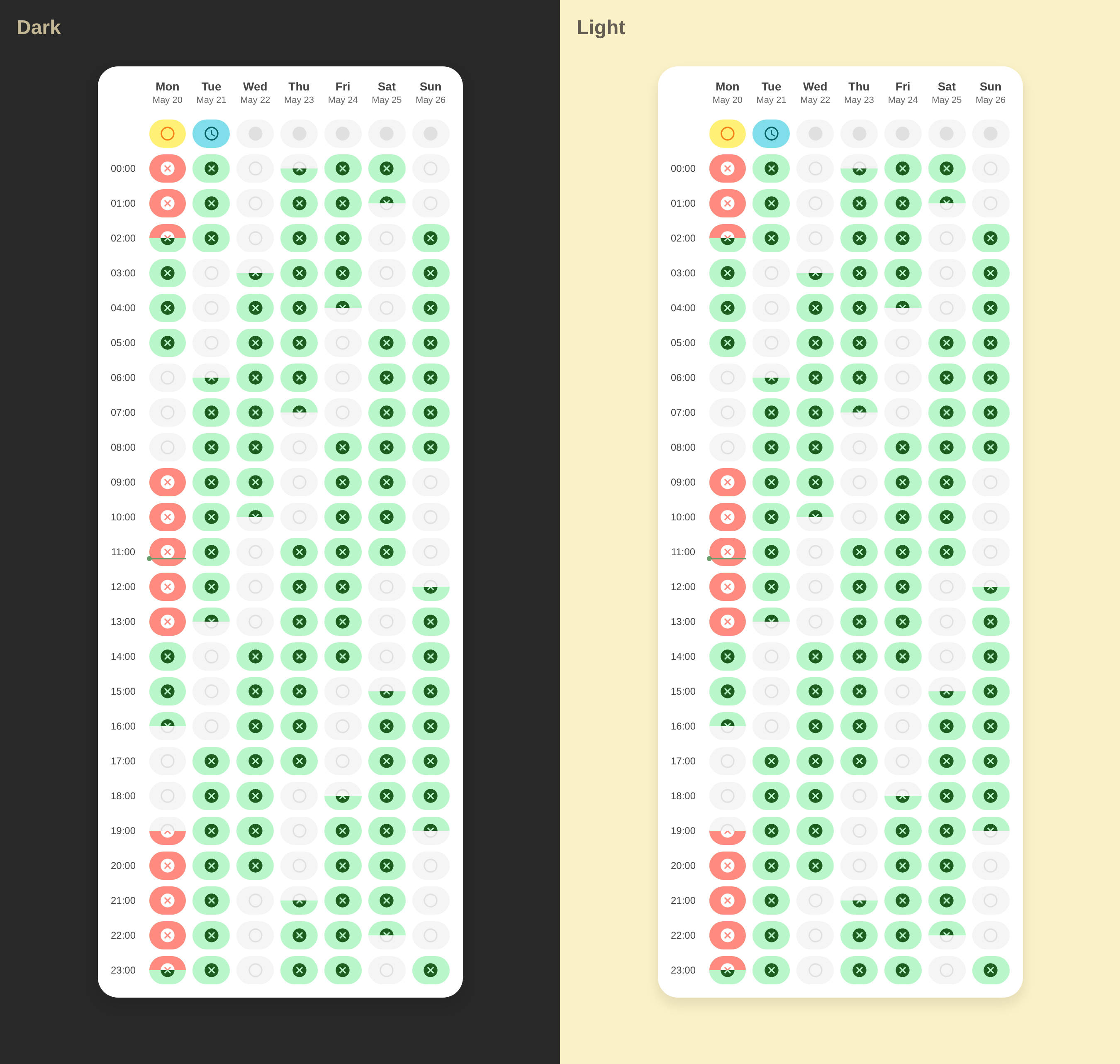
YAML Configuration
type: custom:calendar-week-grid-card
primary_date_format:
  weekday: short
secondary_date_format:
  day: numeric
time_format:
  hour: 2-digit
  minute: 2-digit
  hour12: false
time_range: false
icons_mode: all
icons_container: event
all_day: row
theme_variables:
  color:
    name: Event Color
    description: The color of the event.
blank_event:
  theme_values:
    color: transparent
entities:
  - name: Planned Outages
    entity: calendar.planned_outages
    filter: Outage
    icon: mdi:flash-off
    theme_values:
      color: '#F3511E'
  - name: Probable Outages
    entity: calendar.probable_outages
    icon: mdi:flash-off
    theme_values:
      color: '#4285F4'
  - name: Emergency Shutdowns
    entity: calendar.planned_outages
    filter: Emergency Shutdowns
    icon: mdi:transmission-tower-off
    theme_values:
      color: '#D40101'
  - name: Schedule Applies
    entity: calendar.planned_outages
    filter: Schedule Applies
    icon: mdi:flash-off
    theme_values:
      color: '#34B779'
  - name: Waiting for Schedule
    entity: calendar.planned_outages
    filter: Waiting for Schedule
    icon: mdi:timer-sand
    theme_values:
      color: '#F6BE28'
    hide:
      - Planned Outages
css: |
  ha-card {
    --grid-bg: #FFF;
    --grid-border-color: #dde3ea;
    --grid-primary-text-color: #1f1f1f;
    --grid-secondary-text-color: #444746;
    --grid-event-text-color: #fff;
    --grid-accent-color: #0b57d0;
    --grid-accent-text-color: #fff;
  }

  ha-card.theme-dark {
    --grid-bg: #202124;
    --grid-border-color: #3c4043;
    --grid-primary-text-color: #e3e3e3;
    --grid-secondary-text-color: #c4c7c5;
    --grid-event-text-color: #131314;
    --grid-accent-color: #a8c7fa;
    --grid-accent-text-color: #062e6f;
  }

  ha-card {
    background-color: var(--grid-bg);
    box-shadow: none !important;
    border: none !important;
    font-family: 'Google Sans', Roboto, Arial, sans-serif;
  }

  /* Grid Styling */

  .grid-container {
    gap: 0px;
  }

  .time-label-wrapper::after {
    content: '';
    position: absolute;
    bottom: 0;
    right: 0;
    width: 10px;
  }

  .time-label-wrapper + .cell-wrapper,
  .cell-wrapper + .cell-wrapper,
  .time-label-wrapper::after {
    border-bottom: 1px solid var(--grid-border-color);
  }

  .time-label-wrapper + .cell-wrapper,
  .cell-wrapper + .cell-wrapper {
    border-left: 1px solid var(--grid-border-color);
    padding-right: 4px;
    padding-bottom: 4px;
  }

  .cell {
    position: relative;
    top: -1px;
    left: -1px;
    height: 24px;
  }

  .day-header {
    padding-bottom: 12px;
  }

  .day-header.today {
    color: var(--grid-accent-color);
  }

  .day-header-primary {
    text-transform: uppercase;
    font-size: 10px;
    font-weight: 500;
    color: var(--grid-secondary-text-color);
  }

  .day-header-secondary {
    position: relative;
    font-size: 16px;
    font-weight: 400;
    color: var(--grid-primary-text-color);
    display: flex;
    align-items: center;
    justify-content: center;
    text-align: center;
    margin-top: 4px;
    padding: 6px;
    aspect-ratio: 1/1;
    line-height: 1.2;
    min-width: fit-content;
  }

  .day-header.today .day-header-secondary {
    color: var(--grid-accent-text-color);
  }

  .day-header.today .day-header-secondary:before {
    content: '';
    position: absolute;
    z-index: -1;
    top: 0;
    left: 0;
    right: 0;
    bottom: 0;
    border-radius: 50%;
    background-color: var(--grid-accent-color);
  }

  .time-label {
    top: -14px;
    font-size: 10px;
    line-height: 10px;
    color: var(--grid-secondary-text-color);
    padding-right: 20px;
  }

  .event-block {
    border-radius: 6px;
  }

  /* Icons: Subtle placement */

  .event-icon {
    color: var(--grid-event-text-color);
    --icon-size: 14px;
  }

  /* Current Time Line */

  .current-time-line {
    background-color: #ea4335;
    height: 2px;
  }
  .current-time-circle {
    background-color: #ea4335;
    width: 8px;
    height: 8px;
    left: -4px;
    top: -3px;
  }

  /* Default Event Styles */

  .event-sub-block {
    background-color: var(--color, var(--grid-primary-text-color));
  }
YAML Configuration
type: custom:calendar-week-grid-card
primary_date_format:
  weekday: short
secondary_date_format:
  day: numeric
time_format:
  hour: 2-digit
  minute: 2-digit
  hour12: false
time_range: false
icons_mode: all
icons_container: event
all_day: row
theme_variables:
  color:
    name: Event Color
    description: The color of the event.
blank_event:
  theme_values:
    color: transparent
entities:
  - name: Planned Outages
    entity: calendar.planned_outages
    filter: Outage
    icon: mdi:flash-off
    theme_values:
      color: '#F3511E'
  - name: Probable Outages
    entity: calendar.probable_outages
    icon: mdi:flash-off
    theme_values:
      color: '#4285F4'
  - name: Emergency Shutdowns
    entity: calendar.planned_outages
    filter: Emergency Shutdowns
    icon: mdi:transmission-tower-off
    theme_values:
      color: '#D40101'
  - name: Schedule Applies
    entity: calendar.planned_outages
    filter: Schedule Applies
    icon: mdi:flash-off
    theme_values:
      color: '#34B779'
  - name: Waiting for Schedule
    entity: calendar.planned_outages
    filter: Waiting for Schedule
    icon: mdi:timer-sand
    theme_values:
      color: '#F6BE28'
    hide:
      - Planned Outages
css: |
  ha-card {
    --grid-bg: #FFF;
    --grid-border-color: #dde3ea;
    --grid-primary-text-color: #1f1f1f;
    --grid-secondary-text-color: #444746;
    --grid-event-text-color: #fff;
    --grid-accent-color: #0b57d0;
    --grid-accent-text-color: #fff;
  }

  ha-card.theme-dark {
    --grid-bg: #202124;
    --grid-border-color: #3c4043;
    --grid-primary-text-color: #e3e3e3;
    --grid-secondary-text-color: #c4c7c5;
    --grid-event-text-color: #131314;
    --grid-accent-color: #a8c7fa;
    --grid-accent-text-color: #062e6f;
  }

  ha-card {
    background-color: var(--grid-bg);
    box-shadow: none !important;
    border: none !important;
    border-radius: 16px;
    font-family: 'Google Sans', Roboto, Arial, sans-serif;
  }

  /* Grid Styling */

  .grid-container {
    gap: 0px;
  }

  .time-label-wrapper::after {
    content: '';
    position: absolute;
    bottom: 0;
    right: 0;
    width: 10px;
  }

  .time-label-wrapper + .cell-wrapper,
  .cell-wrapper + .cell-wrapper,
  .time-label-wrapper::after {
    border-bottom: 1px solid var(--grid-border-color);
  }

  .time-label-wrapper + .cell-wrapper,
  .cell-wrapper + .cell-wrapper {
    border-left: 1px solid var(--grid-border-color);
  }

  .cell {
    position: relative;
    top: -3px;
    left: -3px;
    height: 28px;
  }

  .day-header {
    padding-bottom: 12px;
  }

  .day-header.today {
    color: var(--grid-accent-color);
  }

  .day-header-primary {
    text-transform: uppercase;
    font-size: 10px;
    font-weight: 500;
    color: var(--grid-secondary-text-color);
  }

  .day-header-secondary {
    position: relative;
    font-size: 16px;
    font-weight: 400;
    color: var(--grid-primary-text-color);
    display: flex;
    align-items: center;
    justify-content: center;
    text-align: center;
    margin-top: 4px;
    padding: 6px;
    aspect-ratio: 1/1;
    line-height: 1.2;
    min-width: fit-content;
  }

  .day-header.today .day-header-secondary {
    color: var(--grid-accent-text-color);
  }

  .day-header.today .day-header-secondary:before {
    content: '';
    position: absolute;
    z-index: -1;
    top: 0;
    left: 0;
    right: 0;
    bottom: 0;
    border-radius: 50%;
    background-color: var(--grid-accent-color);
  }

  .time-label {
    top: -14px;
    font-size: 10px;
    line-height: 10px;
    color: var(--grid-secondary-text-color);
    padding-right: 20px;
  }

  .event-sub-block {
    padding: 2px;
  }

  .event-sub-block:after {
    content: '';
    display: block;
    width: 100%;
    height: 100%;
    border-radius: 6px;
  }

  /* Icons: Subtle placement */

  .event-icon {
    color: var(--grid-event-text-color);
    --icon-size: 14px;
  }

  .event-wrapper:has(.event-sub-block:not([style*="top: 0%;"][style*="height: 100%;"])) .event-icon-overlay {
    display: none;
  }

  /* Current Time Line */

  .current-time-line {
    background-color: #ea4335;
    height: 2px;
  }
  .current-time-circle {
    background-color: #ea4335;
    width: 8px;
    height: 8px;
    left: -4px;
    top: -3px;
  }

  /* Default Event Styles */

  .event-sub-block:after {
    background-color: var(--color, var(--grid-primary-text-color));
  }