

A performant horizontal picker component for React Native and Expo apps.
-
Smooth Horizontal Scrolling
Optimized withreact-native-reanimatedfor buttery-smooth, performant scroll animations. -
Snapping Behavior
Automatically snaps to the closest item to give users a precise and polished interaction. -
GPU-Accelerated Animations
Customize transform and opacity styles for focused/unfocused items with GPU-accelerated properties for optimal performance. -
Initial Index Support
Set the starting index to highlight a default item. -
TypeScript Support
Fully typed API for a better developer experience. -
Works with Expo and Bare React Native
Supports both managed and bare workflows out of the box.
This package requires react-native-reanimated to work:
npm install expo-horizontal-picker react-native-reanimatedref support uses React 19's ref-as-prop model, so install this package in a React 19 app.
Make sure to follow the additional setup instructions for Reanimated in the official docs.
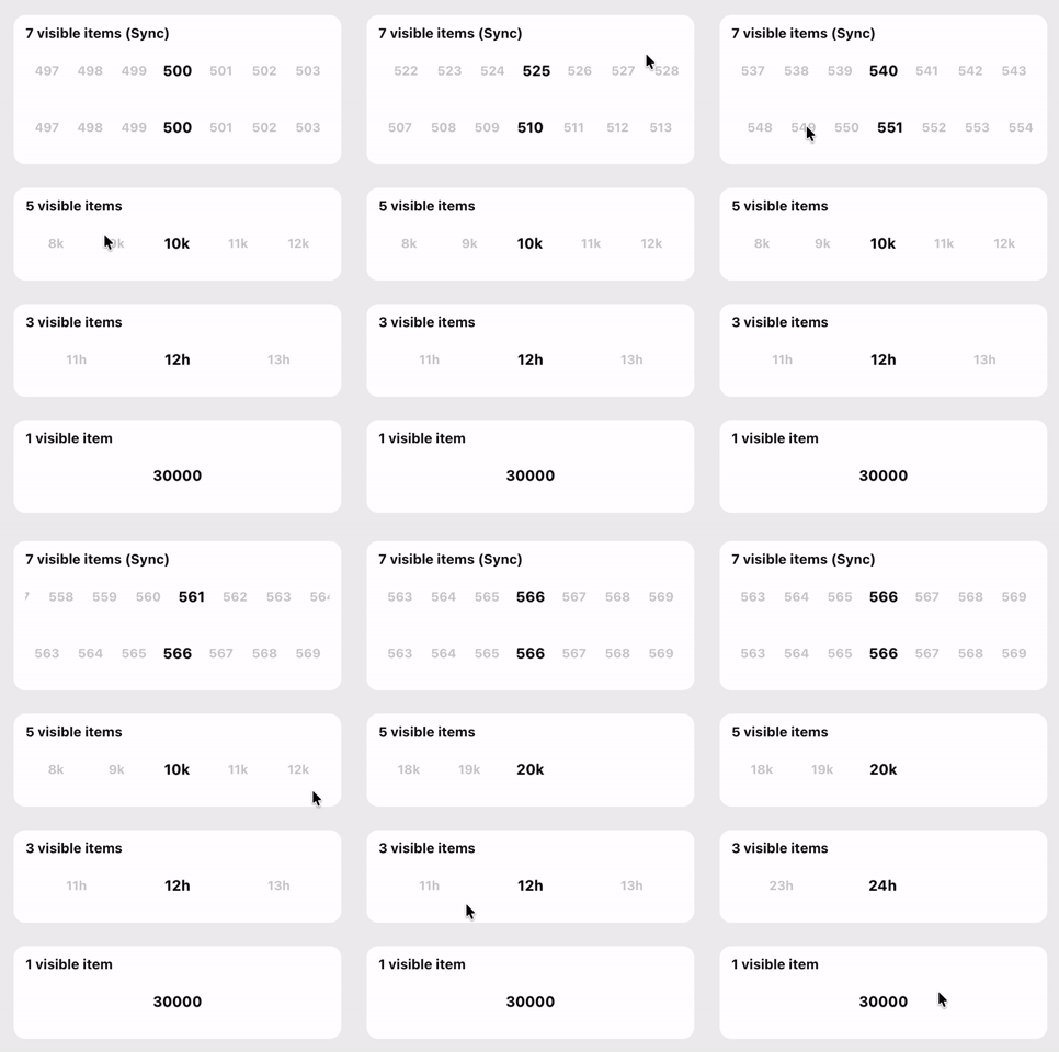
import { HorizontalPicker, type HorizontalPickerRef } from 'expo-horizontal-picker';
import { useRef, useState } from 'react';
import { ScrollView, StyleSheet, Text } from 'react-native';
import { SafeAreaView } from 'react-native-safe-area-context';

const numberItems = Array.from({ length: 600 }, (_, i) => ({
  label: `${i + 1}`,
  value: i + 1,
}));

const thousandItems = Array.from({ length: 20 }, (_, i) => ({
  label: `${i + 1}k`,
  value: (i + 1) * 1000,
}));

const hourItems = Array.from({ length: 24 }, (_, i) => ({
  label: `${i + 1}h`,
  value: i + 1,
}));

const largeNumberItems = Array.from({ length: 5 }, (_, i) => ({
  label: `${(i + 1) * 10000}`,
  value: (i + 1) * 10000,
}));

const pickerContainerHeight = 53;

export default function App() {
  const firstPickerRef = useRef<HorizontalPickerRef | null>(null);
  const secondPickerRef = useRef<HorizontalPickerRef | null>(null);

  const [, setSelectedFirst] = useState({ index: 499, value: numberItems[499].value });
  const [, setSelectedSecond] = useState({ index: 499, value: numberItems[499].value });
  const [, setSelectedThird] = useState({ index: 9, value: thousandItems[9].value });
  const [, setSelectedFourth] = useState({ index: 11, value: hourItems[11].value });
  const [, setSelectedFifth] = useState({ index: 2, value: largeNumberItems[2].value });

  return (
    <SafeAreaView style={styles.container}>
      <ScrollView contentContainerStyle={styles.content} showsVerticalScrollIndicator={false}>
        <Text style={styles.title}>expo-horizontal-picker</Text>

        {/* 7 visible items (sync) */}
        <HorizontalPicker
          ref={firstPickerRef}
          items={numberItems}
          containerHeight={pickerContainerHeight}
          initialScrollIndex={499}
          visibleItemCount={7}
          onChange={(value, index) => {
            setSelectedFirst({ index, value });
            secondPickerRef.current?.scrollToIndex({ index, animated: true });
          }}
          pickerItemStyle={styles.pickerItem}
        />
        <HorizontalPicker
          ref={secondPickerRef}
          items={numberItems}
          containerHeight={pickerContainerHeight}
          initialScrollIndex={499}
          visibleItemCount={7}
          onChange={(value, index) => {
            setSelectedSecond({ index, value });
            firstPickerRef.current?.scrollToIndex({ index, animated: true });
          }}
          pickerItemStyle={styles.pickerItem}
        />

        {/* 5 / 3 / 1 visible items */}
        <HorizontalPicker
          items={thousandItems}
          containerHeight={pickerContainerHeight}
          initialScrollIndex={9}
          visibleItemCount={5}
          onChange={(value, index) => setSelectedThird({ index, value })}
          pickerItemStyle={styles.pickerItem}
        />
        <HorizontalPicker
          items={hourItems}
          containerHeight={pickerContainerHeight}
          initialScrollIndex={11}
          visibleItemCount={3}
          onChange={(value, index) => setSelectedFourth({ index, value })}
          pickerItemStyle={styles.pickerItem}
        />
        <HorizontalPicker
          items={largeNumberItems}
          containerHeight={pickerContainerHeight}
          initialScrollIndex={2}
          visibleItemCount={1}
          onChange={(value, index) => setSelectedFifth({ index, value })}
          pickerItemStyle={styles.pickerItem}
        />
      </ScrollView>
    </SafeAreaView>
  );
}

const styles = StyleSheet.create({
  container: {
    flex: 1,
    backgroundColor: '#eeeeee',
  },
  content: {
    paddingHorizontal: 20,
    paddingVertical: 12,
    gap: 16,
  },
  title: {
    fontSize: 28,
    fontWeight: '800',
    color: '#111111',
  },
  pickerItem: {
    paddingVertical: 20,
  },
});Pass a ref when you need the picker scroll methods: scrollToEnd, scrollToIndex, scrollToItem, or scrollToOffset.
The picker is intentionally stateful around its own scroll position. A ref is meant for imperative coordination, such as keeping two pickers visually in sync or jumping to a specific item from another control. If you choose that pattern, keep any mirrored app state in the parent and update it alongside the ref call, just like the example below.
import { HorizontalPicker, type HorizontalPickerRef, type PickerValues } from 'expo-horizontal-picker';
import { useRef, useState } from 'react';
import { Text, View } from 'react-native';

export default function RefExample() {
  const firstPickerRef = useRef<HorizontalPickerRef | null>(null);
  const secondPickerRef = useRef<HorizontalPickerRef | null>(null);
  const [selected, setSelected] = useState<PickerValues>({
    index: 0,
    value: items[0].value,
  });

  return (
    <View>
      <Text>Selected: {selected.value}</Text>

      <HorizontalPicker
        ref={firstPickerRef}
        items={items}
        containerHeight={53}
        onChange={(value, index) => {
          setSelected({ index, value });
          secondPickerRef.current?.scrollToIndex({ index, animated: true });
        }}
      />

      <HorizontalPicker
        ref={secondPickerRef}
        items={items}
        containerHeight={53}
        onChange={(value, index) => {
          setSelected({ index, value });
          firstPickerRef.current?.scrollToIndex({ index, animated: true });
        }}
      />
    </View>
  );
}A runnable Expo example app is included in example. It includes:
- two synced pickers (
visibleItemCount={7}) driven by refs - additional standalone pickers with
visibleItemCountset to5,3, and1
cd example
yarn
yarn start
The example app resolves expo-horizontal-picker to this repository's local src directory through Metro, so you can iterate on the library and see changes immediately in the app.
Customize the focused and unfocused item styles with GPU-accelerated properties:
<HorizontalPicker
  items={items}
  containerHeight={53}
  focusedTransformStyle={[{ scale: 1.2 }]}
  unfocusedTransformStyle={[{ scale: 0.9 }]}
  focusedOpacityStyle={1}
  unfocusedOpacityStyle={0.3}
  pickerItemStyle={{ height: 80 }}
  onChange={(value, index) => console.log('Selected:', value, index)}
/>| Prop | Type | Default | Description |
|---|---|---|---|
items |
PickerOption[] |
– | Array of options to display. Each option is an object with label and value. |
initialScrollIndex |
number |
0 |
Index of the item initially selected. |
visibleItemCount |
number |
7 |
Number of items visible on screen at once. |
containerHeight |
number |
required | Required picker container height reserved before width is measured, preventing layout shift. |
onChange |
(value: string | number, index: number) => void |
– | Callback triggered when the selected item changes. |
focusedTransformStyle |
ViewStyle['transform'] |
[{ scale: 1.15 }] |
Transform style applied to the focused item (GPU-accelerated). |
unfocusedTransformStyle |
ViewStyle['transform'] |
[{ scale: 1 }] |
Transform style applied to unfocused items (GPU-accelerated). |
focusedOpacityStyle |
number |
1 |
Opacity value for the focused item (GPU-accelerated). |
unfocusedOpacityStyle |
number |
0.2 |
Opacity value for unfocused items (GPU-accelerated). |
pickerItemStyle |
ViewStyle |
– | Style applied to each picker item container. |
pickerItemTextStyle |
TextStyle |
– | Style applied to the text inside each picker item. |
style |
ViewStyle |
– | Style applied to the scroll container. |
The component extends FlatListPropsWithLayout, so you can also pass any valid FlatList props such as:
keyExtractor(default:(item, index) => ${item.value}-${index})scrollEventThrottle(default:16)decelerationRate(default:'fast')onLayoutshowsHorizontalScrollIndicator(default:false)initialNumToRender(default:15)maxToRenderPerBatch(default:15)removeClippedSubviews(default:Platform.OS !== 'android')refto callscrollToEnd,scrollToIndex,scrollToItem, andscrollToOffset
The focusedTransformStyle and unfocusedTransformStyle props only accept GPU-accelerated transform properties (e.g., scale, translateX, translateY, rotate) for optimal performance. These properties are processed directly on the GPU without triggering layout recalculations.