feat(icon): add form-folder icon#3352
Conversation
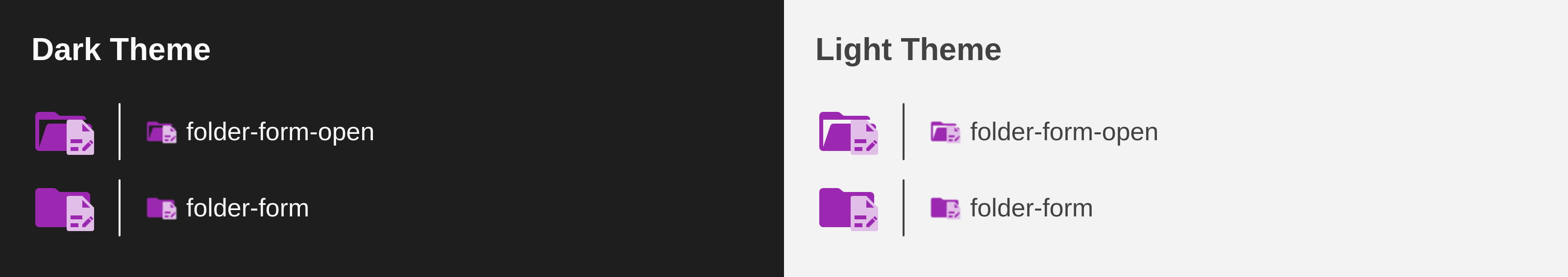
Able to display icon for form/forms named folder.

Add closed form folder with text and check-boxes.
Add open form folder with text, check-boxes and a pencil.

Fixes: material-extensions#3351
PreviewThank you for creating a pull request. This preview shows you how your icons will look on the different themes: Check how your icons fit in a 16x16 grid with our Pixel Perfect Checker by following this link. You can find more information on how to contribute in the contribution guidelines. |
Able to differenciate config from service.

Update config folder gear context to wrench.

Fixes: material-extensions#3357
Able to display icon for form/forms named folder.

Add form folder with text, check-boxes and a pencil.

Fixes: material-extensions#3351
|
Committed the required form folder icon. Thanks @chiptumor for the required suggestions and a valuable discussion. Dear @PKief, Please review and merge it. |
|
@SayanShankhari thanks for the changes, can you please remove the changes to the config folder? We're not planning to update that at the moment: 
And why didn't we just clone the existing docs folder? That would look similar right? See my comment here: #3351 (comment) |
|
Okay, the config changes will be removes for now. As the existing |
Revert proposed change for config folder and place old one.
|
This will be approximately the view how you see the icon in the file explorer of VS Code It's pretty difficult to make our many details of the icon. That's why we do align our icons to a 16x16 as much as possible. This icon doesn't follow the lines in the grid: 
Try to ensure that most (if not all) at least as many shapes as possible, follow the lines in the grid - similar to how we do it for the folder icon in the background - the same applies for the motive in the foreground: 
You can see the grid details here: And here are more information why we're doing this: |
|
Got it, thanks for pointing it out, i get the grid thing now. Added the grid in the edited sample below, please check them. Once finalized, i'll remove the grid, box and other extra lines, before commit. 

|
The motive is fixed with the 16x16 grid guide.
 PKief
left a comment
PKief
left a comment
There was a problem hiding this comment.
The icon looks pretty good already, thanks for the improvements. @SayanShankhari could you please also move the motive to the complete right border?

As you can see, most of our folder icons the motives are filling our the last right pixel:

Adjust the motive to the recommended position.
Add light icon pair having slightly darker color.
|
Looks nice now! If there's any further criticism I may add:
The icon looks sweet otherwise! |
|
Hi, @chiptumor, I can't remove the idea of the pencil (an editor), but did some workaround making the page longer by 1 and wider by 1 pixel and adjusted the lines to fit in the grid horizontally, but remained with 0.75 pixel height to feel the checkbox little bigger, also added another line at top to fill the gap. Please check the below sample, |

|
I'd stray away from resizing the motive for the sake of staying consistent with similar icons (i.e.
I'm unsure if you're implying the pencil exists solely because this folder would be viewed or modified in an editor. That's a redundant case to account for. Are you talking about the idea of a form being filled out ("edited") by a user? |
|
Hi @chiptumor,
Now my only concern is it looks good or not in lower pixel. It seems good to me, and should solve (reduce) the blur effect during tiny size render. |
I'd argue that they were mistaken in asking for the motive to be moved to the very right edge of the icon. I'd believe the motive's right-boundary rule is based on the square boundary of a motive. For example, the 
I've used the old If this icon's motive should abide according to its genuine shape, then I would imagine the @PKief, do you have input on this? Should an issue be opened to correct
That makes more sense, and I'd agree a pencil would fit the motive. The issue I have with it more or less regards its complication to the icon itself. The motive's limitation of a 9x9 resolution hinders the legibility of it. There's several elements compacted into one motive--the fold, the bulleted/check list, the pencil--and when viewed at a legitimate resolution of 16x16, it becomes hard to tell what's going on in the icon. I would argue the pencil isn't necessary because of the possible usage of a folder named However, though I'd strongly argue for removing the pencil and keeping the list, perhaps vice versa could apply--maybe you could omit the list and make the pencil the focus. I imagine a page with a large pencil in the center is distinct enough from the |
|
@SayanShankhari I just explored it a little bit, and do we actually need the bullet list? Can't we just have some kind of bars which would represent input fields and a pencil? I guess that would simplify it a little bit: 
|
|
@chiptumor yeah there's some inconsistency, that's true. We could put the forms motive icon also centered in that box, that would be ok I guess. My biggest concerns are the shapes inside the motive. On that super small resolution how the icons are displayed it is really important to make the motive as simple as possible without having too many shapes. |
|
Here is the comparison between the two in same color accent. Sometimes it seems different in different color combination. Those are tiny version of check-boxes, not bullets. If you don't want to keep them, you may remove. Your new version |

it looks good, can you update it? maybe a different color than blue would be nice, but don't create two separate icons for light and dark theme, choose a color that fits both themes and we create only a single version |
|
I'm not good at picking color combinations, after long hours found these, could you please review and confirm which one fits good both in light and dark theme, and tinker a bit if required. |
I appreciate your efforts, the first looks quite good to me, maybe go with that color. Usually I don't have a huge preference in colors as long as they are following our palette and they have a good contrast with the background and the motive. From my experience orange and yellow colors are usually a little bit tricky with the contrast on light themes, so choosing any other color is more straightforward. 
|
Update motive shapes and change accent orange to indigo.
|
Thanks for your feedback. Also strongly agree with your opinion on orange and yellow accent. Let's just stick with indigo for now as your choice. |
PKief
left a comment
There was a problem hiding this comment.
@SayanShankhari it looks really good now! Thanks for the adjustments.
Merge SuccessfulThanks for your contribution! 🎉 The changes will be part of the upcoming update on the Marketplace. |
Able to display icon for form/forms named folder.
Add closed form folder with text and check-boxes.
Add open form folder with text, check-boxes and a pencil.
Fixes: #3351
Description
Added form-folder icon inside svg icons folder named "folder-form.svg" and "folder-form-open.svg".
Add configuration inside "folderIcons.ts" file.
Contribution Guidelines